Table
On this page
Style
Use a table to organize and display data efficiently in a grid with columns and rows. When using a table, consider the structure of the data and how to make it easy for a user to scan, examine, and compare. Although a table can share space with other components and content, consider giving a table extra space on the page to help a user view dense data.
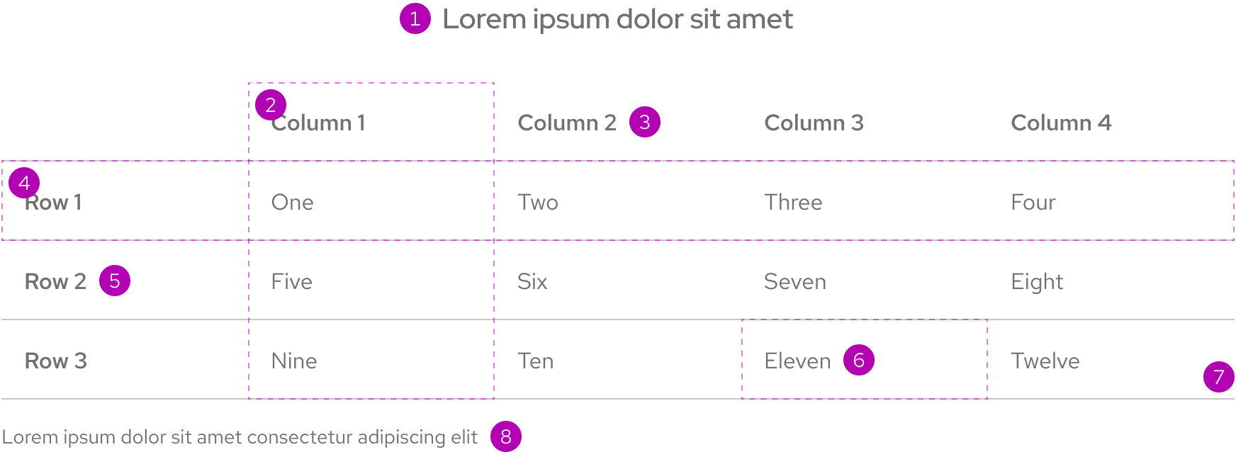
- Title
- Column
- Column title
- Row
- Row title
- Cell
- Divider
- Caption
Column and row titles
Column and row titles should be a few words that describe the data in that column or row.
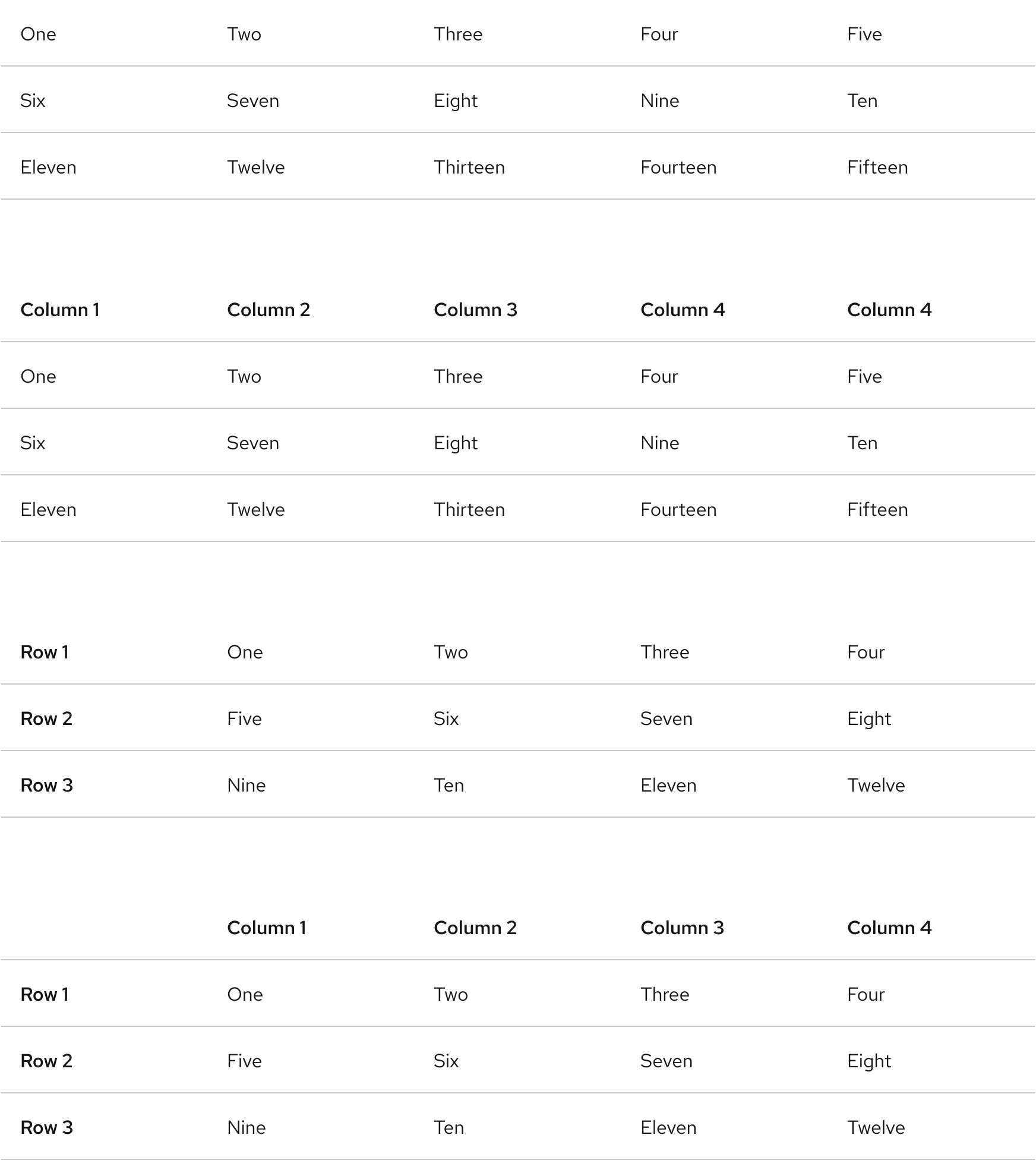
Table title and caption
The table title should make it clear to a user what the data is and what purpose it serves. A caption can be added under the table to provide more information about the data or its source.
Color scheme
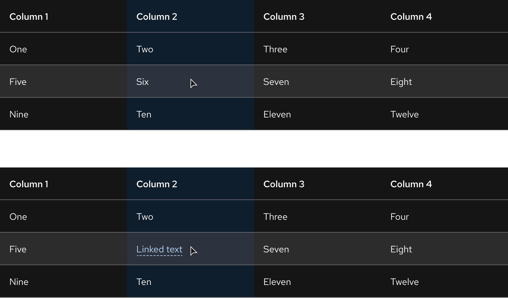
A table is available in both light and dark color schemes.
Light scheme
Dark scheme
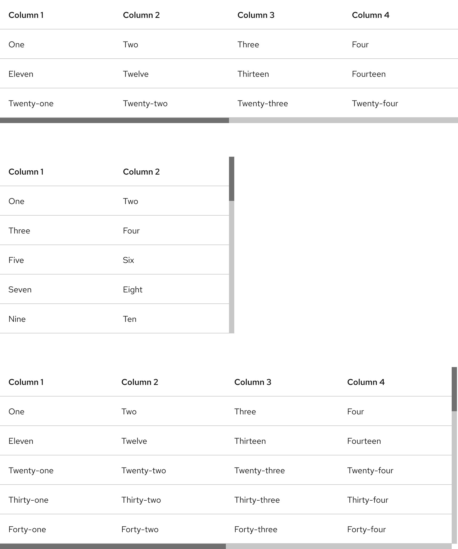
Scrolling
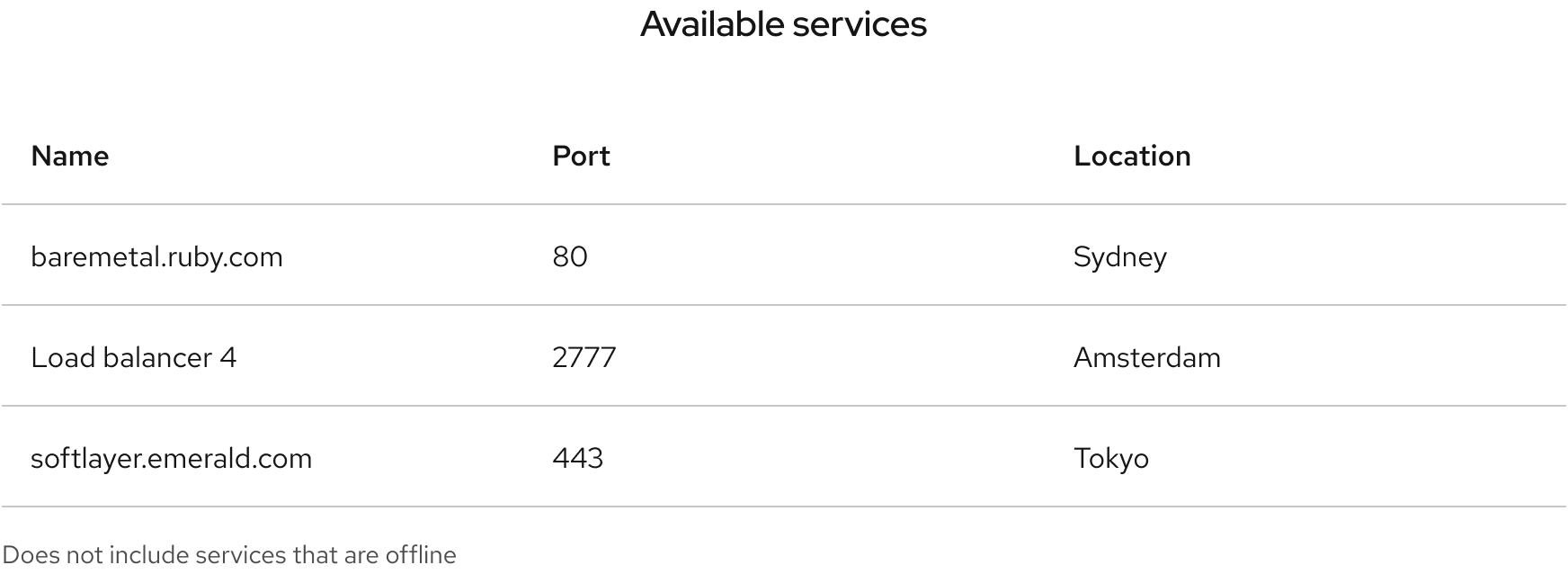
A scrollbar is visible if content exceeds the width or height of a table. Content can scroll horizontally, vertically, or both.
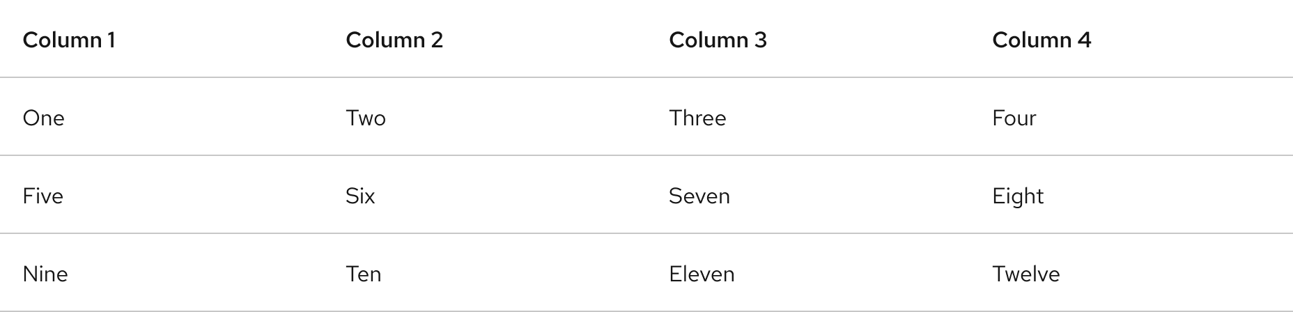
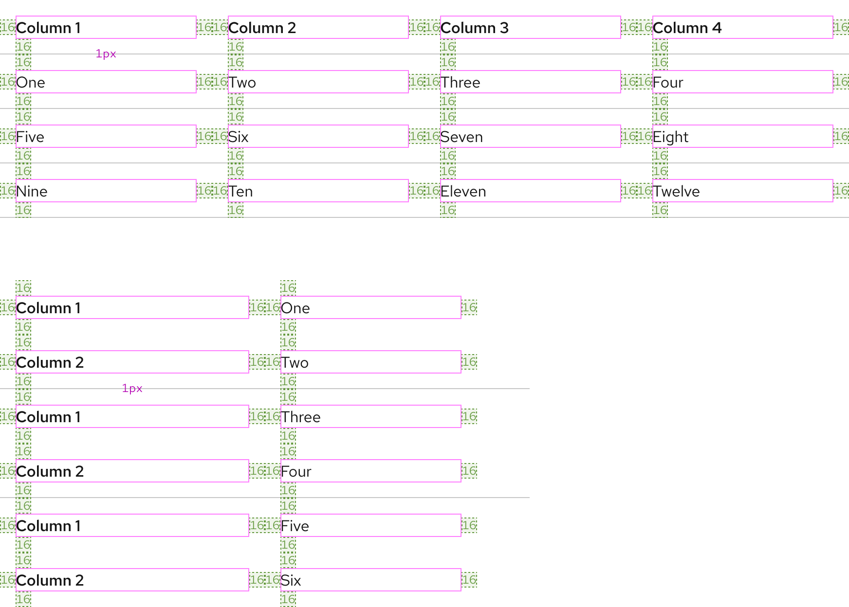
Space
A table has equal spacing within columns, rows, and in between divider lines. The same spacing is also maintained across large and small viewport sizes.
Example
Token
Description
lg
16px spacer
Interaction states
Interaction states are visual representations used to communicate the status of an element or pattern.
Hover
On hover, cell rows and columns are highlighted with a semitransparent background color to make content easier to view.
In light scheme, a row is highlighted in light gray on white surface colors. The column highlight is light blue.
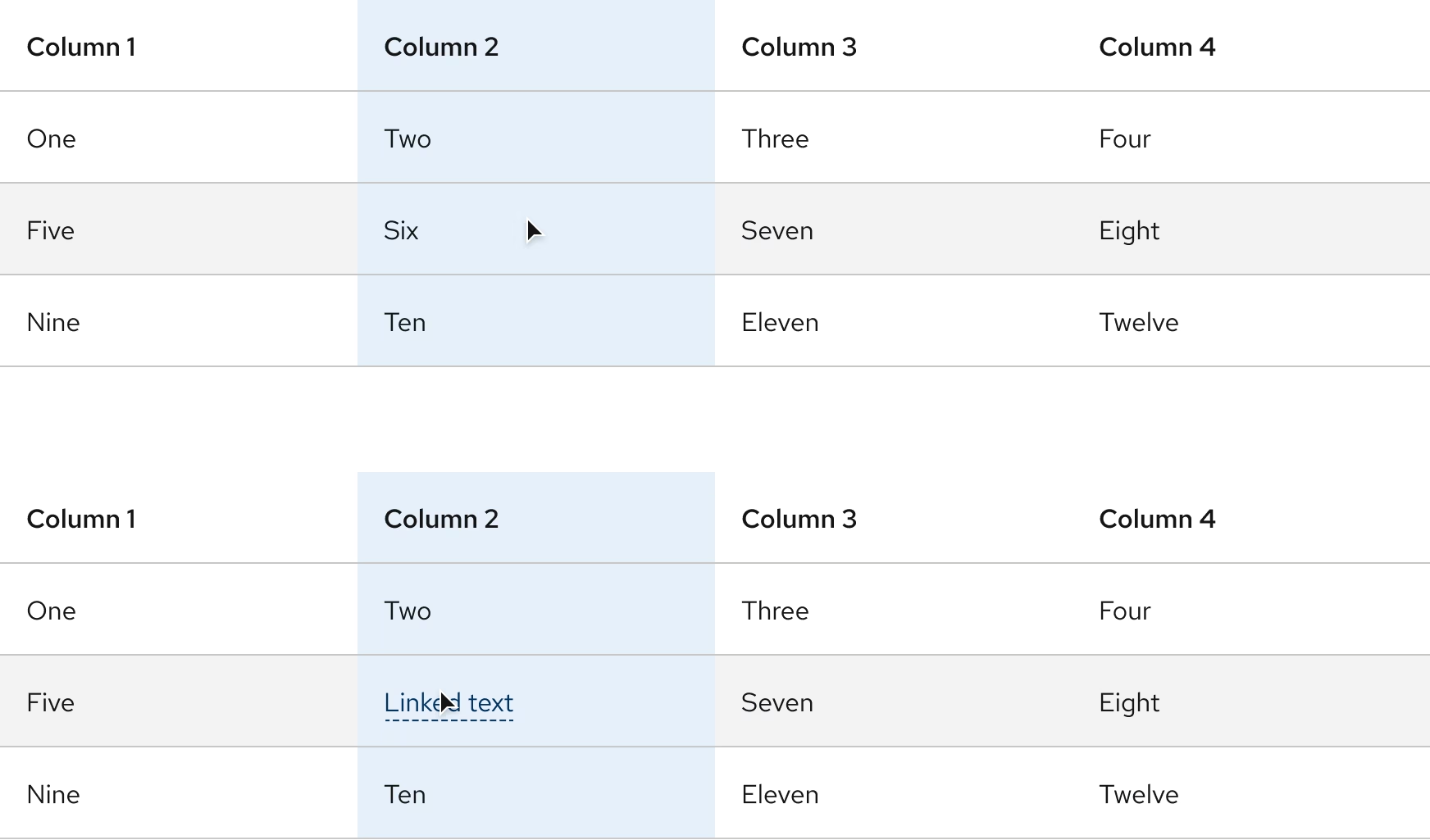
On all dark color palettes, the row highlight is white, and the column highlight uses a dark blue.
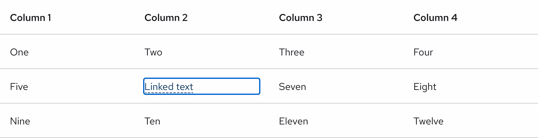
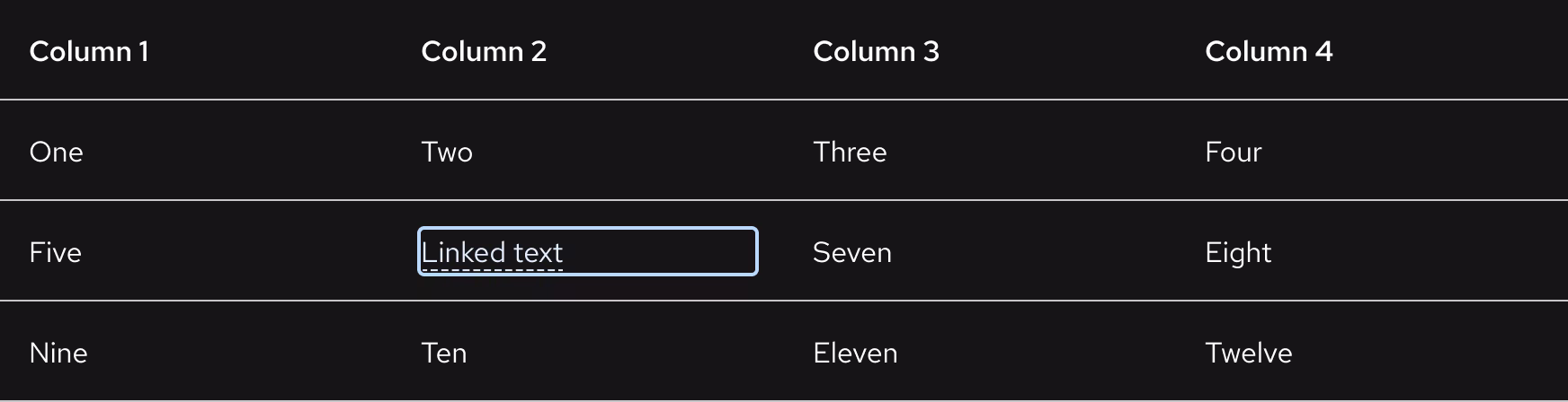
Focus
Warning
A cell with focus does not display row and column highlighting unless it is hovered.
Other libraries
To learn more about our other libraries, visit this page.
Feedback
To give feedback about anything on this page, contact us.
