Sticky card
On this page
Overview
Sticky cards slide into view at a certain scroll position and then anchor themselves to the edge of a browser window. They stay in one place as content scrolls underneath until a user dismisses them.
Sample pattern

Style
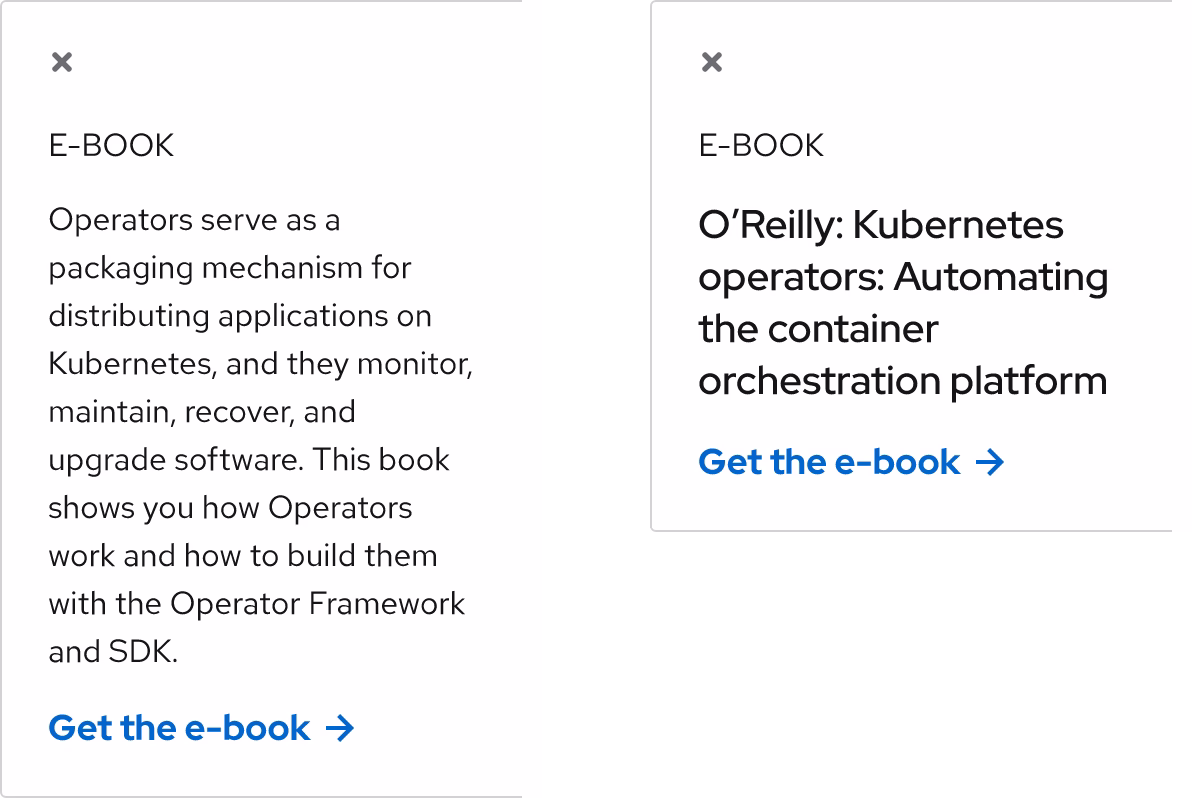
A sticky card acts as a small container for a limited amount of content.

Color scheme
The required elements in a sticky card are a close button, a title or a headline, a call to action, and a container (the light container features a drop shadow). The container consists of a background color and two rounded corners on the left or the right side, depending on the orientation. A thin border is also required even if the sticky card background color is different than the page background color.


Layout
A sticky card features header, body, and footer sections, just like a normal Card. Header, body, and footer sections can only include a limited amount of content to ensure that the card doesn’t become too tall.
Close button
A close button is required for accessibility if a user wants to dismiss the sticky card from their view if they find it distracting.
Header
The header section can feature only a limited amount of content like a card title or a small headline. This required section introduces what the content is and shouldn’t be hidden.
Body
To keep the vertical height short, the body section can only include a small amount of text or a small image thumbnail. If a card title and a headline are enough to explain what the content is, the body section can be hidden.
Footer
The footer section can include normal links or a call to action. A sticky card footer is always required and shouldn't be hidden.

Usage
The sticky card placement is different than the normal card placement, where a normal card lives in a predetermined spot on a page. A sticky card slides into view only when a user reaches a specific scroll position on a page. When it does, it stays fixed to the edge of the page and it floats above content and layouts when a user scrolls. It should only be used to feature secondary content that’s helpful to a user, like a resource or webinar.
Layout
A sticky card can be placed on the left or the right edge of a page and it has a fixed width of 262px.

Content
A sticky card has limited vertical height, so keep content short and only include essential information. A sticky card can include a card title, a headline, text, and a call to action, but not all of these elements need to be included at the same time. Move any extra content to other parts of the page if possible.
Character count
The recommended maximum character count for the elements of a sticky card are listed below and include spaces.
| Element | Character count |
|---|---|
| Title | 20 |
| Headline | 50 |
| Body text | 120 |
| Footer | 55 |
Alignment
Text and other content in a sticky card is always left-aligned, even if the sticky card is anchored to the right edge of a page.
Best practices
Don’t use more than one sticky card per page.

Don’t change the width of a sticky card on large screens, it’s fixed at 262px.

Don’t anchor a sticky card on small screens, it covers too much content.

Don't omit the close button, it’s needed for accessibility.

Don’t use more than one call to action.

Behavior
Sliding
A sticky card is always hidden until it slides into view. The trigger is when a user reaches a specific scroll position on a page, which should be below the fold to avoid distracting a user as soon as a page loads.
Scrolling
A sticky card can be anchored to the left or the right edge of a page and it stays in the same position when a user scrolls up or down. Any content below will scroll underneath, but it will be partially covered.
Dismissing
A user can click on or tap the close button if they want to dismiss the sticky card from their view. The page’s scroll position won’t be impacted and the sticky card won’t return in the same browsing session after it’s closed.
Vertical height
The vertical height of a sticky card greatly expands when too much content is placed inside. Doing this will cover too much content and negatively impact the user experience, so keep the content short to maintain as close to a square aspect ratio as possible.

Breakpoints
A sticky card is 262px wide on large screens only. On small screens, it acts like a normal card and is placed in a predetermined spot on a page, but it maintains the same styles.
Desktop

Tablet

Mobile

Interaction states
Since a sticky card can consist of a variety of elements, refer to the specific interaction states that are assigned to each style and component for more information.
Spacing
A sticky card uses space tokens to define spacing values between elements.

Example
Token
Description
lg
16px spacer
xl
24px spacer
Other libraries
To learn more about our other libraries, visit this page.
Feedback
To give feedback about anything on this page, contact us.
Other libraries
To learn more about our other libraries, visit the getting started page.
