Table
On this page
Usage
A table is a set of data that can be easily scanned and compared. Each row in a table represents an item and each cell of that row is an attribute of that item. This means that cells in a particular column will be the same data type such as dates, numerals, text, etc. Ideally, there should be one value per cell. If there is more than one piece of information within a cell, use another component.
Number of columns or rows
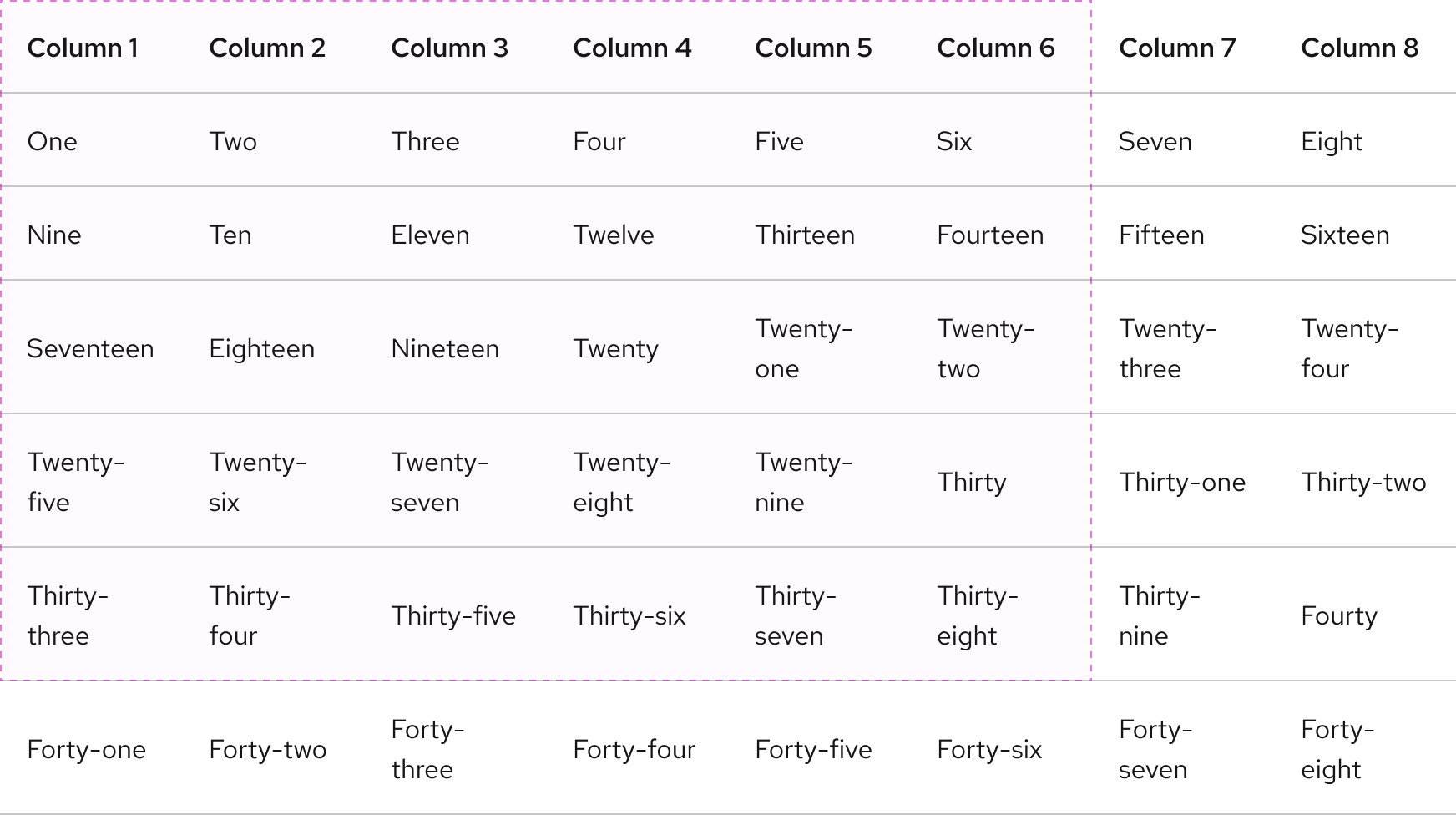
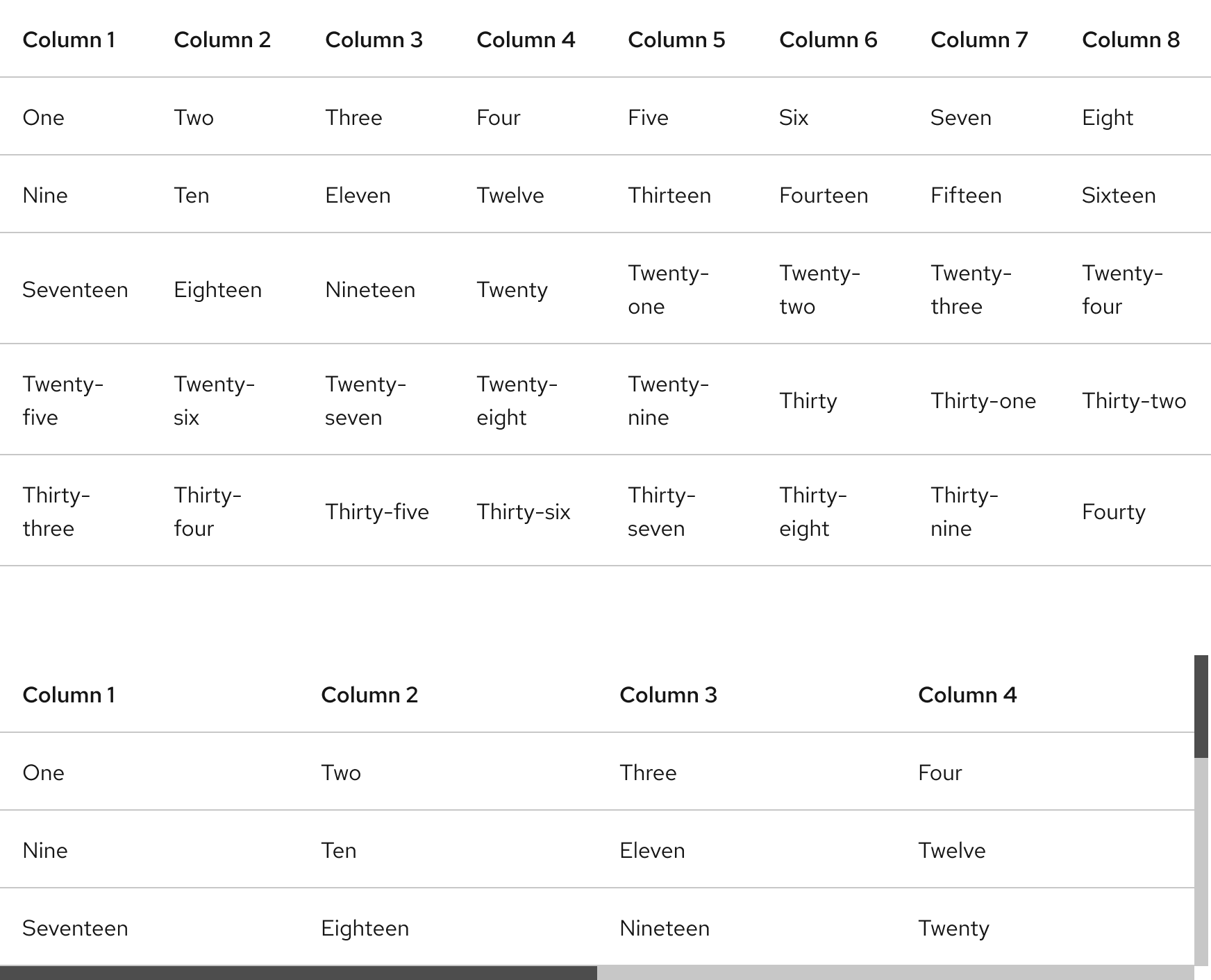
There is no maximum number of columns or rows. To reduce cognitive load and a cluttered user interface, set a max-width or max-height after five or six of each.
Padding
In some edge cases, table rows can have double padding if there are more element types than just text.
Writing content
Column and row titles
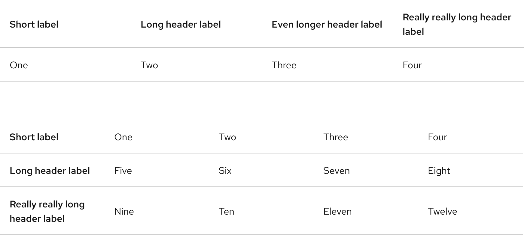
Titles should be concise, scannable, and descriptive of content in the column or row. Header labels should have two or three words maximum. If more words are included, the label might break to a second line.
Character count
In general, header labels should be as short as possible. However, if columns have more width, more words can be added.
| Column count | Character count (including spaces) |
|---|---|
| Two | 40 - 50 |
| Four | 20 - 30 |
| More than four | 10 - 20 |
Layout
Placement
A table should be the same width as nearby blocks of content on the page.
Scrolling
A table will scroll horizontally or vertically if content exceeds the max-width or max-height.
Logos
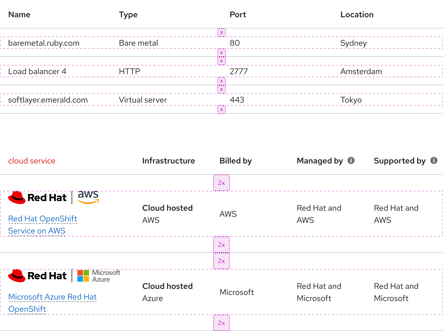
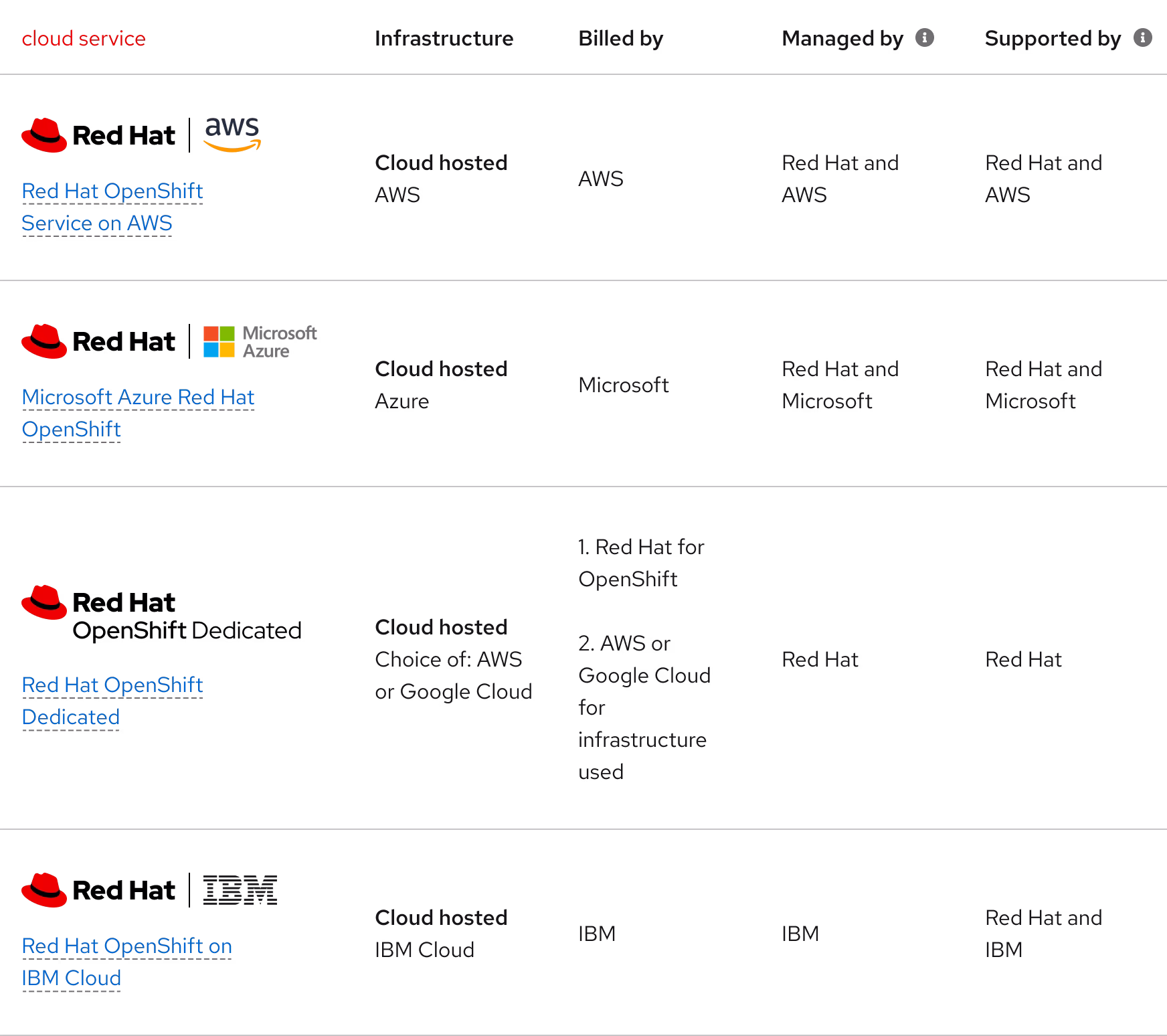
Logos can be used in cells along with text if necessary.
Behavior
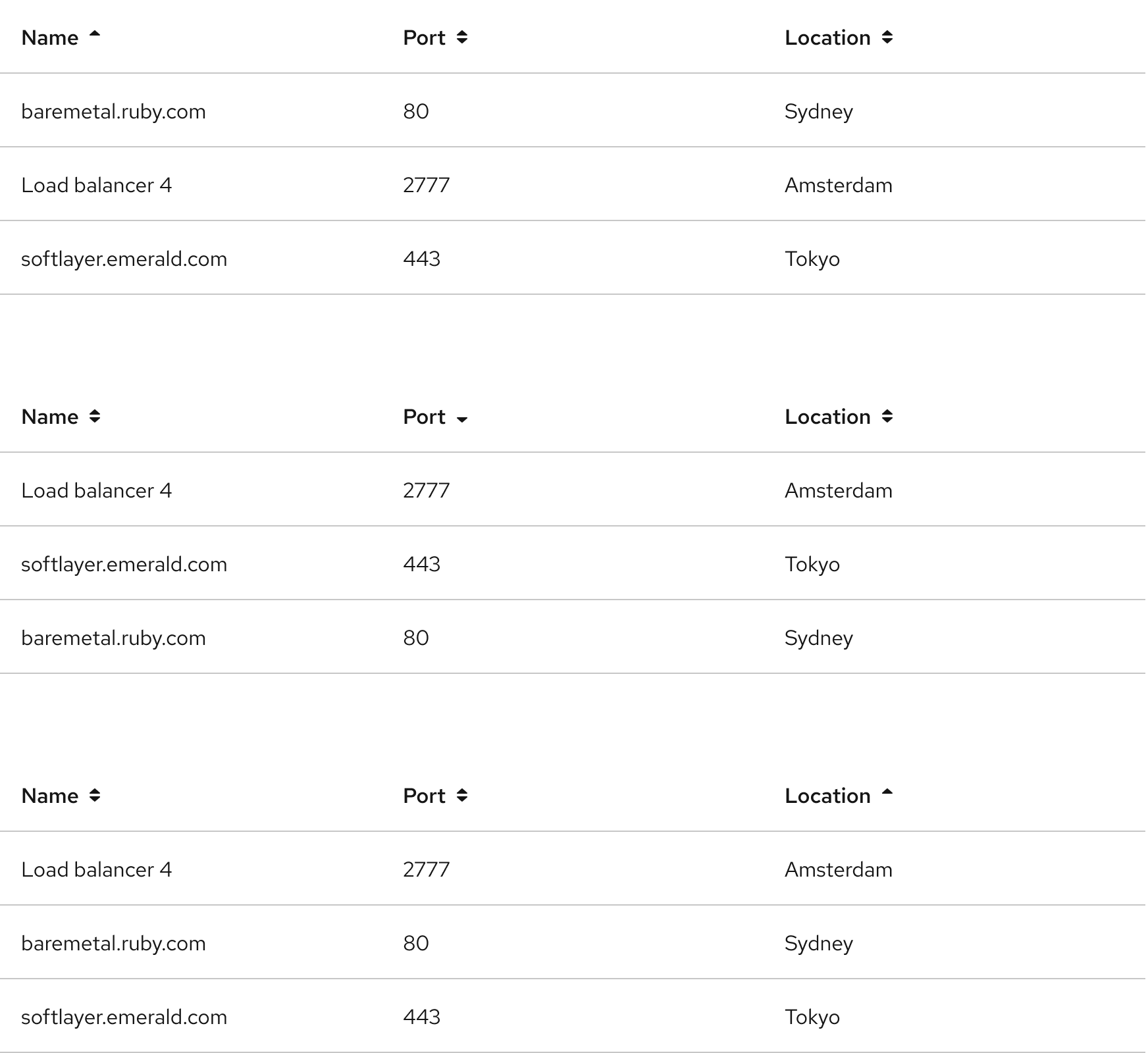
Column sorting
Columns can be sorted in ascending or descending order. Sorting controls are located in the column headers and the icon indicates the current sorted state. A sorted table has three states:
- Unsorted (both arrows visible)
- Sorted up (arrow pointing up)
- Sorted down (arrow pointing down)
Responsive design
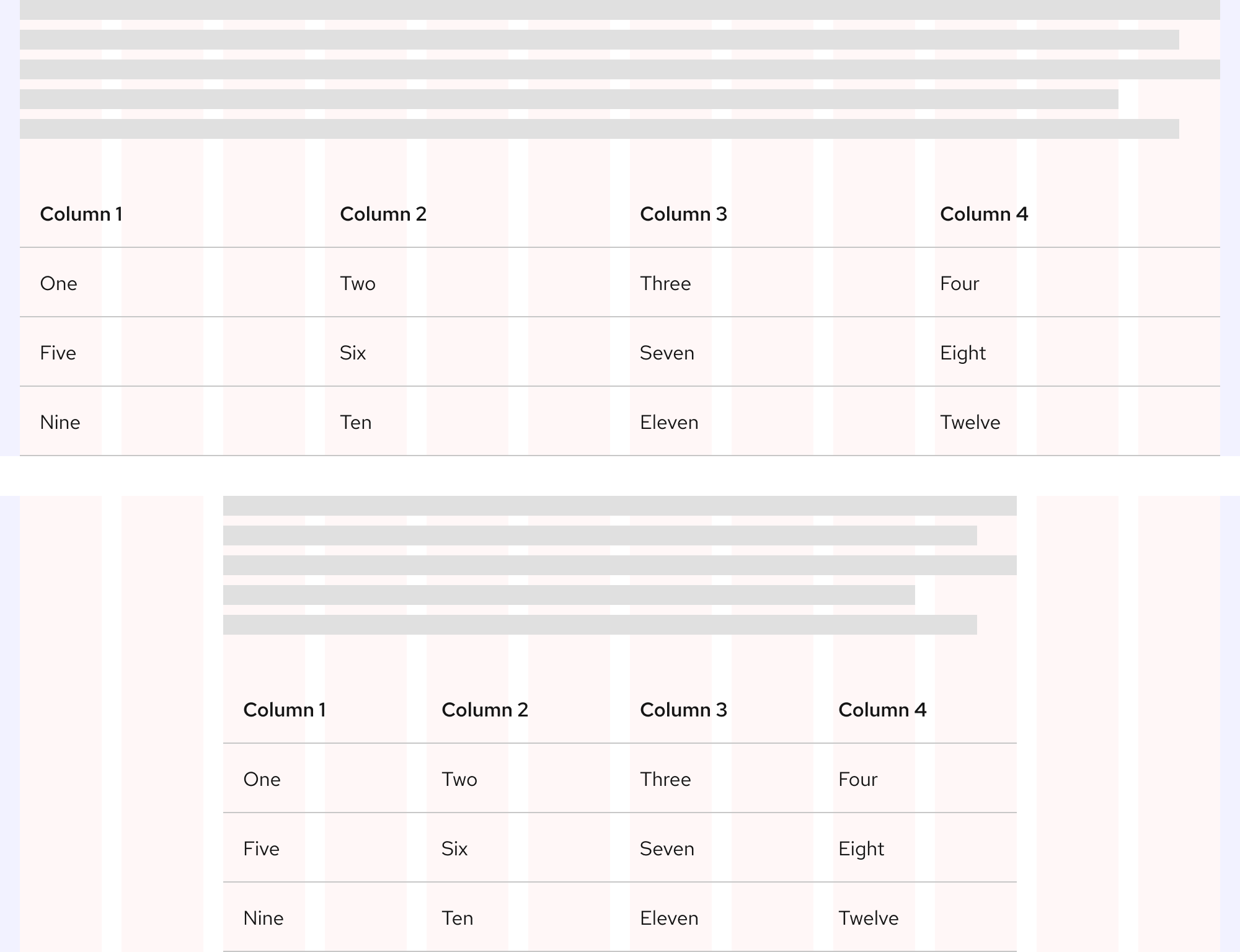
Large viewport sizes
Small viewport sizes
Best practices
Number of columns

A table should display at least two columns.

Avoid having a table with only one column.
Cell padding and height

Keep the table’s default padding to make it easy for users to view the table’s content. In some edge cases, a table can have large cell height if there are more element types than just text.

Don’t add extra padding to increase the cell height if it’s not necessary for the content.
Table size

Use the right configuration for the table’s container or viewport size.

Do not use the small viewport size configuration in large containers or viewports.
Other libraries
To learn more about our other libraries, visit this page.
Feedback
To give feedback about anything on this page, contact us.
