Design
On this page
Overview
Note
This section covers design accessibility. Designers should also be familiar with accessibility fundamentals, content, and development.
Layout and hierarchy
Order
The contents of a page should be arranged in a meaningful order. Here are some things to keep in mind:
- Heading levels should help users distinguish between different sections and understand how content is grouped hierarchically.
- Items should be placed in a clear, logical visual order, so that developers can easily match this order in the DOM, allowing users of all sorts (with and without assistive technologies) to have similar experiences when engaging with content.
Repeated content
Elements that repeat across a site (e.g., navigation and site search) should appear in consistent locations and with consistent ordering. That said, it’s okay if some elements within repeating sections (e.g., individual items in a navigation menu) change and shift by necessity, depending on context.
For repeating sections that come before a page’s main content (e.g., a navigation menu at the top of the site), there must be a means for keyboard users to bypass them and get to the unique content. Such "skip links" may be hidden by default, but you will want to design how they appear onscreen upon receiving keyboard focus.
If one element has the same function as another, both should be labeled the same way. For example, a call to action for the Contact page should have consistent text labels.
Color
Using color alone
When presenting meaningful information or indicating the location of interactive elements, do not rely upon color alone in your designs. Users with vision impairments or even situational concerns (e.g., a poor monitor, viewing a display in bright sunlight, etc.) may be unable to discern these color cues. So, ensure you use non-color indicators, as well.
For specific information on how we use color accessibly, visit our Foundations page on the topic.
Contrast
We strive to adhere to WCAG 2.2 AA contrast ratio standards. Our text, links, interface elements, etc. are designed with sufficient contrast when used on top of surfaces, image backgrounds with low contrast, and near adjacent colors.
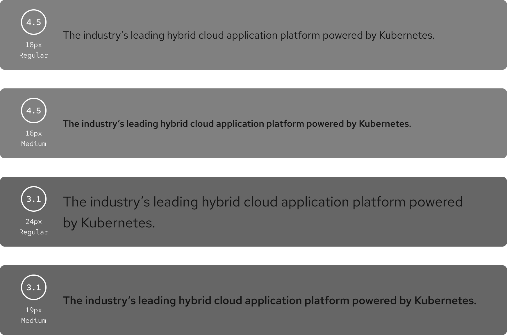
Text
Small foreground text (non-bold text under 24px and bold text under 19px) must have a contrast ratio of 4.5:1 and large foreground text (non-bold text of at least 24px and bold text of at least 19px) must have a contrast ratio of 3:1.
Links
When possible, you should underline inline text links that may appear within blocks alongside non-link text (e.g., within paragraphs and list items). This makes such links easy to discern for all visitors, particularly those with visual impairments or in situations that could make color differentiation difficult.
If you can’t add underlines to your inline links, and color is the only way you can distinguish these links from non-link text within a paragraph or list, the contrast ratio between a link and its surrounding text must be at least 3:1 in both visited and unvisited states. And underlines or other non-color cues must also then be used to signify when the link receives hover.
Our Interactions section has specific information on styling links for Red Hat experiences.
Graphical objects and UI components
Graphical objects and UI components (including those within charts and infographics) should have a contrast ratio of at least 3:1 . If color is the only way to distinguish between inline controls and their surrounding text (e.g., no outline or underline), the contrast ratio between the control and surrounding text must be at least 3:1.
Non-color cues must be also used to signify when an object or component receives focus (e.g., a border).
Layering
It is acceptable to layer colors with the same hue, saturation, or lightness on white, black, or gray. However, layering them near or on top of each other might cause vibration. If you need to layer colors, follow WCAG 2.2 AA requirements.

Further help
TPGi’s Colour Contrast Analyzer for Windows and Mac computers can help you identify colors and gauge their contrast from one another.
Imagery
Text in images
Avoid using images of text, except for logotypes or text in decorative images. Many effects can be applied to text via CSS, and designers can work with developers or engineers to determine the best approach. In addition to making reading more difficult for screen reader users, images of text usually can’t be resized or manipulated by assistive tech well.
Charts and diagrams
Any charts, diagrams, or complex images should have a description placed immediately before or after. Explaining these types of visuals is typically too long for alt text. So, this accompanying text can be a caption or integrated into the adjacent body copy.
Decorative images
Any decorative images that add no meaningful information to an experience should be identified as such for anyone writing alt text or developing the interface. These decorative images can then be hidden from assistive technology by developers, and content writers will know they don’t need to provide text alternatives for them.
An image used as a link or button is always meaningful (i.e., not decorative) and must be both labeled properly and exposed to assistive tech, except in the following cases:
- The image is accompanied by sufficient descriptive text that is also within the containing link or button, or
- The containing link or button has an aria-label or aria-labelledby value applied to it.
Motion and audiovisual content
Animations
The following guidelines should be followed to make animated content accessible to users that may have motion sensitivity or who experience seizures:
- Any animations lasting five seconds or more require mechanisms for stopping or hiding it.
- Any text that’s animated or that automatically changes needs a way to be viewed statically.
- Any flashing or blinking content should do so fewer than three times per second.
Videos
Designers must provide ways to pause and/or mute video content if the video:
- Has no audio and lasts longer than five seconds, or
- Has audio and lasts longer than three seconds.
These guidelines apply whether or not the video autoplays.
Most video players have caption controls built in, and designers will not typically be responsible for creating captions. However, designers will have to show text or audio descriptions for any embedded videos if essential information isn’t also conveyed through audio.
Audio
Similarly to video, an audio file that lasts longer than three seconds must have controls for muting or pausing. An audio-only file should also come with a way to view a transcript.
Essential information should not be conveyed by sound alone. For example, if a timer dings at the end of a timed test, provide a corresponding visual indication.
Interactions
User control
Giving users control over user interfaces is a foundational principle of user experience design. It is also the basis of several WCAG 2.2 AA requirements, like ensuring interfaces operate in predictable ways.
Links
Appearance
Links should appear clickable and focusable. And, when possible, links and buttons should look different from one another to give users cues as to their purpose.
Opening links in new windows
Avoid opening links in new windows or tabs, as this takes control away from the user. There are only a few exceptions where it may be acceptable to open links in new windows/tabs:
- When a link might interrupt an ongoing process (e.g., filling out a form) where navigating away would lose the user's progress.
- When a link provides help or assistance that would take the user away from a step in the current experience, like search results.
- When a link leads to a file or document that isn't a web page or web application, like a PDF.
In the first two cases above, such experience interruptions may be better handled through tooltips, popovers, or modals/dialogs.
If a link must open in a new window, indicate this both visually and non-visually. Text is preferred, but an icon (with text alternative for assistive tech users) can be used to announce that a new window will open.

Target size
A click or touch target, like a button or link, should be large enough for all users to activate easily on all devices. The minimum size is 24 × 24 pixels for level AA compliance and 44 × 44 pixels for level AAA. Proper target sizes ensure that a user with dexterity impairments can still select a link with a mouse, that a user in a moving vehicle can tap the correct button in an app, etc.
If a target must be smaller than 24 pixels in either direction, it must be spaced from any other targets as if it were centered within its own 24 pixel diameter (or larger) circle.
Keyboard interactions
Mouse and keyboard users must be able to interact with interfaces in functionally equivalent ways. For example, if a mouse user can scroll through a page and click to expand and collapse accordions in a group, a keyboard user must also be able to use the tab key to navigate through this accordion group and expand and collapse focused accordions by pressing enter.
Though much of the work of incorporating such functionality happens in the development stage, designers should consider how their designs will be approached by keyboard users. In the preceding example, a large accordion group may be more difficult for keyboard users to use because they may have to tab through many accordion panels before arriving at the one they want to read. In this case, it may be a better experience for both keyboard and mouse users to have those accordions broken into smaller groups.
Keyboard and assistive tech users must also have the ability to perform path- and gesture-based tasks typically done via mouse or touchscreen. If users are expected to interact with an image gallery by swiping, the designer should include buttons to allow all users to cycle through these images. And clicking and holding down a slider marker with a mouse pointer shouldn’t be the only means of increasing/decreasing values for that element. (e.g., You could add up/down arrows to the interface, or a developer could ensure that arrow keys update the value when the slider has focus.)
Focus
The act of focusing on an element should not cause the element to change the interface’s context. For example, if a user places keyboard focus on a link, that action shouldn’t automatically send them to a new page.
Note
A change in a page’s content does not always mean that the context has changed. Learn more about what constitutes a change in context.
If keyboard focus appears to be trapped in a subsection, instructions for exiting this section via keyboard will need to be available. For example, if pressing the tab key does not allow the user to exit an embedded video or learning module on a page, another method (e.g., pressing the escape key or some key combo) must exist, and instructions must be presented to all users.
Typography
Spacing
Line heights for body copy should be at least 1.5× regular single-spacing. And paragraph spacing should be 1.5× of that line height. In other words, if your line height is 1.5, your paragraph spacing should be at least 2.25× (or 1.5×1.5) the original single-spaced height. (W3C rounds to 2.5× in their paragraph-spacing recommendation.) Such spacing helps people who find it difficult to read when lines are too close together.
Character counts
Long lines of text can be difficult to read. Character counts for one line of text should not exceed 80 characters (40 if content is in Chinese, Japanese, or Korean). This can be done by setting a maximum width for content areas.
Alignment
For left-to-right languages, left-aligned text is the easiest to read and skim. The same is true of right-aligned text for right-to-left languages.
Center-aligned text can be used sparingly, but it should be avoided for paragraphs.
Text should never be justified. Justified text is aligned to the left and right edges of a content area, and spacing between words is adjusted to make this happen. Depending on how the content flows on various screen sizes and whether the user is manipulating the text for improved readability, justified text can create spaces between words that are too large or narrow to be read comfortably.
