Spacing
On this page
Overview
Spacers are visual cues used to define fixed amounts of space between elements. They make it easy for designers to maintain consistent spacing across components and patterns as well as simplify the handoff process between designers and developers. Consistent spacing helps maintain balance and rhythm across the system.
Style
Base increment
The base increment of spacers starts at 4px. The Form field pattern features a 6px spacer for very specific use cases. It should not be used anywhere else.
Scale
There are a variety of spacers available which can be used for different spacing needs, which are all divisible by 4. To keep the system simple, there’s only one scale for spacers that applies to components, patterns, and layouts. The smallest spacer is 4px and the largest is 80px. New spacers are added based on design needs, so do not create any new spacers, combine different spacers instead.
| Example | Token | Description | |
|---|---|---|---|
| xs |
|
4px spacer | |
| sm |
|
6px spacer | |
| md |
|
8px spacer | |
| lg |
|
16px spacer | |
| xl |
|
24px spacer | |
| 2xl |
|
32px spacer | |
| 3xl |
|
48px spacer | |
| 4xl |
|
64px spacer | |
| 5xl |
|
80px spacer | |
| 6xl |
|
96px spacer | |
| 7xl |
|
128px spacer |
Applying spacers
The size of an element dictates its spatial relationship with other elements in a layout, i.e. small elements need less space and large elements need more space. For example, use small spacers to define the spacing between text styles or buttons and use large spacers to define the vertical rhythm in a layout or spacing between sections.

Typography
When placing text in a layout, using the right spacers will ensure a smooth vertical rhythm and readability.
Spacing between text styles
Use spacers between text styles to establish hierarchy and maintain relationships. For example, if text styles are spaced too closely, the content in the group will be hard to process. If they’re spaced too far apart, it won’t appear as if the styles are related to each other.

Titles and headlines
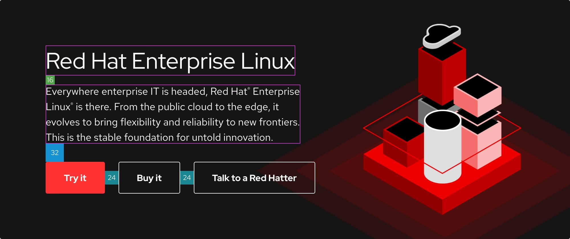
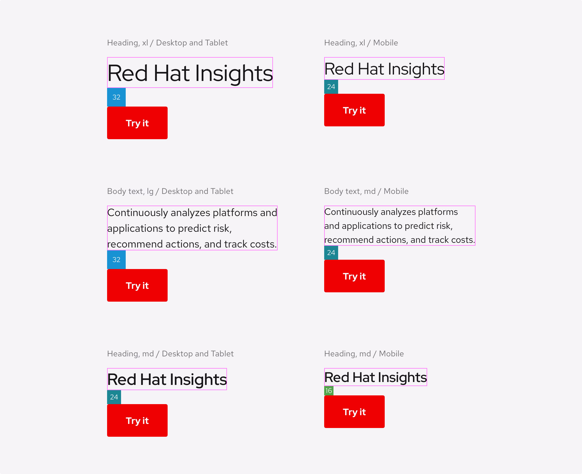
The spacing between Layout titles and headlines as well as Card titles and body copy is always the same at 16px on desktop, tablet, and mobile. It's enough space so that the title can introduce the content underneath.
Spacing guidelines
- The spacing between a Layout title and a headline is 16px on desktop, tablet, and mobile
- The spacing between a Card title and body copy is 16px on desktop, tablet, and mobile

Desktop scale
The columns indicate which spacer to use between headlines and body copy on desktop and tablet devices. To see the exact size values of each text style, visit the Typography page.
| Headline style | Text style | Spacer |
|---|---|---|
| Headline, 2xl | Body copy, lg |  |
| Headline, xl | Body copy, lg | |
| Headline, lg | Body copy, lg |  |
| Headline, md | Body copy, lg | |
| Headline, sm | Body copy, lg | |
| Headline, xs | Body copy, lg | |
Mobile scale
The columns indicate which spacer to use between headlines and body copy on mobile devices. To see the exact size values of each text style, visit the Typography page.
| Headline style | Text style | Spacer |
|---|---|---|
| Headline, xxl | Body copy, md | |
| Headline, xl | Body copy, md | |
| Headline, lg | Body copy, md | |
| Headline, md | Body copy, md | |
| Headline, sm | Body copy, md | |
| Headline, xs | Body copy, md | |
Headlines and Calls to action
The spacing between headlines and Calls to action depends on the point size of the headline
Spacing guidelines
- The spacing between large headlines and Calls to action is 32px on desktop and tablet, and 24px on mobile
- The spacing between small headlines and Calls to action is 24px on desktop and tablet, and 16px on mobile
- The spacing between body copy and Calls to action is 32px on desktop and tablet, and 24px on mobile
Scale
The columns indicate which spacer to use between headlines and Calls to action, depending on the breakpoint. To see the exact size values of each text style, visit the Typography page.
| Text style | Spacer (desktop and tablet) | Spacer (mobile) |
|---|---|---|
| Headline, 2xl |  |
|
| Headline, xl | |
|
| Headline, lg | |
|
| Headline, md | |
|
| Headline, sm | |
|
| Headline, xs | |
|
| Body copy, lg | |
|
| Body copy, md | |
|
Headlines and Buttons
The spacing between headlines and Buttons depends on the point size of the headline.
Spacing guidelines
- The spacing between large headlines and Buttons is 32px on desktop and tablet, and 24px on mobile
- The spacing between small headlines and Buttons is 24px on desktop and tablet, and 16px on mobile
- The spacing between body copy and Buttons is always 24px on desktop, tablet, and mobile

Scale
The columns indicate which spacer to use between headlines and Buttons, depending on the breakpoint. To see the exact size values of each text style, visit the Typography page.
| Headline style | Spacer (desktop and tablet) | Spacer (mobile) |
|---|---|---|
| Headline, 2xl | Do not use | Do not use |
| Headline, xl | Do not use | Do not use |
| Headline, lg | |
|
| Headline, md | |
|
| Headline, sm | |
|
| Headline, xs | |
|
Other examples

Other use cases
If you still have questions about how to use spacers with typography, please contact us or create an issue in our GitHub repo.
Components and patterns
When working in Figma, content is already spaced correctly, so there is no need to guess. Remember to take into account how spacers might change when modifying content inside of a component or pattern.
Responsive design
Figma maintains the space inside of components and patterns even when used on different screen sizes. Spacers used in complex layouts may change values from large to small breakpoints and vice versa, depending on the screen real estate.

Calls to action
Some styles have a 2:1 spacing ratio. That ratio never changes, so do not add more spacing to those styles.
Primary and Secondary styles have a 2:1 spacing ratio, meaning the left and right spacing is fixed at 32px and the top and bottom spacing is fixed at 16px.

The Brick style has a fixed top and bottom spacing of 16px, but the left and right spacing can stretch to fit a certain amount of grid columns.

The Default style needs 8px of spacing between the text and the arrow or icon.

Accordion
An Accordion is a good example of how a component uses spacers to maintain a comfortable balance between text, horizontal rules, icons, and backgrounds.

Tabs
Tabs is another good example of how a component uses spacers to maintain a comfortable balance between lots of elements that are in close proximity to each other. The area below (or to the right) of the component is a large content area layout and therefore should use a large spacer.

Cards
Cards are small layouts that use different spacers depending on their size. As Cards increase or decrease in size, they require more or less spacing on the inside or outside.


Scale
| Breakpoint | Columns | Spacer |
|---|---|---|
| Desktop | 8 or more |  |
| Desktop | 3 – 7 | |
| Tablet | 8 or more | |
| Tablet | 3 – 7 | |
| Mobile | 1 or 2 | |
Other components or patterns
Here’s how spacing is used in other components and patterns.

Other use cases
If you still have questions about how to use spacers with components, please contact us or create an issue in our GitHub repo.
Layout
Layouts require large spacers to create white space and disassociate sections from each other.
Applying spacers
Every layout or section on a page needs enough vertical spacing so that content doesn’t feel too close or crushed. The top and bottom spacing of a layout is 64px by default, but some layouts feature different spacing depending on hierarchy or importance.
Some components like Tabs contain a large spacer because there's a content area layout inside.

Responsive design
When layouts reduce in size, the spacers will also reduce in size to compensate for the loss in screen real estate.
In the desktop breakpoint, the gutters in the grid are spaced 30px apart from each other.

In the tablet, landscape breakpoint, the gutters in the grid are spaced 24px apart from each other.

In the tablet, portrait breakpoint, the gutters in the grid are spaced 18px apart from each other.

In the mobile breakpoint, the gutters in the grid are spaced 16px apart from each other.


Other use cases
If you still have questions about how to use spacers in a layout, please contact us or create an issue in our GitHub repo.
Best practices
Use existing spacers for horizontal and vertical spacing. If a current spacer doesn't meet your needs, submit a request for us to establish new spacers.

Other libraries
To learn more about our other libraries, visit this page.
Feedback
To give feedback about anything on this page, contact us.
Foundations
To learn how to use our other foundations in your designs, visit the foundations section.
