Color Palettes
On this page
Red Hat Design System comes with a contextual color-theming feature based on color schemes (light, dark) and six corresponding color palettes. Designed to respect user's preferences while enabling designer's vision and increasing developers' efficiency, theming with RHDS builds upon state-of-the-art web standards. Authors and developers who adopt the color palette system can quickly produce accessible, branded experiences with less effort and greater cross-property consistency.
Results from Customer Portal
Create, manage, and dynamically scale automation across your entire enterprise.
More cloud choice. Less cloud management.
<div id="elements">
  <rh-disclosure summary="Results from Customer Portal"></rh-disclosure>
  <rh-cta href="#" variant="primary">Get started</rh-cta>
  <rh-audio-player layout="mini"></rh-audio-player>
  <rh-pagination>
    <ol>
      <li><a href="#">1</a></li>
      <li><a href="#2">2</a></li>
      <li><a href="#3">3</a></li>
      <li><a href="#4">4</a></li>
      <li><a href="#5">5</a></li>
    </ol>
  </rh-pagination>
  <rh-card ssr-hint-has-slotted-default="" ssr-hint-has-slotted="footer">
    <p>Create, manage, and dynamically scale automation across your entire enterprise.</p>
    <rh-cta slot="footer" href="#">Get product details</rh-cta>
  </rh-card>
  <p>More cloud choice. Less cloud management.</p>
  <rh-tabs box="box">
    <rh-tab slot="tab" ssr-hint-has-slotted-default="">App development and delivery</rh-tab>
    <rh-tab-panel>App development and delivery content</rh-tab-panel>
    <rh-tab slot="tab" ssr-hint-has-slotted-default="">Modernize existing apps</rh-tab>
    <rh-tab-panel>Modernize existing apps content</rh-tab-panel>
    <rh-tab slot="tab" ssr-hint-has-slotted-default="">AI/ML</rh-tab>
    <rh-tab-panel>AI/ML content</rh-tab-panel>
    <rh-tab slot="tab" ssr-hint-has-slotted-default="">Edge computing</rh-tab>
    <rh-tab-panel>Edge computing content</rh-tab-panel>
  </rh-tabs>
</div>#elements {
min-height: auto;
display: grid;
gap: var(--rh-space-2xl);
grid-template-areas:
'disclosure'
'cta'
'audio-player'
'card'
'pagination'
'p'
'tabs';
grid-template-columns: 1fr;
grid-template-rows: auto;
& rh-card { grid-area: card; }
& rh-cta { grid-area: cta; }
& rh-tabs { grid-area: tabs; }
& rh-disclosure { grid-area: disclosure; }
& rh-audio-player { grid-area: audio-player; }
& rh-pagination {
grid-area: pagination;
&::part(numeric) {
display: none;
}
}
& p { margin: 0; }
& > p {
grid-area: p;
font-size: var(--rh-font-size-body-text-2xl);
font-weight: var(--rh-font-weight-heading-bold);
}
@container (min-width: 768px) {
margin: var(--rh-space-2xl);
grid-template:
'disclosure disclosure '
'cta audio-player'
'pagination card'
'p card'
'tabs tabs' / 1fr 1fr;
grid-template-rows: repeat(5, min-content);
grid-template-columns: 1fr 1fr;
& rh-audio-player {
max-width: 340px;
}
}
@container (min-width: 992px) {
margin: var(--rh-space-2xl);
grid-template:
'disclosure disclosure disclosure'
'cta audio-player card'
'pagination pagination card'
'p p card'
'tabs tabs tabs' / 1fr 1fr 2fr;
grid-template-columns: max-content max-content 3fr;
}
}import '@rhds/elements/rh-audio-player/rh-audio-player.js';
import '@rhds/elements/rh-button/rh-button.js';
import '@rhds/elements/rh-card/rh-card.js';
import '@rhds/elements/rh-cta/rh-cta.js';
import '@rhds/elements/rh-disclosure/rh-disclosure.js';
import '@rhds/elements/rh-pagination/rh-pagination.js';
import '@rhds/elements/rh-tabs/rh-tabs.js';Color palettes in action
Color schemes
Color schemes (previously referred to as backgrounds) are rendering modes
for elements that change their foreground and background colors. There are two
color schemes: light and dark, each corresponding to three of the six color
palettes. Elements which respond to their color scheme by changing their colors
are called color scheme consumers (previously referred to as color context
consumers).
Light Scheme
Corresponding color palettes: light, lighter, lightest.
Dark Scheme
Corresponding color palettes: dark, darker, darkest.
Being aware of which elements are rendering in which color scheme is important to ensure that things like icons, text, and border colors remain legible.
Color palettes
RHDS defines six color palettes
ranging from lightest to darkest, and those are the two palettes you will
use the most for the majority of your projects.
Understanding how color palettes, color schemes, and theming work together is important not only in terms of design guidelines but also for accessibility compliance, and to enable positive experiences for all our users. We've developed our theming system with web standards in mind, and aiming to use CSS over JavaScript as much as possible. The following explains how the theming system works.
RHDS' color palette system is an HTML and CSS system with some supporting JavaScript.
Some design system elements may define their own color palettes. Elements that
have this ability also pass on a specific color scheme to their children, based
on their current color palette. For example <rh-surface>, <rh-card>, and
<rh-accordion> can define their own color palette, while <rh-cta> and
<rh-badge> cannot.
Elements which have this ability are called color scheme providers
(previously referred to as color context providers). They usually implement
a default color palette (e.g. lightest). Color scheme providers must also
possess an optional color-palette attribute. When it is set to one of the six
color palette values, any child elements which consume a background type will
respond to the change. Setting the color-palette attribute will override any
parent's color scheme.
There are six color palettes in RHDS:
Lightest Lighter Light Dark Darker Darkest
Context providers typically use the lightest color palette as the default.
Authors may define the color palette of a container using the color-palette
HTML attribute. So for example, to create a card with the darkest color palette,
use this HTML:
This card uses the default
color palette.
This card uses the author-set
"darkest" color palette.
Copy to Clipboard
Copied!
Toggle line wrap
<rh-card ssr-hint-has-slotted-default="">
  <p>
    This card uses the default
    color palette.
  </p>
</rh-card>

<rh-card color-palette="darkest" ssr-hint-has-slotted-default="">
  <p>
    This card uses the author-set
    "darkest" color palette.
  </p>
</rh-card>
Copy to Clipboard
Copied!
Toggle line wrap
/* Demo CSS only */
rh-card:not(:last-child) {
  margin-block-end: var(--rh-space-xl);
}
Copy to Clipboard
Copied!
Toggle line wrap
Color palettes allow for the creation of different experiences using the same design system. Changing an element's color palette can affect its colors and backgrounds, but usually spacing, typography, layouts, content, and imagery remain the same.
Nested color palettes
Color palette containers can be nested, such that child elements will always
adopt the color theme corresponding to the nearest container's palette.
Extending our card example from above, if you add an
<rh-cta> to the card, it will automatically adopt the dark color theme. The
page author need not and should not customize the CTA's colors.
The outer card and CTA
respond to the theme of their container. On a light container,
the CTA uses the light theme, and dark on dark.
The nested card uses the "darkest" palette.
its CTA is always themed with the "dark" theme, because the card
sets its own palette, rather than responding to it's container's.
Copy to Clipboard
Copied!
Toggle line wrap
<rh-card ssr-hint-has-slotted-default="" ssr-hint-has-slotted="footer">
  <p>
    The outer card <em>and</em> <abbr title="call to action">CTA</abbr>
    respond to the theme of their container. On a light container,
    the CTA uses the light theme, and dark on dark.
  </p>

  <rh-card color-palette="darkest" ssr-hint-has-slotted-default="" ssr-hint-has-slotted="footer">
    <p>
      The nested card uses the "darkest" palette.
      its CTA is always themed with the "dark" theme, because the card
      sets its own palette, rather than responding to it's container's.
    </p>
    <rh-cta slot="footer">Nice!</rh-cta>
  </rh-card>

  <rh-cta slot="footer">Fine!</rh-cta>
</rh-card>
Copy to Clipboard
Copied!
Toggle line wrap
Copy to Clipboard
Copied!
Toggle line wrap
To summarize: color providers can adopt one of six palettes, three dark and three light, and setting a color palette also sets the color scheme for its descendants, overriding any user preferences.
Combination elements
Some elements are both providers and consumers. Card, for example is both a provider and a consumer. It accepts the color scheme of its parent elements, or it can set its own color palette, and inherit that scheme to it's child elements.
Because this card does not set it's This card, by contrast, sets it's Consumer
color-palette attribute,
it acts as a consumer. It will always receive its parent's color scheme.Provider
color-palette, so it acts
as a provider. Try changing this card's color-palette using
the controls below, and see how it affects this card's children.
Copy to Clipboard
Copied!
Toggle line wrap
<rh-card ssr-hint-has-slotted-default="" ssr-hint-has-slotted="header,footer">
  <h2 slot="header">Consumer</h2>
  <rh-tag slot="header" icon="info" color="purple" ssr-hint-has-slotted-default="">passive</rh-tag>
  <p>Because this card does not set it's <code>color-palette</code> attribute,
    it acts as a consumer. It will always receive its parent's color scheme.</p>
  <rh-cta slot="footer" href="/elements/card/">Read card docs</rh-cta>
</rh-card>

<rh-card id="provider-card" color-palette="lightest" ssr-hint-has-slotted-default="" ssr-hint-has-slotted="header,footer">
  <h2 slot="header">Provider</h2>
  <rh-tag slot="header" icon="info" color="green" ssr-hint-has-slotted-default="">active</rh-tag>
  <p>This card, by contrast, sets it's <code>color-palette</code>, so it acts
    as a provider. Try changing this card's <code>color-palette</code> using
    the controls below, and see how it affects this card's children.
  </p>
  <rh-cta slot="footer" href="/elements/call-to-action/">Read CTA docs</rh-cta>
  <label slot="footer" for="provider-picker">
    Set this card's color palette.
    <rh-context-picker id="provider-picker" target="provider-card" allow="darkest, lighter, lightest" value="lightest"></rh-context-picker>
  </label>
</rh-card>
Copy to Clipboard
Copied!
Toggle line wrap
rh-card:first-of-type {
  margin-block-end: var(--rh-space-xl);
}
label[slot="footer"] {
  margin-inline-start: auto;
  display: flex;
  align-items: center;
  gap: var(--rh-space-md);
}
Copy to Clipboard
Copied!
Toggle line wrap
Theming
Page authors do not need to and should not directly customize the colors of consumer elements, but instead should set custom values for theme tokens.
.custom-theme-card {
  --rh-color-interactive-primary-default-on-light: var(--my-theme-darkblue);
  --rh-color-interactive-primary-default-on-dark: var(--my-theme-lightblue);
}
Customize theming tokens for themed containers
.custom-cta {
  color: var(--my-theme-darkblue);
}
Avoid customizing element CSS directly
See the customizing page for a more detailed example.
Choosing a color palette
How you choose a color palette is based on content, user experience, and accessibility needs.
Lightest color palette
The lightest color palette is the default and has lots of use cases.
Darkest color palette
The darkest color palette can be used for highlighting content with dark colors or if a brighter interface would otherwise disrupt the user experience. Most light elements and patterns have dark counterparts.
Brand red and accessibility
Do not apply the Red Hat red color to text in dark environments unless it meets WCAG 2.2 AA requirements.
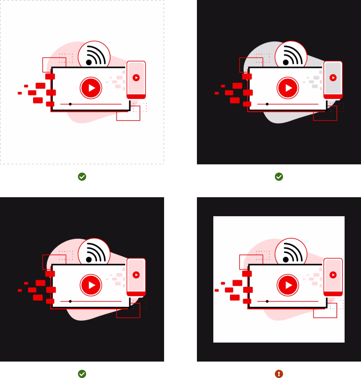
Illustrations and imagery
Illustrations and imagery should align to the color palette. The light color palette should feature imagery with light colors and vice versa. Imagery with high contrast is only acceptable if it has a transparent background. If you cannot find color-palette-specific imagery, contact the Brand team. Developers have a number of art-direction techniques at their disposal for creating themable, responsive graphics.
Other libraries
To learn more about our other libraries, visit this page.
Feedback
To give feedback about anything on this page, contact us.
Other libraries
To learn more about our other libraries, visit the getting started page.
