Table
On this page
Markup Guidance
Warning
Tables are strictly intended for tabular data, and should never be used for layout purposes.
Since tables are inherently complex HTML structures, they can create barriers for users and assistive technologies (View WCAG guidelines) if their markup does not clearly define the relationships within the tabular data. Therefore, it is essential for tables to contain as much context as possible through the application of appropriate structural markup.
Minimum requirements
- Column titles (or headers) must use
<th>elements withscope="col"attributes (WCAG technique H63) - Row titles (or headers) must use
<th>elements withscope="row"attributes (WCAG technique H63) - Add a
<caption>element to title a table and help users identify its purpose (WCAG technique H39)
Further guidance
- Use
idandheadersattributes to associate data cells with their table headers in complex tables (WCAG technique H43) - Define sections with
<thead>and<tbody>(and optionally<tfoot>for larger tables)
Example markup
<rh-table>
  <table>
    <caption>
      Concerts
    </caption>
    <colgroup>
      <col>
      <col>
      <col>
    </colgroup>
    <thead>
      <tr>
        <th id="concerts-date" scope="col">Date</th>
        <th id="concerts-event" scope="col">Event</th>
        <th id="concerts-venue" scope="col">Venue</th>
      </tr>
    </thead>
    <tbody>
      <tr>
        <td headers="concerts-date">12 February</td>
        <td headers="concerts-event">Waltz with Strauss</td>
        <td headers="concerts-venue">Main Hall</td>
      </tr>
      <tr>
        <td headers="concerts-date">24 March</td>
        <td headers="concerts-event">The Obelisks</td>
        <td headers="concerts-venue">West Wing</td>
      </tr>
      <tr>
        <td headers="concerts-date">14 April</td>
        <td headers="concerts-event">The What</td>
        <td headers="concerts-venue">Main Hall</td>
      </tr>
    </tbody>
  </table>
</rh-table>
Keyboard interactions
If a table is in a container that can receive keyboard focus (e.g., with a tabindex="0" attribute), then a user can place focus on the container and scroll the table horizontally or vertically using the arrow keys.
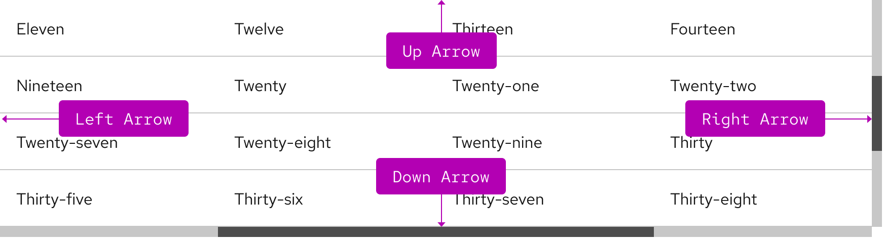
| Key | Result |
|---|---|
| Up Arrow | Moves the table view up |
| Left Arrow | Moves the table view left |
| Right Arrow | Moves the table view right |
| Down Arrow | Moves the table view down |
| Tab | Moves focus to next interactive element within a cell or outside of the table |
| Shift+Tab | Moves focus to previous interactive element within a cell or outside of the table |
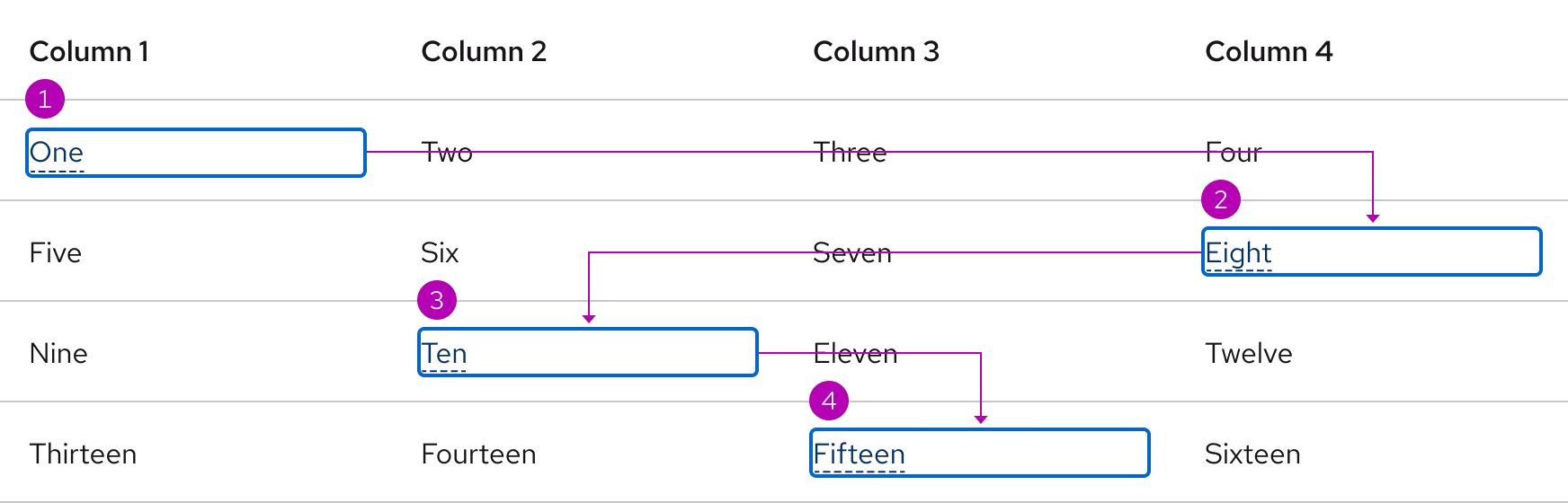
Focus order
A logical focus order helps keyboard users operate our websites and apps. Elements need to receive focus in an order that preserves meaning, therefore the focus order should make sense and not jump around randomly. Focus within a table moves from top to bottom and left to right.
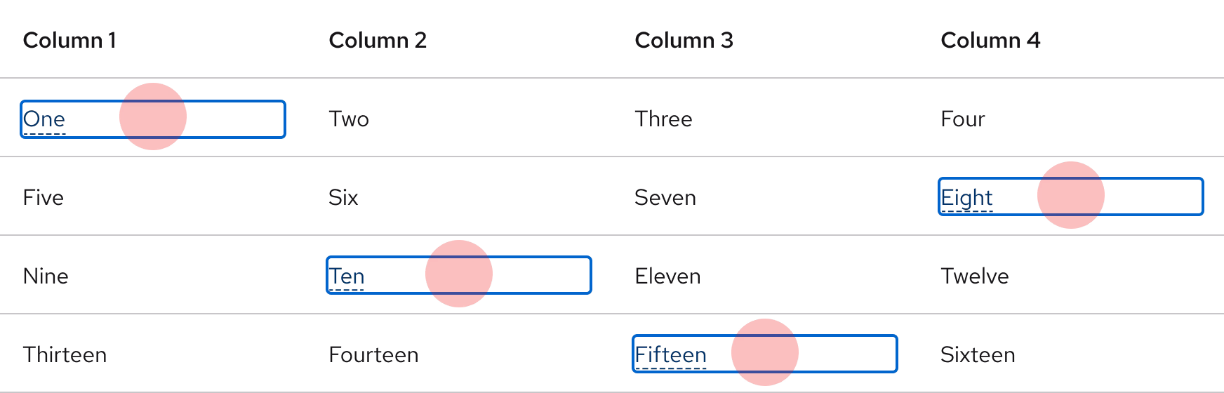
Touch targets
Each cell includes enough spacing for selecting interactive elements.
Additional guidelines
- No column title (or header) cells should be blank
- Each cell should only have one piece of data
- Avoid merged cells. When possible consider breaking a complex table into a series of simpler tables
- Do not place multiple inactive elements in a single cell
ARIA Authoring Practices Guide (APG)
Learn to use the accessibility semantics defined by the Accessible Rich Internet Application (ARIA) specification to create accessible web experiences.
Web Content Accessibility Guidelines
Automated testing
Some of our elements may receive errors or warnings that are false positives from automated testing tools. If you are experiencing some of these issues, please read our update on false positives in automated tools.
Understanding documents provide detailed explanations for Web Content Accessibility Guidelines (WCAG) guidelines and success criteria.
-
SC 1.3.1 Info and relationships (Level A)
-
SC 2.1.1 Keyboard (Level A)
-
SC 2.1.3 Keyboard (no exception) (Level AAA)
-
SC 2.4.3 Focus order (Level A)
-
SC 2.5.5 Target size (Level AAA)
Other libraries
To learn more about our other libraries, visit this page.
Feedback
To give feedback about anything on this page, contact us.
