Skip to main content Home About the Design SystemRoadmap OverviewDesignersDevelopers OverviewColorGridIconographyInteractionsSpacingTypography Overview Global colorBox shadowTypographyBorderOpacitySpaceLengthIconBreakpointsMedia queries All elements Accordion Alert Announcement Audio player Avatar Back to top Badge Blockquote Breadcrumb Button group Button Card Chip Code block Call to action Dialog Disclosure Footer Health index Icon Jump links Menu dropdown Navigation link Navigation (primary) Navigation (secondary) Navigation (vertical) Pagination PopoverPlanned Progress stepper Readtime Scheme dropdown Scheme toggle Select Site status Skeleton Skip link Spinner Statistic Subnavigation Surface Switch Table Tabs Tag Tile Timestamp Tooltip Video embed How to useProject FeltColor PalettesCustomizingDevelopers All PatternsAccordionAlertCall to ActionCardFilterFormLink with iconLogo wallSearch barSticky bannerSticky cardTabsTagTile AI design principlesLegal requirementsTransparency noticesIconographyColorChatbot avatarsAnimation All Personalization PatternsAnnouncement FundamentalsColorAccessibility toolsAssistive technologiesCI/CDContentContributorsDesignDevelopmentManual testingResourcesScreen readers Design/code status Release notes Get support

Scheme dropdown Since v4.2.0

OverviewStyleGuidelinesCodeAccessibilityDemos
UsageLayoutBehaviorBest practicesUsageLayoutBehaviorBest practices

Usage

Use a scheme dropdown to quickly switch between color schemes.

Layout

Placement

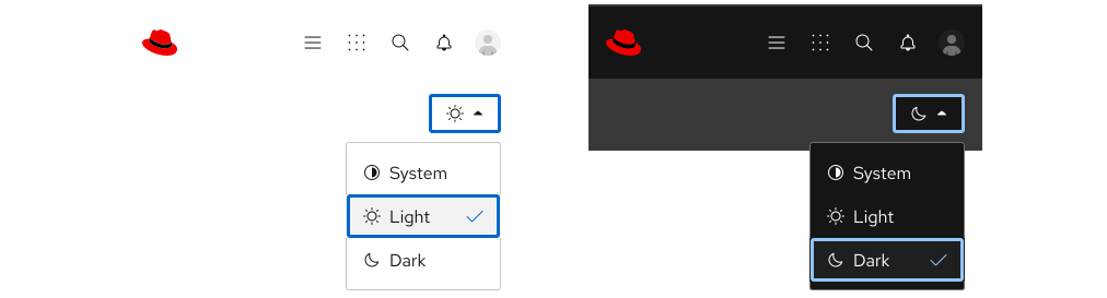
A scheme dropdown can change the look of a page or interface in one click, so it should be placed somewhere highly-visible. It is also recommended to place a scheme dropdown in an element or pattern that scrolls with the user, so they always have access to it.
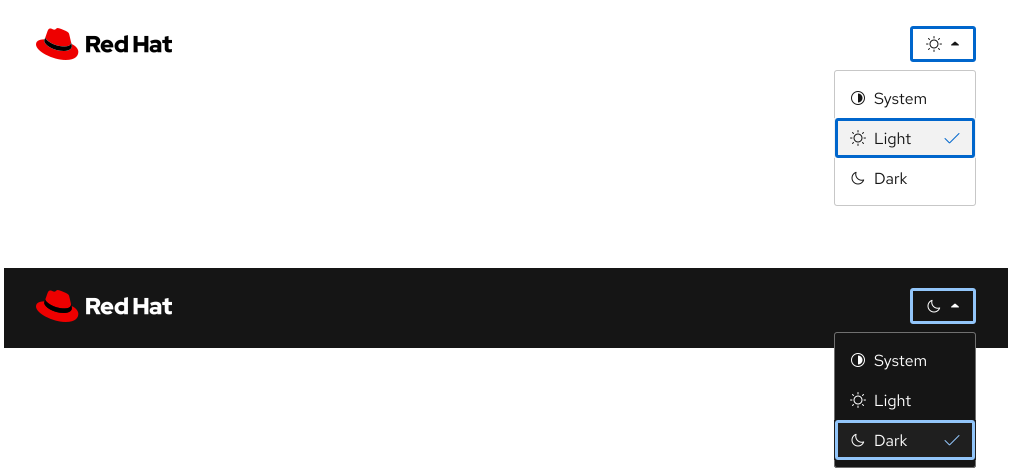
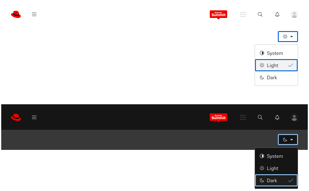
Two expanded scheme dropdowns in a main navigation, right aligned on light and dark color schemes Two expanded scheme dropdowns on light and dark color schemes in a bar below a main navigation Two expanded scheme dropdowns on light and dark color schemes in a bar below a main navigation but shown in a mobile viewport

Behavior

Light and dark color schemes

When users interact with either light or dark color schemes, the following should happen:

  • Available color schemes are displayed
  • The color scheme changes immediately (if the color scheme that is being toggled is different)
  • Their selected color scheme is saved so it persists across browser sessions
  • Their saved preference is restored on page load

System default color scheme

When users select the System default color scheme, the following should happen:

  • The browser or operating system determines the appropriate color scheme
  • The color scheme updates automatically if system preferences change

Best practices

Other icons
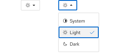
A collapsed and expanded scheme dropdown showing the default included icons

Maintain the same icons that are included.
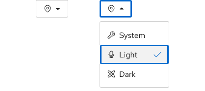
A collapsed and expanded scheme dropdown showing a location icon for the currently selected item, then a microphone, atom symbol, and wrench for the various options.

Do not change the icons, it will cause confusion about what will happen when each color scheme is selected.

© 2026 Red Hat Deploys by Netlify