
Skip to main content Home About the Design SystemRoadmap OverviewDesignersDevelopers OverviewColorGridIconographyInteractionsSpacingTypography Overview Global colorBox shadowTypographyBorderOpacitySpaceLengthIconBreakpointsMedia queries All elements Accordion Alert Announcement Audio player Avatar Back to top Badge Blockquote Breadcrumb Button group Button Card Chip Code block Call to action Dialog Disclosure Footer Health index Icon Jump links Menu dropdown Navigation link Navigation (primary) Navigation (secondary) Navigation (vertical) Pagination PopoverPlanned Progress stepper Readtime Scheme dropdown Scheme toggle Select Site status Skeleton Skip link Spinner Statistic Subnavigation Surface Switch Table Tabs Tag Tile Timestamp Tooltip Video embed How to useProject FeltColor PalettesCustomizingDevelopers All PatternsAccordionAlertCall to ActionCardFilterFormLink with iconLogo wallSearch barSticky bannerSticky cardTabsTagTile AI design principlesLegal requirementsTransparency noticesIconographyColorChatbot avatarsAnimation All Personalization PatternsAnnouncement FundamentalsColorAccessibility toolsAssistive technologiesCI/CDContentContributorsDesignDevelopmentManual testingResourcesScreen readers Design/code status Release notes Get support

Scheme dropdown Since v4.2.0

OverviewStyleGuidelinesCodeAccessibilityDemos
Screen reader guidelinesKeyboard navigationFocus orderTouch targetsARIA Authoring Practices Guide (APG)Web Content Accessibility GuidelinesScreen reader guidelinesKeyboard navigationFocus orderTouch targetsARIA Authoring Practices Guide (APG)Web Content Accessibility Guidelines

Screen reader guidelines

A scheme dropdown should communicate the following clearly to assistive technology:
Parameter Details
Semantic Structure
  • Uses the browser native custom <select>
  • Option elements provide standard form control semantics
  • Each selected option has visually-hidden text to convey meaning
  • Includes a visually-hidden <label> element that labels the <select>
Information conveyed
  • The purpose of the control (color scheme selection)
  • Available options (light, dark, and system default)
  • Current selection state
  • Changes when selection is made
Implementation details
  • Icons in the dropdown are hidden in lieu of visible text in the <option>

Keyboard navigation

Users should have the ability to move focus to each color scheme button using a keyboard.
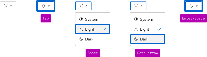
A diagram showing a blue focus ring when tabbing to the control, then the focus ring after hitting arrow keys, and what the control looks like after hitting Enter or Space. See table below for more information.
Key Result
Tab Moves focus to the menu dropdown
Space/Down arrow Expands the menu
Down arrow Selects the next color scheme, but does not switch
Up arrow Selects the previous color scheme, but does not switch
Enter/Space Switches the color scheme
Esc/Tab Closes the dropdown without changing the current selection

Focus order

The scheme dropdown receives focus first. When the menu is expanded, up and down arrow keys select between the other color schemes.
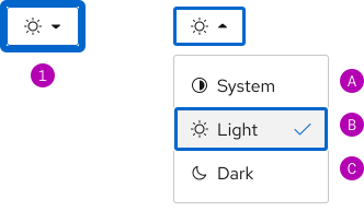
A collapsed and expanded scheme dropdown. Users tab to focus the control, then use their arrow keys to focus individual options.

Touch targets

All interactive elements meet minimum touch target requirements.
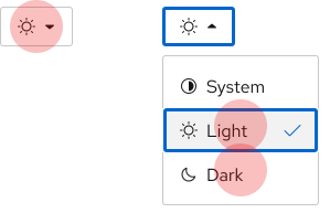
A collapsed and expanded scheme dropdown with touch targets over the center of the control and each item in the control.

ARIA Authoring Practices Guide (APG)

Learn to use the accessibility semantics defined by the Accessible Rich Internet Application (ARIA) specification to create accessible web experiences.

View APG resources

Web Content Accessibility Guidelines

Automated testing

Some of our elements may receive errors or warnings that are false positives from automated testing tools. If you are experiencing some of these issues, please read our update on false positives in automated tools.

Understanding documents provide detailed explanations for Web Content Accessibility Guidelines (WCAG) guidelines and success criteria.

© 2026 Red Hat Deploys by Netlify
