Button
On this page
Style
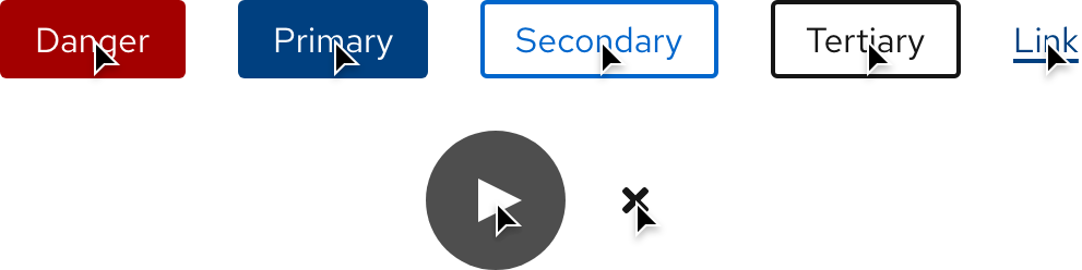
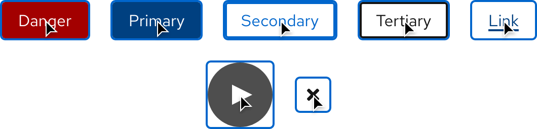
A button is clickable text or an icon that triggers an action on the page or in the background. Depending on the action, content, and hierarchy, a button can be used on its own or grouped with other buttons.
Anatomy
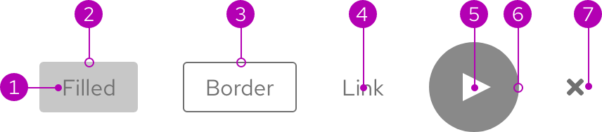
- Text
- Container
- Border
- Text only
- Icon
- Icon background
- Icon only
Color scheme
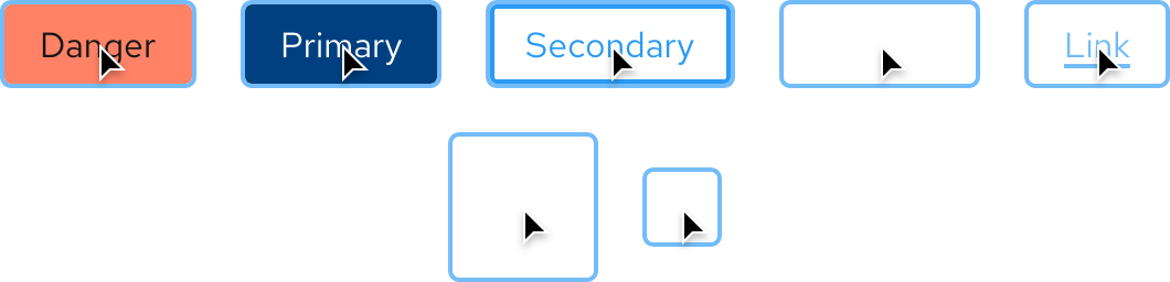
Buttons are available for both light and dark color schemes.
Light and dark themes
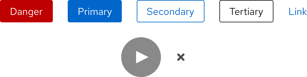
| Property | Light theme | Dark theme |
|---|---|---|
| Color - Danger button text | #FFFFFF |
#151515 |
| Color - Danger button surface | #C9190B |
#FF542E |
| Color - Primary button text | #FFFFFF |
#FFFFFF |
| Color - Primary button surface | #0066CC |
#0066CC |
| Color - Secondary button text and border | #0066CC |
#2B9AF3 |
| Border width - Secondary button | 1px |
1px |
| Color - Tertiary button text and border | #151515 |
#FFFFFF |
| Border width - Tertiary button | 1px |
1px |
| Color - Link button text | #0066CC |
#2B9AF3 |
| Color - Play button background | #151515 |
#FFFFFF |
| Opacity - Play button background | 50% |
25% |
| Color - Close button | #4D4D4D |
#C7C7C7 |
Configuration
All buttons with a container have the same height and border radius, but the width varies based on the amount of content. Buttons in a row are all horizontally centered. When a Play button is placed on an image, it is both horizontally and vertically centered and stays the same size no matter how big or small the image gets.
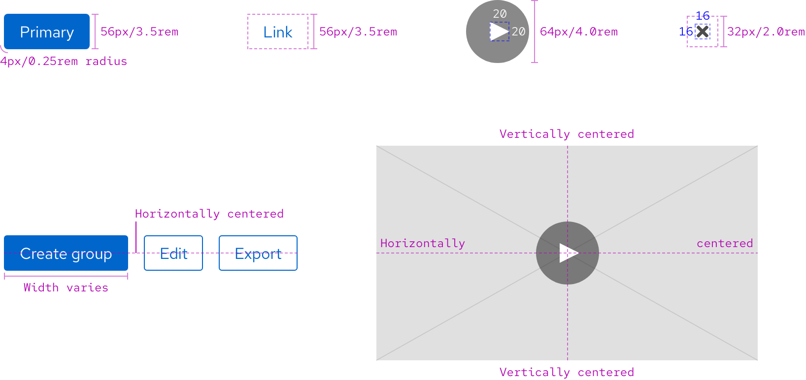
Space
Space values are the same on all breakpoints for the following buttons. To see space values when buttons are grouped, go to the Guidelines page.
Helpful tip
Buttons include a custom 6px spacer, do not use it anywhere else.

Example
Token
Description
sm
6px spacer
md
8px spacer
lg
16px spacer
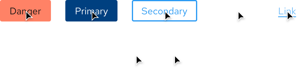
Interaction states
Interaction states are visual representations used to communicate the status of an element or pattern.
Hover
| Property | Light theme | Dark theme |
|---|---|---|
| Color - Danger button surface | #A30000 |
#FF8266 |
| Color - Primary button surface | #004080 |
#004080 |
| Border width - Secondary button | 2px |
2px |
| Border width - Tertiary button | 2px |
2px |
| Color - Link button text | #004080 |
#73BCF7 |
| Text decoration - Link button text | Underline |
Underline |
| Opacity - Play button background | 75% |
50% |
| Color - Close button | #151515 |
#FFFFFF |
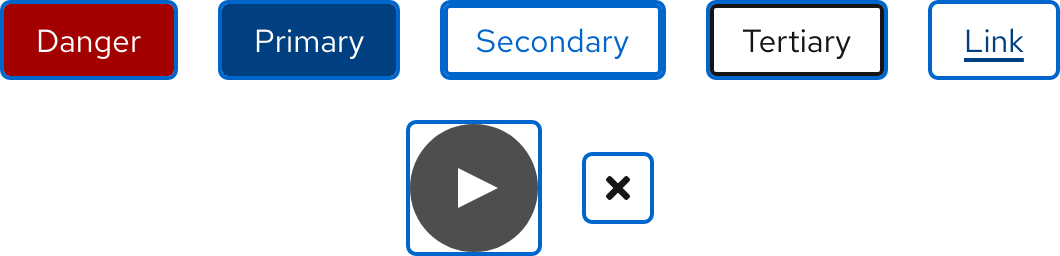
Focus
Helpful tip
The Focus state has the same styles as the Hover state.
| Property | Light theme | Dark theme |
|---|---|---|
| Color - focus ring | #0066CC |
#73BCF7 |
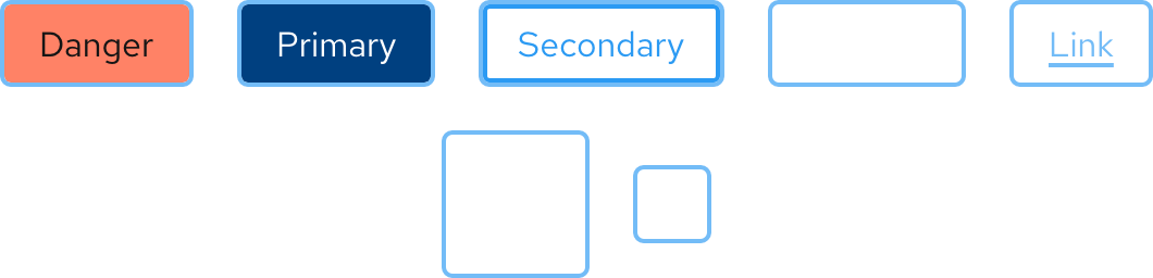
Active
Helpful tip
The Active state has the same styles as the Hover state.
| Property | Light theme | Dark theme |
|---|---|---|
| Color - focus ring | #0066CC |
#73BCF7 |
Other libraries
To learn more about our other libraries, visit this page.
Feedback
To give feedback about anything on this page, contact us.
