Button
On this page
Usage
Use buttons to communicate and trigger actions like submitting a form, canceling a process, or creating a new object.
When to use a button
Use buttons to communicate actions users can take. Each page should have only one Primary button and any remaining buttons should be represented as lower emphasis.
Button vs. call to action
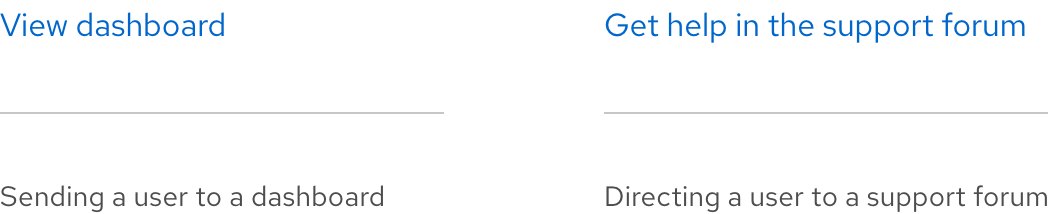
Do not use buttons as navigational elements. Instead, use a link or call to action when the desired action is to take users to a new page. Consider using a checkbox, switch, or control when you need to capture two togglable states.
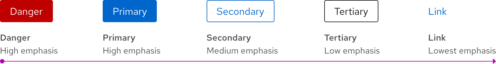
Variants
Each button has a specific function and the design of each variant signals that function to users. Therefore, it is important that each variant is implemented consistently so they communicate the correct actions.
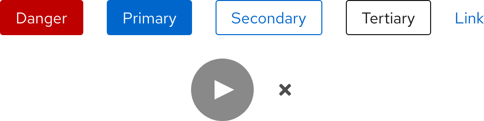
| Variant | Use case |
|---|---|
| Danger | The most prominent of all the button options. Use them for actions that are potentially destructive like deleting or removing data. These are mostly found in dialogs to emphasize a destructive action. |
| Primary | The most prominent button, use them for the most important action on a page. Try to limit their usage to one per page. |
| Secondary | Buttons with less visual prominence than Primary buttons. Use them for general actions that do not require as much emphasis as Primary button actions. |
| Tertiary | Buttons with the least visual prominence. Use them to be less striking while still retaining a classic button format. Tertiary buttons are flexible and can be used as needed. |
| Link | Labeled buttons with no background or border. Use them with an icon on the left or right of text to further emphasize an action or to create greater visual hierarchy between two buttons. |
| Play | Use on top of images or near text to play audio or video. |
| Close | Use to close a window. |
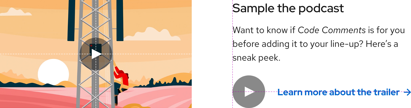
Play button
Use a Play button to indicate that audio or video will play when selected.
Helpful tip
The Play button is both horizontally and vertically centered when placed on an image or photo.
Close button
Use a Close button to indicate that a window will close when selected. Close buttons are mostly found in dialogs.
Other icons
When adding icons, prefer to use the microns as they fit the button layout better.
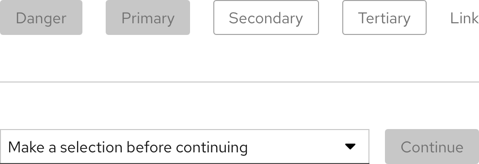
Disabled
To indicate that an action is currently unavailable or if a task needs to be completed first, most buttons can become disabled. However, the Play and Close buttons do not include a disabled state.
Writing content
Button text labels
Button text labels express what action will occur when users interact with it. When writing button labels, be specific and clearly communicate the action by doing the following:
- Make sure button text is unique and easily understood for when screen readers announce button text to users
- Use simple verbs or verb phrases
- Aim for short labels when possible
- Try not to use articles (for example, write Add source instead of Add a source)
- Do not use punctuation
- Use an icon within a button to add attention or clarify the action
- Do not create icons within buttons by using typed symbols (for example, a plus)
Link button text labels
When writing link button text labels, use specific and action-focused language that matches what users will see when they arrive at their location.
Button vs. call to action text labels
Button text labels are written to be short and communicate an action whereas call to action text labels are written to entice users to select a link.

Character and word count
| Element | Character count | Word count |
|---|---|---|
| Button text labels | 30 | 3 |
| Link text labels | 45 | 10 |
Layout
Placement
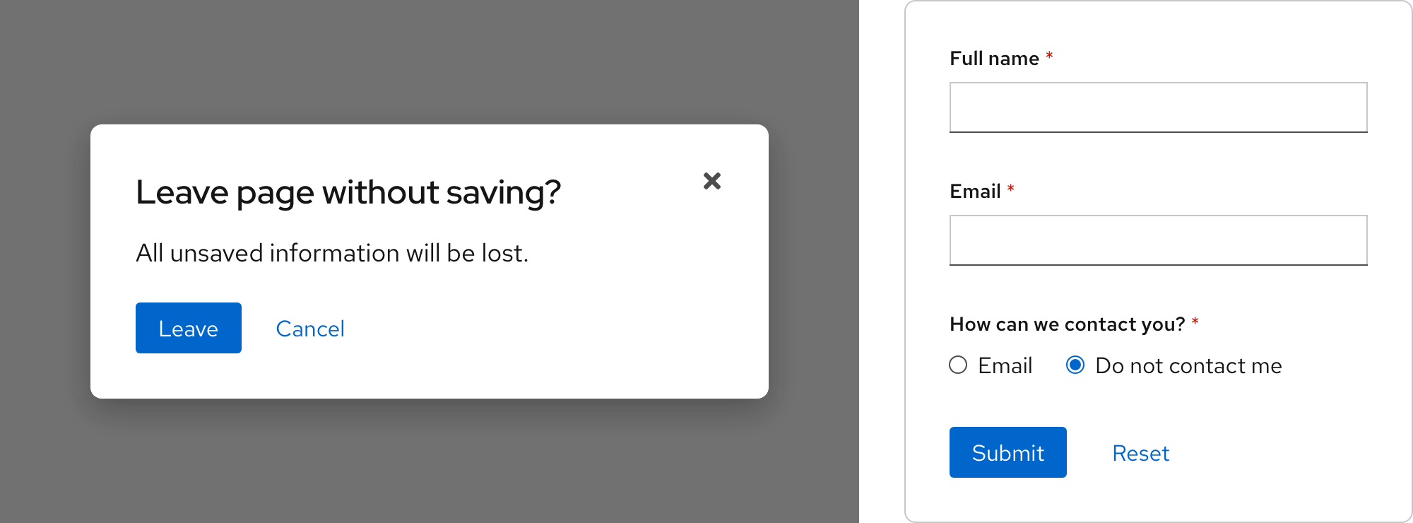
Buttons in dialogs, forms, etc. should always be left aligned in the container. This solves for the following:
- Modularity and flexibility - a standard alignment creates consistency in how objects appear
- Accessibility - buttons in a form are on the same scan line as the fields which benefits low vision users Users who are blind can easily navigate form submit buttons because the order is consistent across all contexts
- Responsiveness - the most important actions are encountered first when elements are stacked vertically
Hierarchy
Buttons are ordered by hierarchy from left to right. Do not use multiple Danger, Primary, or Close buttons in the same area.
Grouping
Grouping buttons is a useful way of aligning buttons that have a relationship. Group buttons logically into sets based on hierarchy and usage.
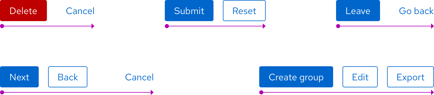
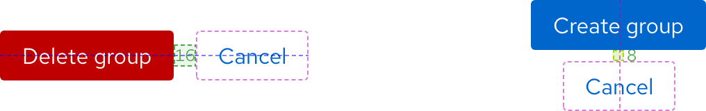
Space in groups
The standard spacing between each button is --rh-space-lg, even for Danger
buttons. If buttons are stacked vertically, the spacing between each button should be
--rh-space-md.
Best practices
Lines of text

Keep the button’s text on one line.

Do not use more than one line of text.
Variants in button groups

Use one primary or primary danger button per button group.

Do not use multiple primary or primary danger buttons in the same button group.
Text labels

Label buttons clearly and succinctly.

Do not write button text labels that are expressive or ambiguous.
Danger button

Use a danger button for destructive actions only.

Do not use a danger button for non-destructive actions.
Buttons vs. calls to action

Use buttons for actions, and retain the primary button styling to make them look different from calls to action.

Do not use buttons as links or change the style of a primary button to look more like a call to action.
Button icons
Use only one icon in a button.
Do not use more than one icon in a button.
Other libraries
To learn more about our other libraries, visit this page.
Feedback
To give feedback about anything on this page, contact us.
