Button
On this page
Implementation
- Ensure a button can be navigated to and interacted with via keyboard and other assistive technologies
- Provide unique and descriptive text content for a button or an aria-label if the button does not contain visible text
- Provide context that a link will open in a new tab or window when using a button link
- Do not place other interactive elements within a button
Keyboard interactions
Users should have the ability to navigate to and interact with buttons using their keyboard.
| Key | Result |
|---|---|
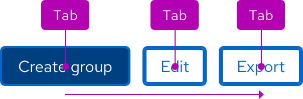
| Tab | Moves focus to the next button or interactive element |
| Shift + Tab | Moves focus to the previous button or interactive element |
| Enter | Activates an action |
Focus order
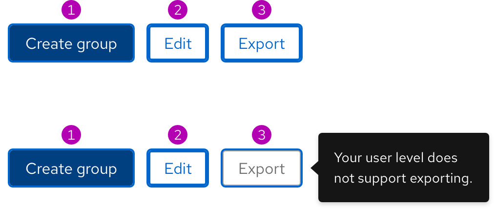
A logical focus order helps keyboard users operate our websites. Elements need to receive focus in an order that preserves meaning, therefore the focus order should make sense and not jump around randomly. For buttons in groups, the focus order is from left to right and top to bottom when stacked. Disabled buttons are not included in the focus order unless they include the aria-disabled=“true” attribute and display a tooltip when focused.
Touch targets
Buttons in groups are adequately spaced for optimal touch targets.
Screen reader guidelines
Buttons should communicate the following to users:
- Their intended purpose or function
- The toggle state if it has two states
- An instruction that a menu will open
ARIA Authoring Practices Guide (APG)
Learn to use the accessibility semantics defined by the Accessible Rich Internet Application (ARIA) specification to create accessible web experiences.
Web Content Accessibility Guidelines
Automated testing
Some of our elements may receive errors or warnings that are false positives from automated testing tools. If you are experiencing some of these issues, please read our update on false positives in automated tools.
Understanding documents provide detailed explanations for Web Content Accessibility Guidelines (WCAG) guidelines and success criteria.
-
SC 2.1.1 Keyboard (Level A)
-
SC 2.1.3 Keyboard (no exception) (Level AAA)
-
SC 2.4.3 Focus order (Level A)
-
SC 2.5.5 Target size (Level AAA)
Other libraries
To learn more about our other libraries, visit this page.
Feedback
To give feedback about anything on this page, contact us.
