Tile
On this page
Style
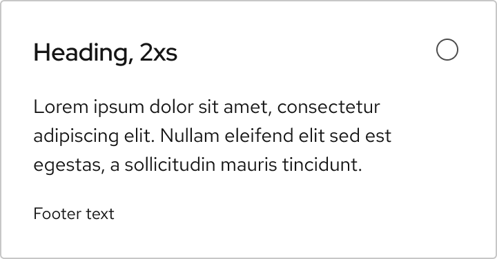
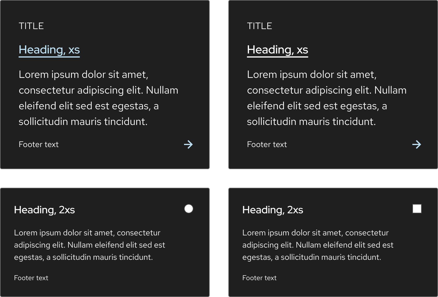
A tile is available as a Link tile or Selectable tile. A link tile has two sizes and heading color options; the blue arrow in the bottom right corner helps distinguish it from card. A selectable tile has a consistent style for both the checkbox and radio button variants.
Anatomy
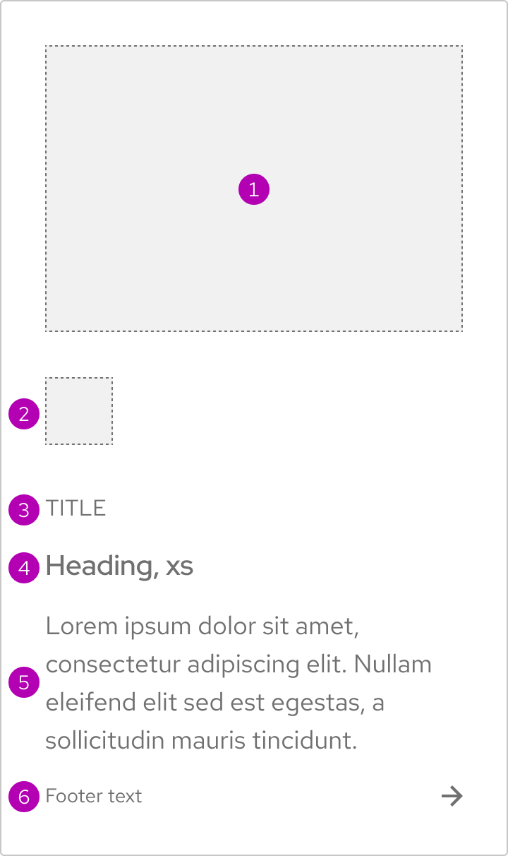
- Image
- Icon
- Title
- Heading
- Body text
- Footer

- Heading
- Form input (checkbox or radio button)
- Body text
- Footer
Sizes
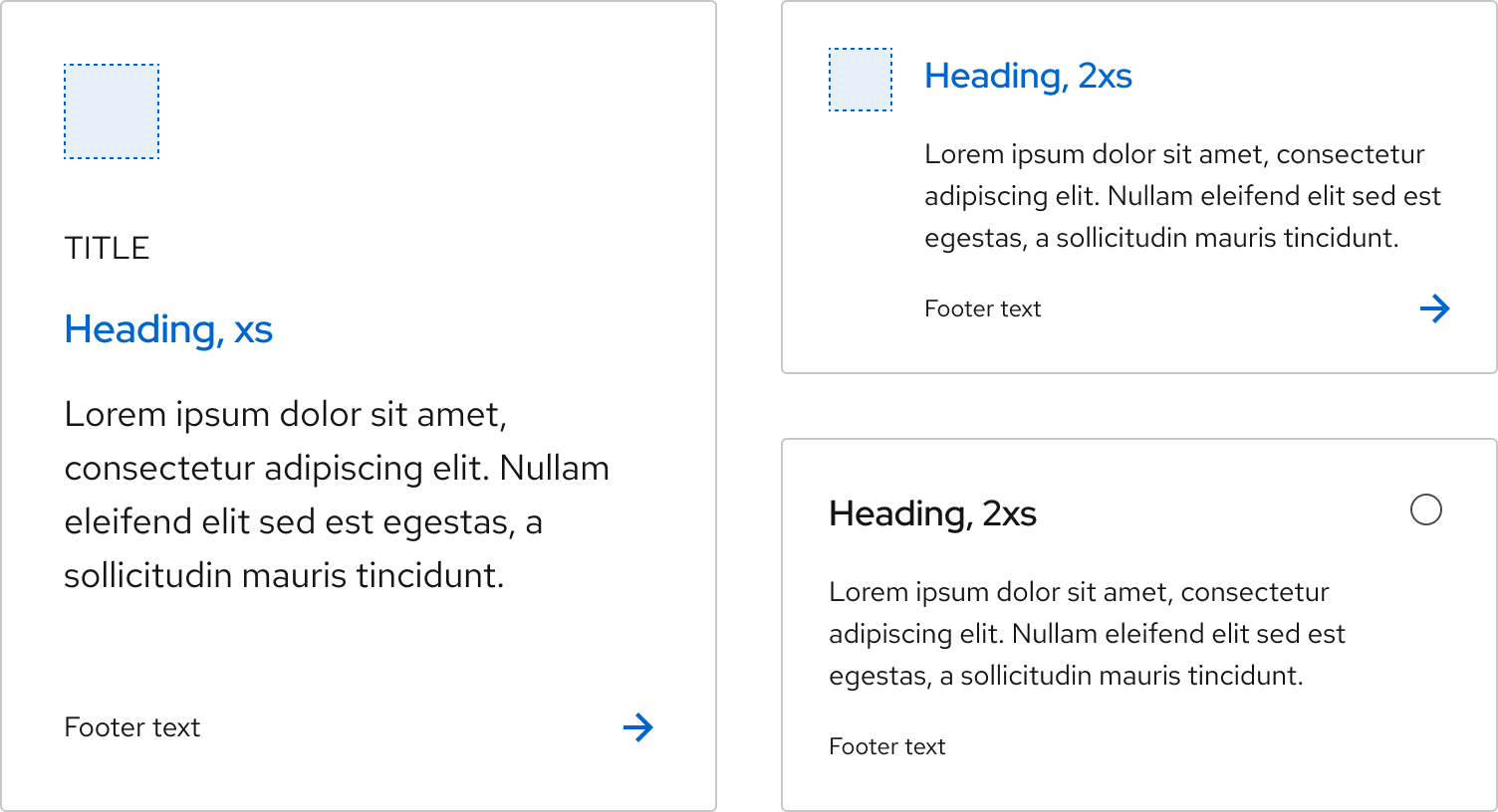
A link tile is available in Default and Compact sizes. A selectable tile has only one size which is based on the size of a compact tile.
Color scheme
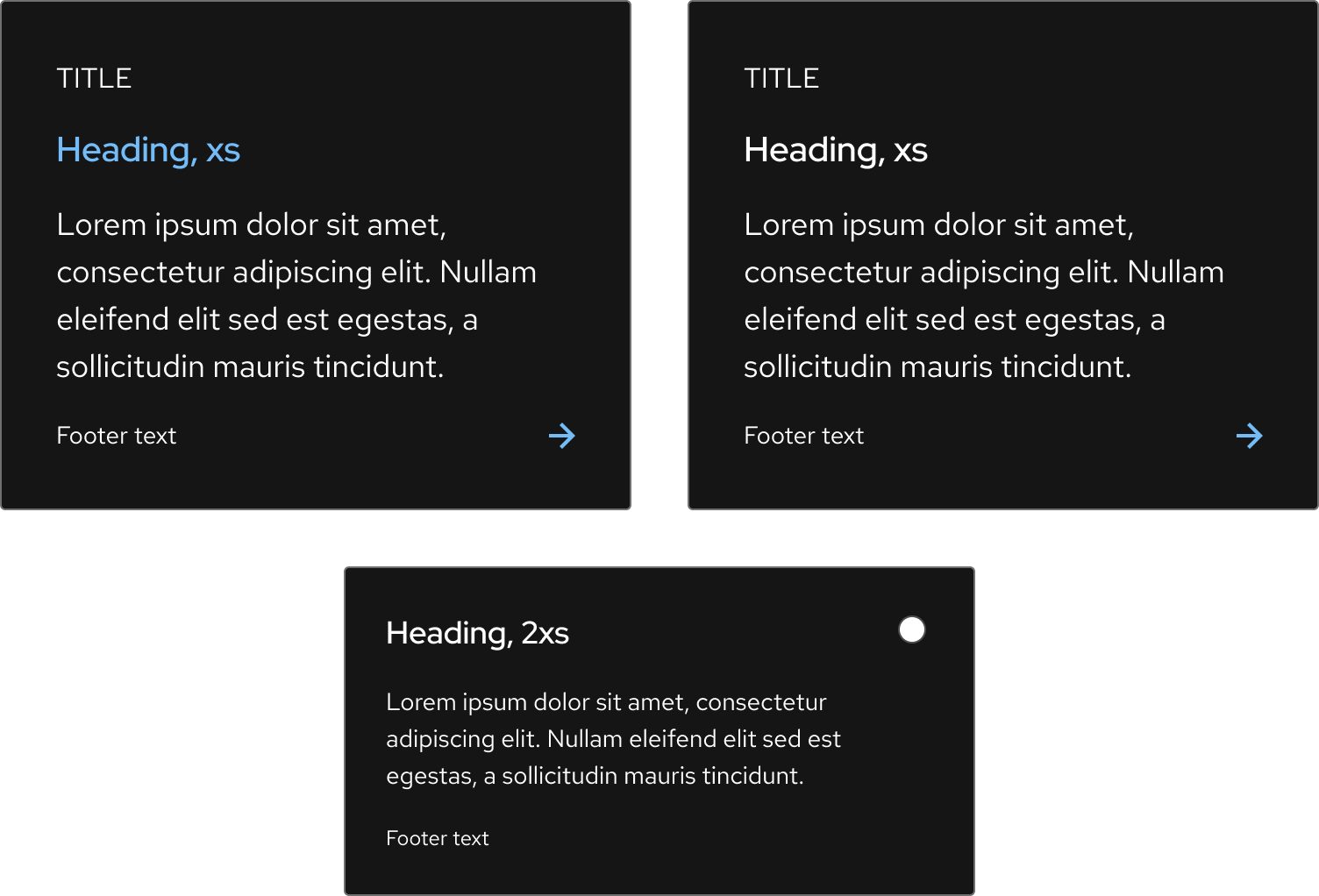
Both the link tile and the selectable tile are available for dark and light schemes.


Heading color
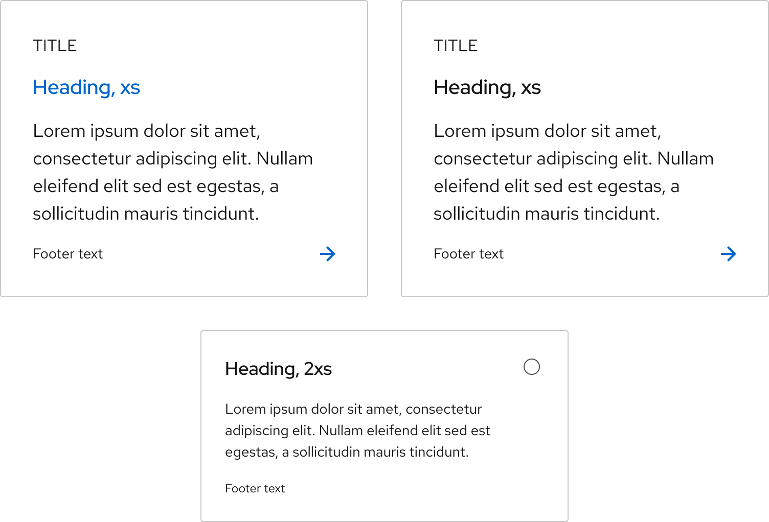
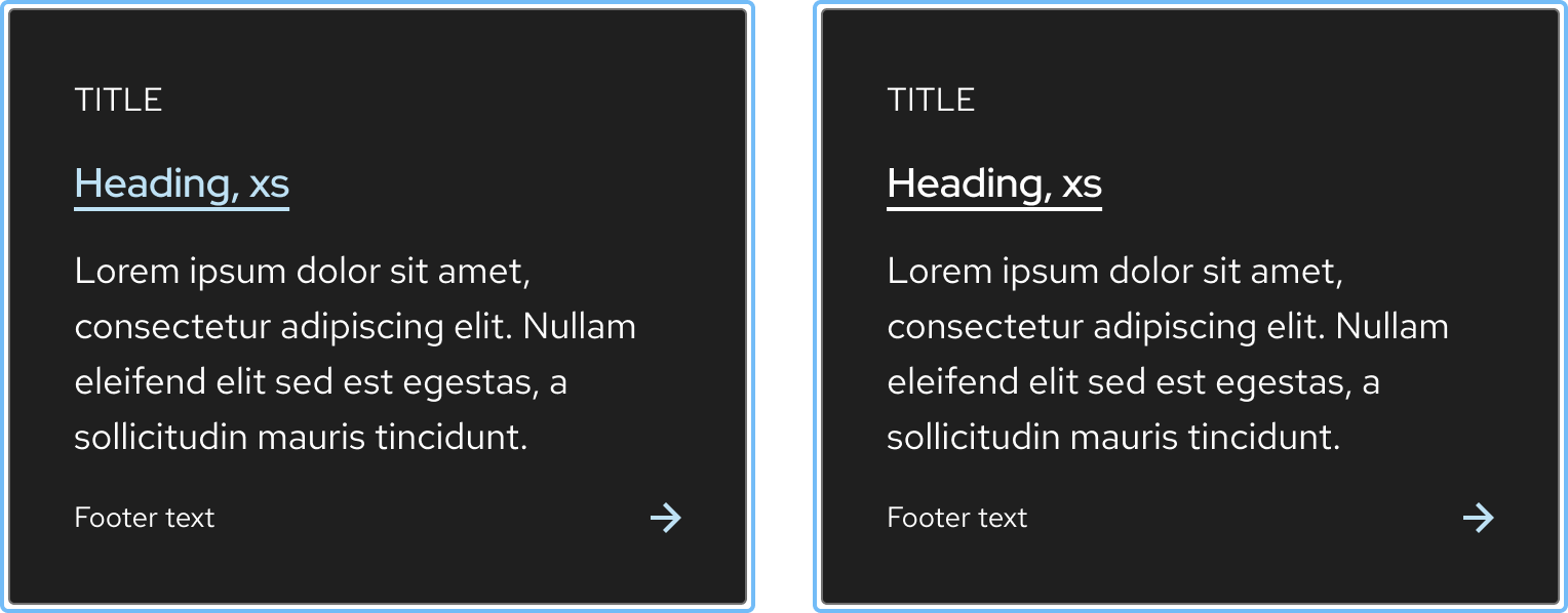
A link tile has a blue heading by default, but a desaturated variant exists for both light and dark themes. The desaturated heading uses either a black or white heading. A selectable tile has a desaturated heading only and does not have the option for a blue heading.
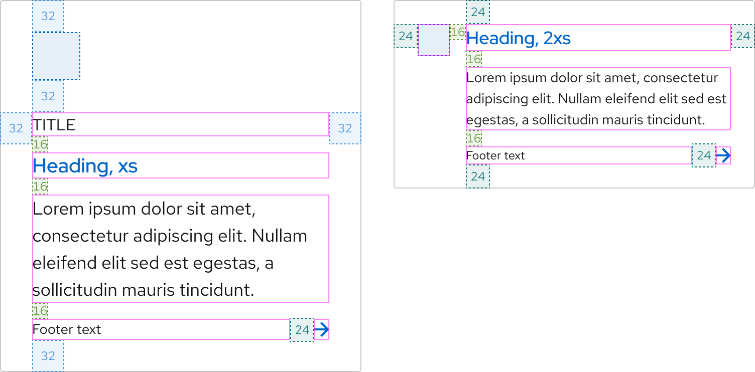
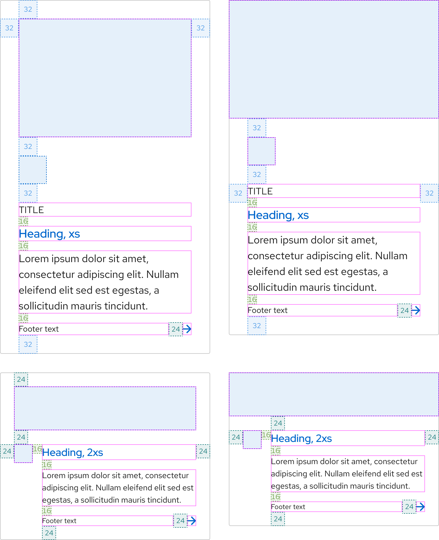
Space
Space values remain the same at all breakpoints.
Link tile without image
Link tile with an image
Selectable tile
Interaction states
Interaction states are visual representations used to communicate the status of an element or pattern. The interaction states of a default link tile are the same for a compact link tile as long as they use the same heading color. A selectable tile does not have an underlined heading to avoid users thinking it contains a link.
Hover
The hover state of a link tile also includes the arrow icon moving 3px to the right.
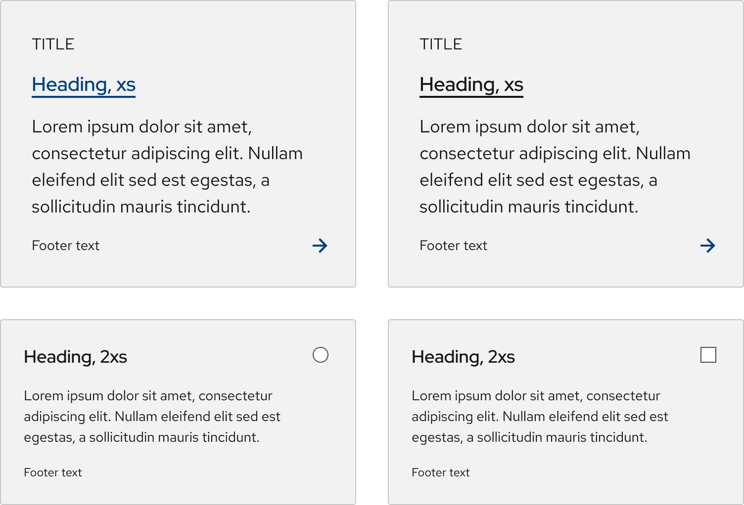
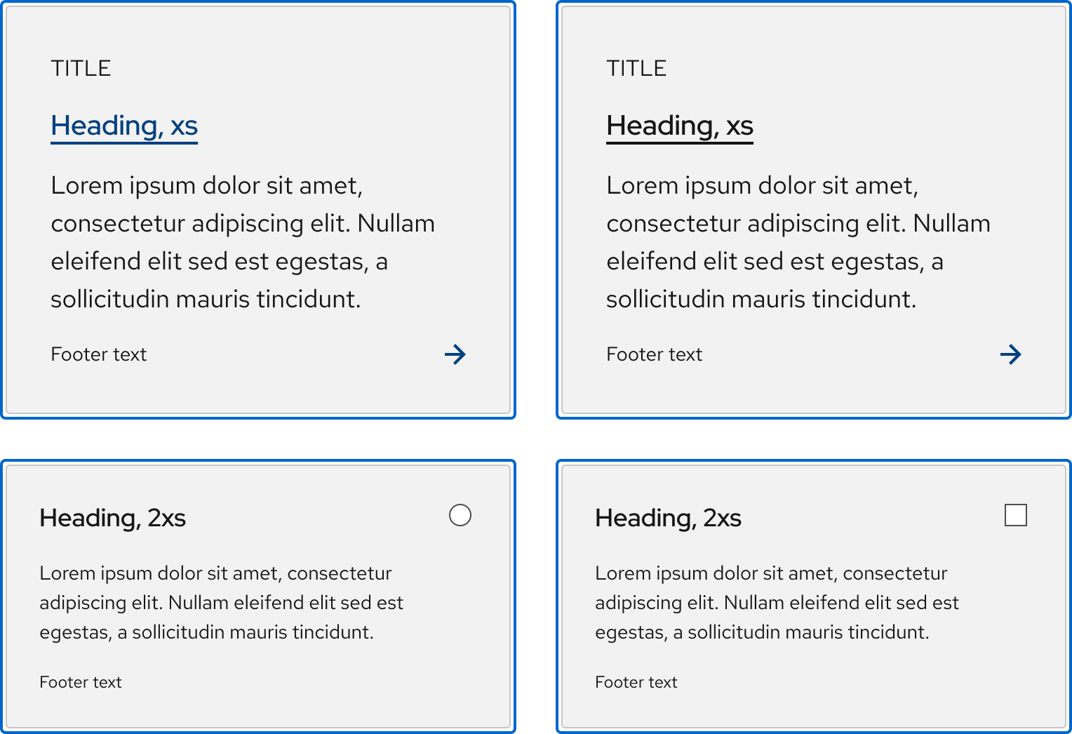
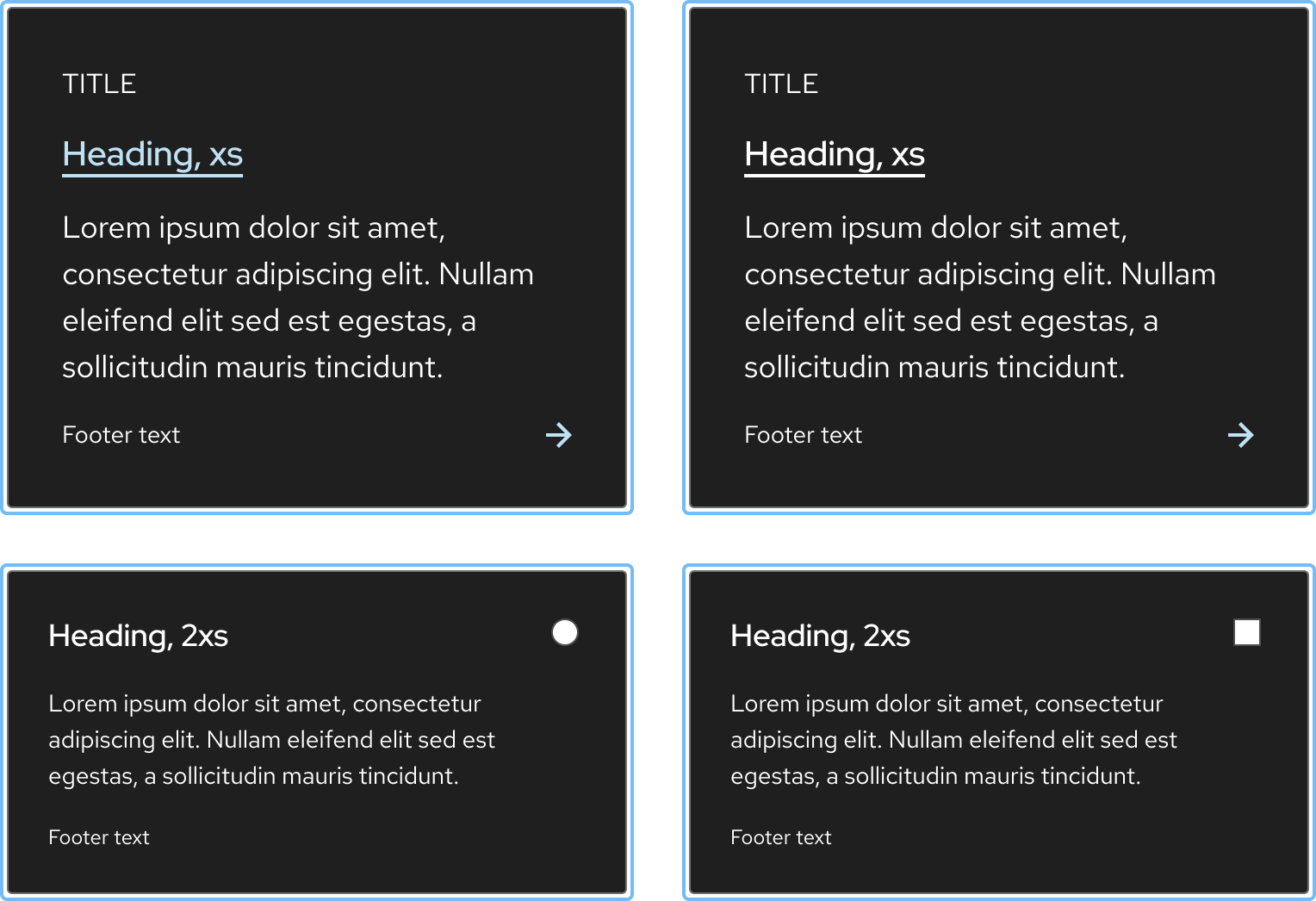
Focus
Helpful tip
Focus state has the same styles as the hover state, except for the arrow icon animation.
Active
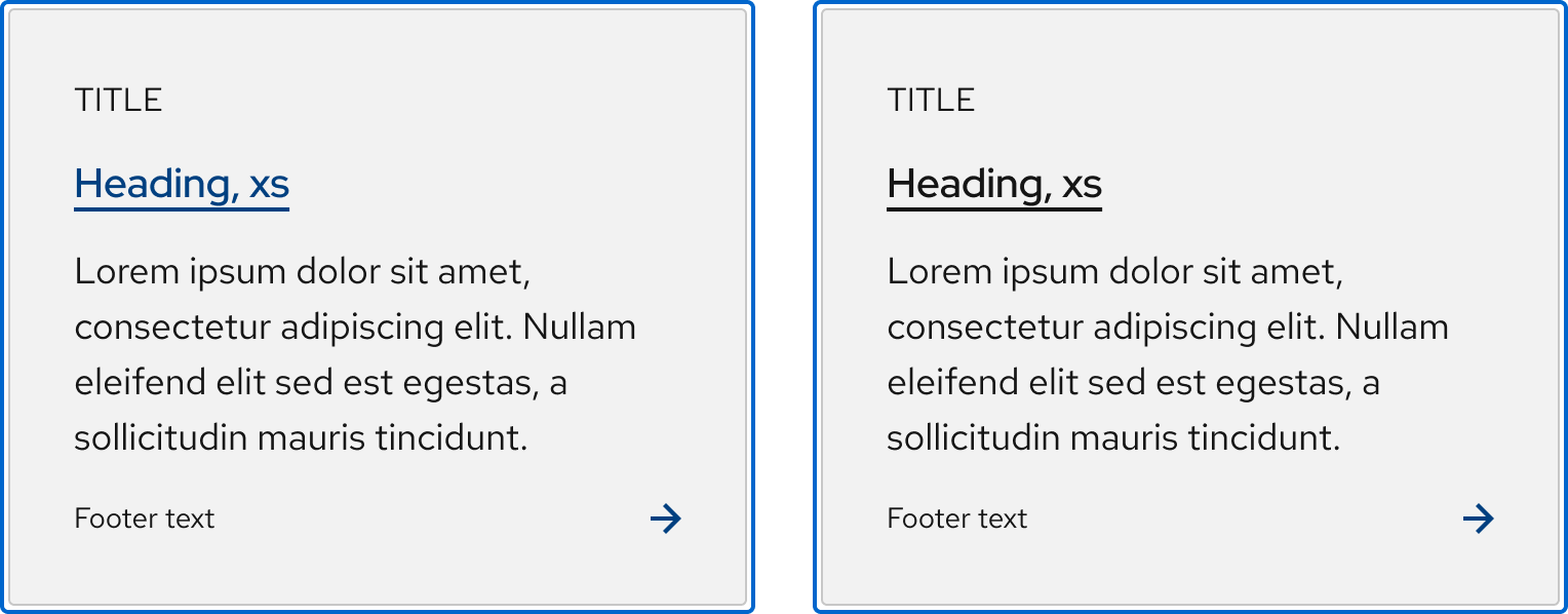
Only link tiles have an active state. Selectable tiles have a selected state instead.
Helpful tip
The Active state has the same styles as the Hover state.
Selected
Only a selectable tile has a selected state. A link tile has an active state instead.

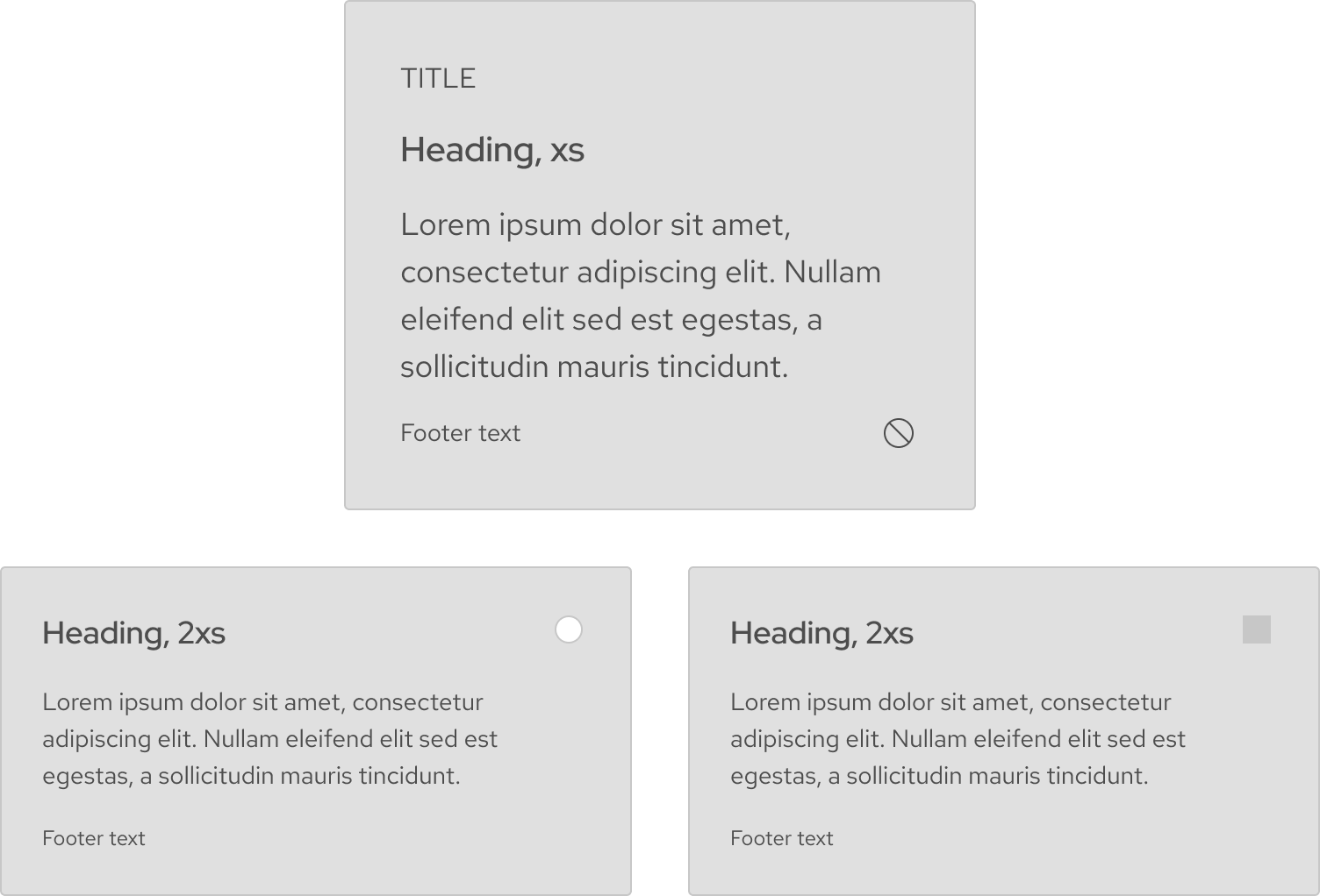
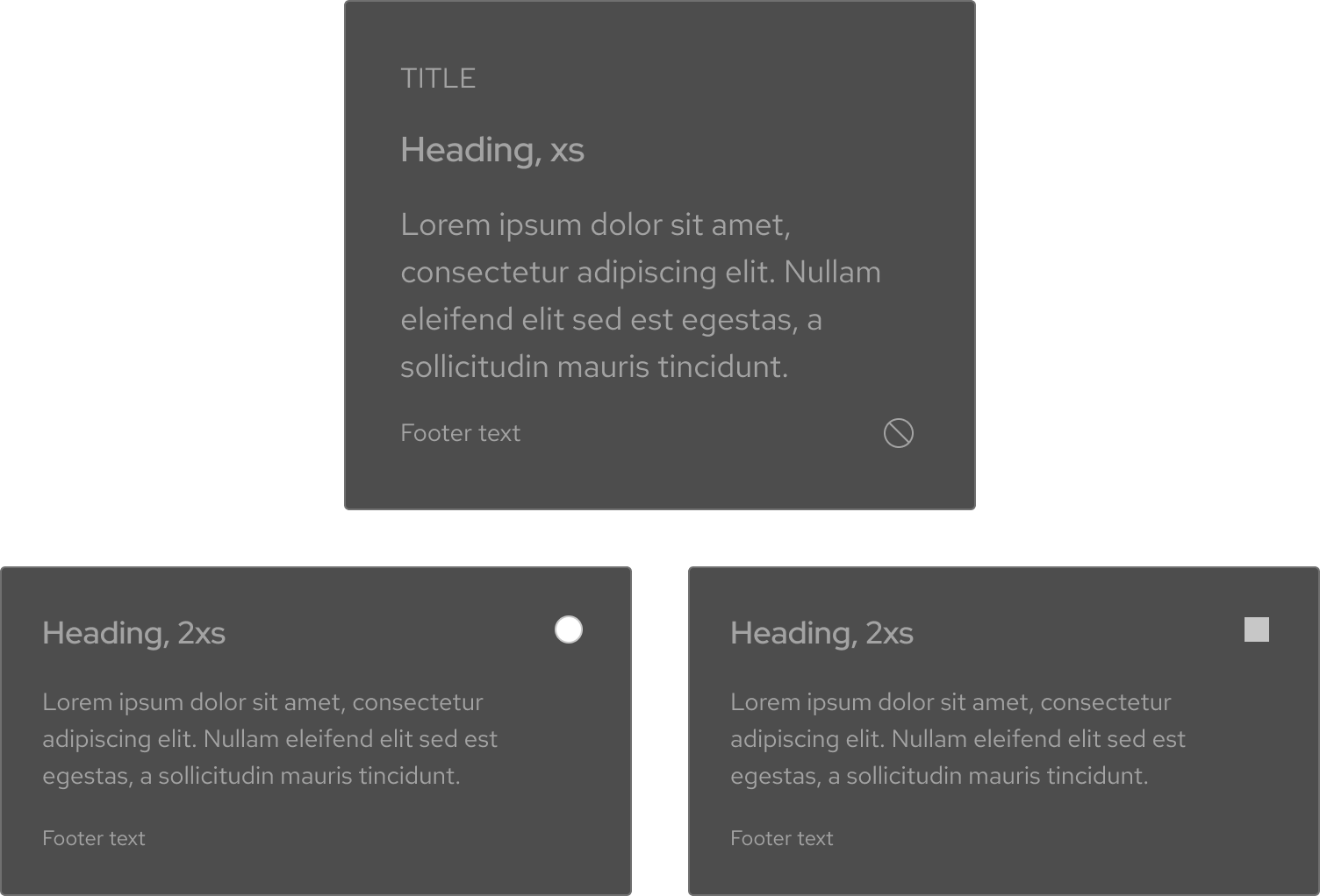
Disabled
Other libraries
To learn more about our other libraries, visit this page.
Feedback
To give feedback about anything on this page, contact us.
