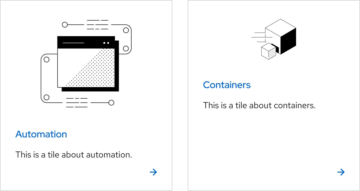
Tile
On this page
Usage
A tile can be used when a clickable container is needed to provide one call to action or show one form input option. It can be grouped with similarly-structured and styled tiles in a tile group. There are two types, link tiles and selectable tiles. Both can be used in groups or individually, except for a selectable tile with a radio button, which always has to be grouped.
Tiles vs. cards
The primary distinguishing factor between a tile and a card is that each tile must perform only one action, because its whole surface is interactive (e.g., can be clicked).
Tiles also have the ability to be used as selectable items in a form.
Tiles can be grouped together with other tiles, and cards can be grouped together with other cards.
Variants
Link tiles
A link tile has many different use cases, but it is especially helpful to use in place of a card group that would have repetitive calls to action. They can also be used in place of Brick calls to action if adding icons or images is necessary.
Compact link tile
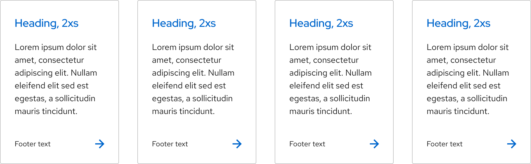
A link tile has a compact variant that can be used in sections that need a denser concentration of information. To further condense each tile, a compact link tile does not have a title slot and the icon appears to the left of content, rather than above it.
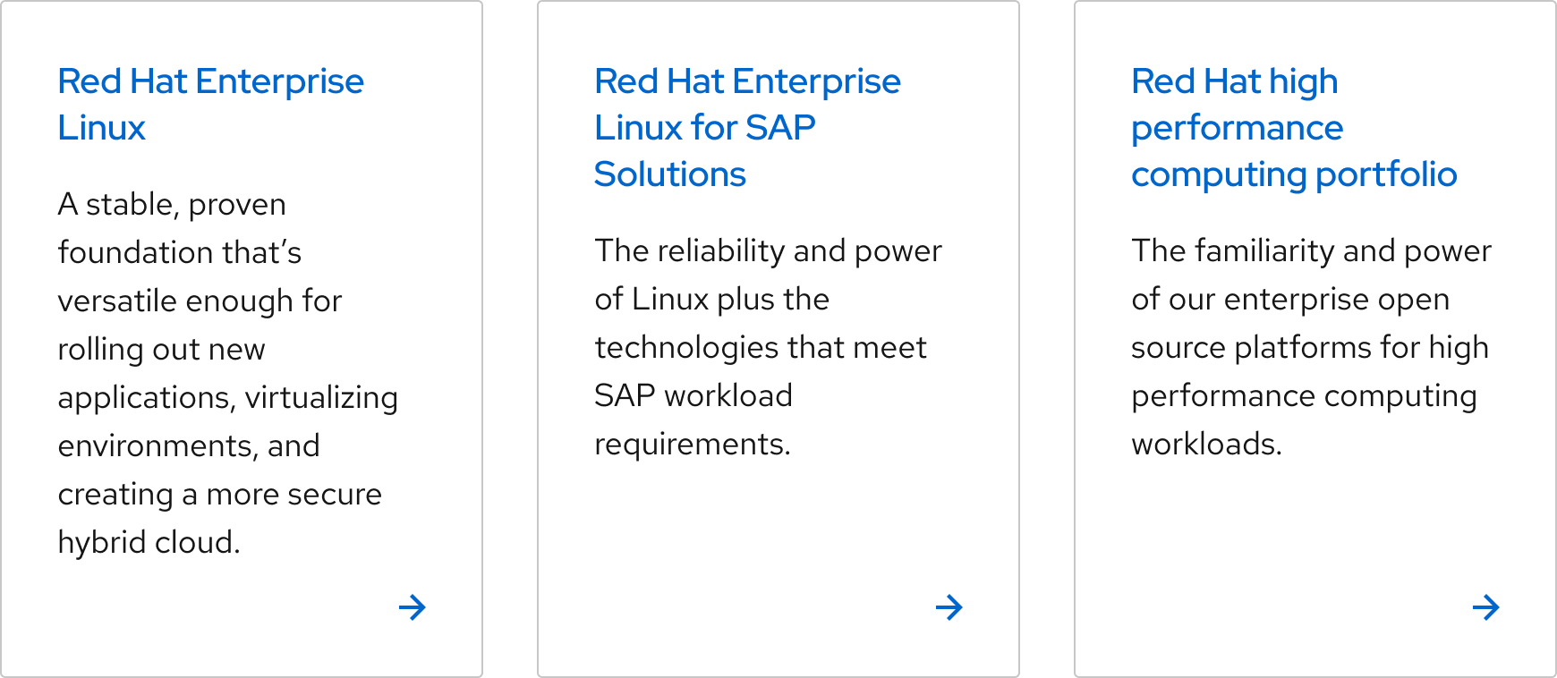
Desaturated heading
The desaturated heading variant is best used for pages with many link tiles. For example, it can help prevent a blue heading from appearing visually overwhelming on a search results page, especially if each tile includes a logo. Other than the heading color, the hover, focus, and active states look the same as a default link tile and the arrow will always be blue.
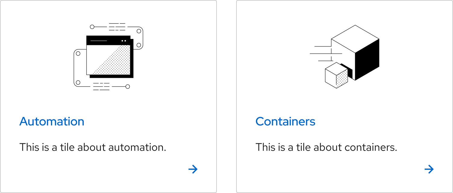
Image sizes
For a link tile, there are two image sizes available. The Default size has spacing around the entire image. The Full-width image size bleeds to the top, left, and right edges. The default image size is recommended for logos, while illustrations or photos would work well as a full-width image.

Selectable tiles
Helpful tip
A selectable tile with a radio button must be used in a group. If there is only one choice listed, use a checkbox.
A selectable tile is a form element and can be used as either a radio button or a checkbox. The radio button should be used if only one option can be selected. A selectable tile with checkboxes should be used when a user can select more than one option.
Writing content
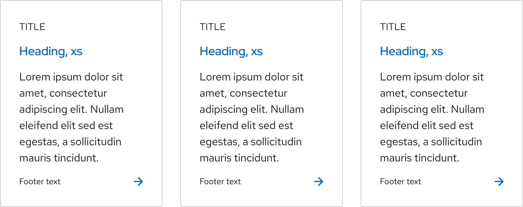
The four content slots within a tile are title, heading, body, and footer.
| Slot | Content |
|---|---|
| Title | A title provides secondary descriptive context. A selectable tile does not have title slots. |
| Heading | In a link tile, the heading should indicate what clicking on the tile will do. In a selectable tile, the heading labels the radio button or checkbox. |
| Body | The body text expands on heading content and gives the user more information. |
| Footer | Footer text should be brief and be used for supplementary information only. |
Character count
The recommended character counts below include spaces. Line counts are based on a default link tile at minimum width.
| Element | Character count | Line count |
|---|---|---|
| Title text | 20 | 1 |
| Heading text | 64 | 3 |
| Body text | 160 | 7 |
| Footer text | 25 | 1 |
Layouts
Like a card, the default tile should have a minimum width of four grid columns, so there is a maximum of three default link tiles in one row.
The compact link tiles or selectable tiles can condense to a minimum width of three grid columns or a max of four compact tiles in a row.
Behavior
Vertical height
The vertical height of a tile will increase as more content is added. The vertical height of multiple tiles in one row matches the height of the tallest tile.
Best practices
One action per tile

Each tile should go to only one destination or have one action.

Do not use a tile if you need to include more than one link or action.
Link tile actions

Link tiles should navigate users to another page or section.

A link tile should not be used as a button.
Tile variants in groups

Use the same variants for a tile group.

Avoid using different variants or sub-variants in one tile group.
Tile content

When grouped, use the same number of content slots to make them easy to scan.

Do not use a different number of content slots in grouped tiles.
Image sizes
If grouped tiles have images, the images should have the same height. This will keep the headings of each tile aligned, which helps users scan more easily.
Images for tiles in a group should not be different heights.
Footer content

The footer of a tile can include non-interactive elements, like unlinked tags or badges. Ideally, footer content should be able to fit on one line, but it can wrap to two when necessary.

Do not use a tile if you need to include more than one link or action.
Other libraries
To learn more about our other libraries, visit this page.
Feedback
To give feedback about anything on this page, contact us.
