Tabs
On this page
Usage
Use tabs to help users navigate information while staying on the same page. Text labels and content in the panel should be related so users know what to expect when they select each tab. Never force users to switch back and forth between tabs to complete a task.
When to use tabs
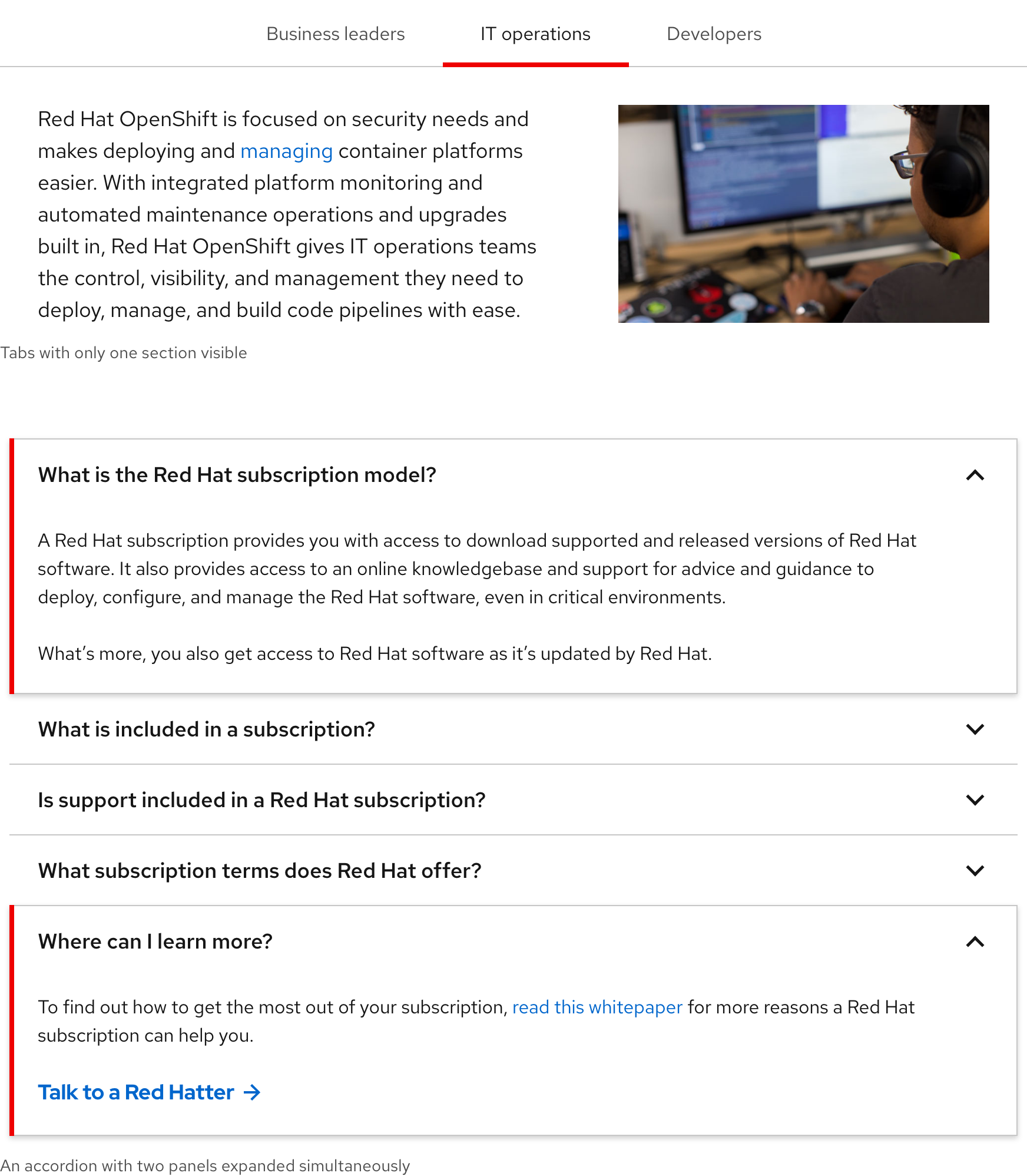
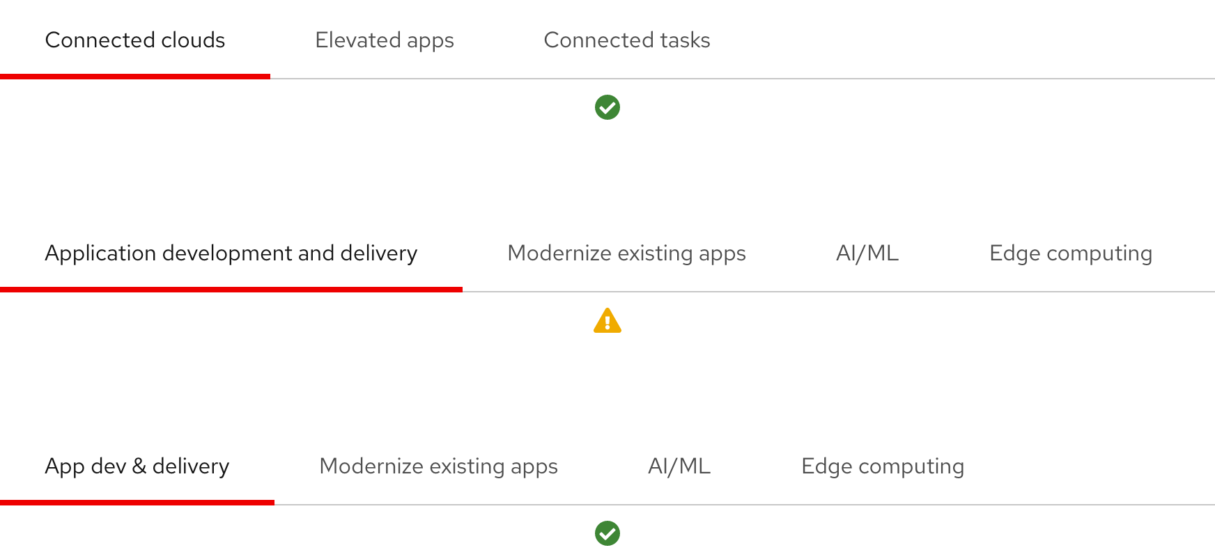
Use tabs to organize lots of information into logical sections. Consider using an accordion if that information needs to be viewed simultaneously because using tabs is not suitable as it forces users to rely on short-term memory when switching back and forth. Using an accordion can also accommodate more sections with longer text labels whereas tabs should only display three or four sections with short text labels. Therefore, if viewing lots of sections of content simultaneously is critical to the user experience or if important information requires more focus and less clicking, use an accordion instead.
Tabs vs. accordion
Tabs allow users to click through content one section at a time whereas an accordion allows users to view multiple sections of content simultaneously.
Number of tabs
To reduce cognitive load and a cluttered user interface, avoid using more than three or four tabs.
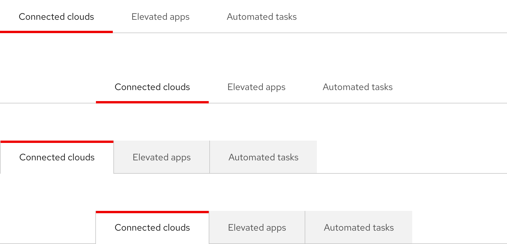
Variants
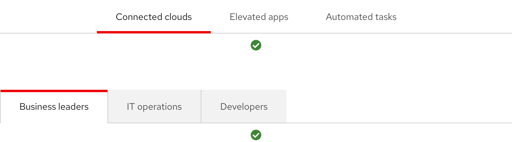
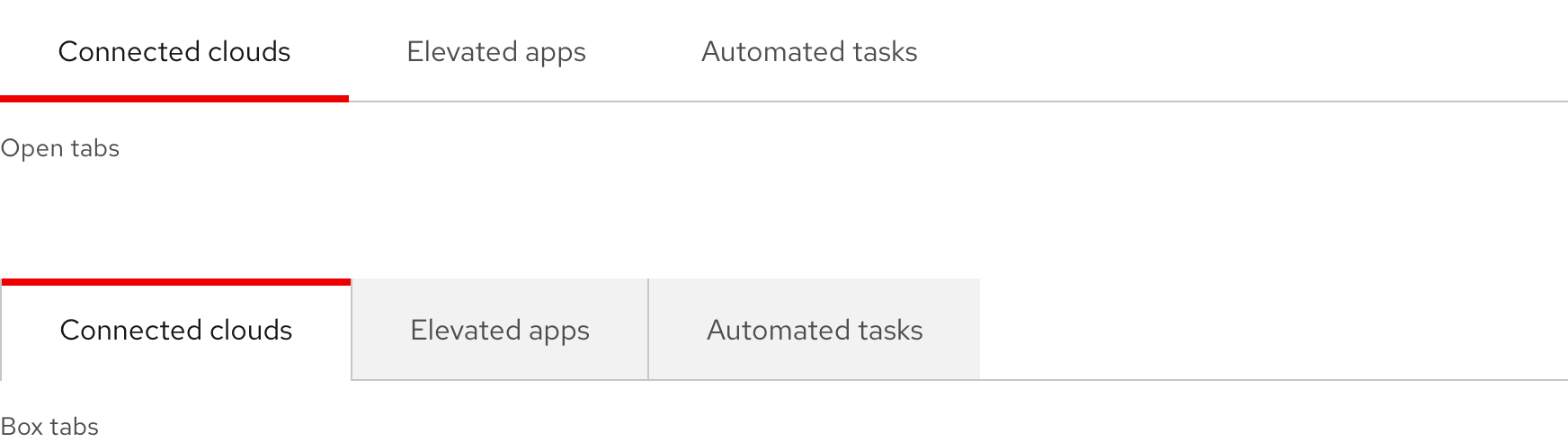
When choosing one variation over the other, consider where it is being used. If using tabs multiple times on one page, use one variation only. Open tabs - use if you want to keep your design clean and maintain a minimal look and feel Box tabs - use if your design includes a lot of boxes or you want to maintain the classic tabs look and feel
Orientation
When choosing one orientation over the other, consider the content in the panel, other elements in the layout, and how you want users to read the content:
- Horizontal tabs are placed in the middle of a container and offer users a top-to-bottom reading experience
- Vertical tabs are placed on the left side of a container and offer users a left-to-right reading experience
Alignment
If using horizontal tabs, the default orientation is left aligned, but center aligned is also an option.
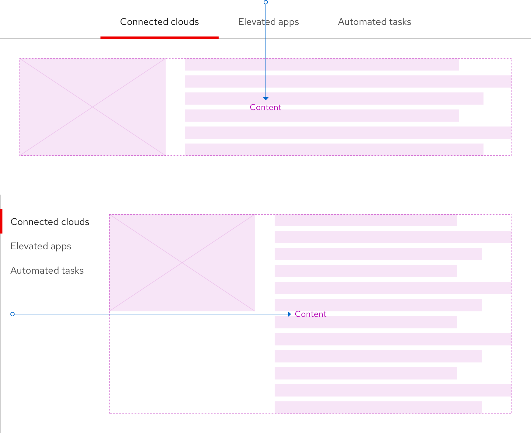
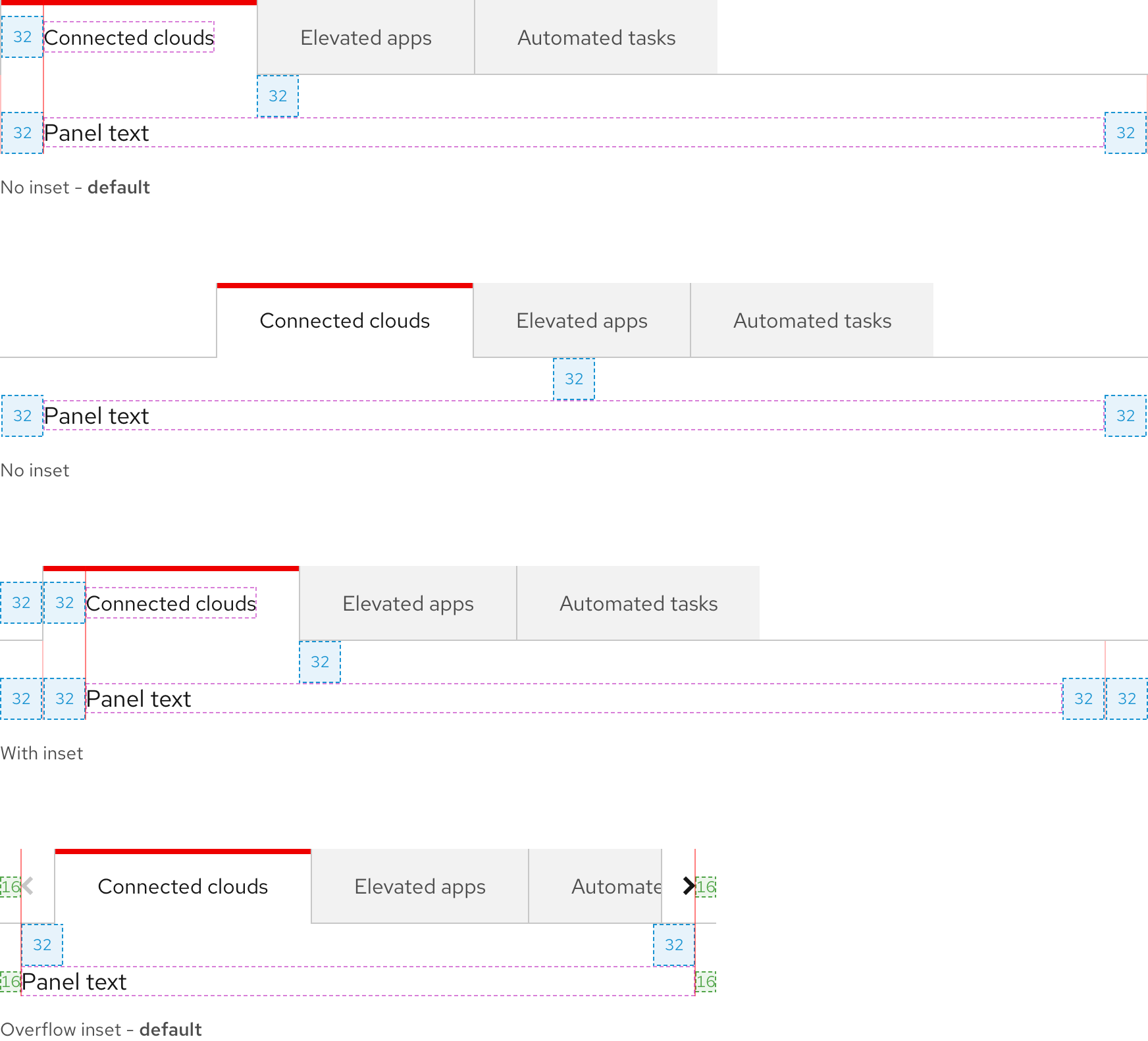
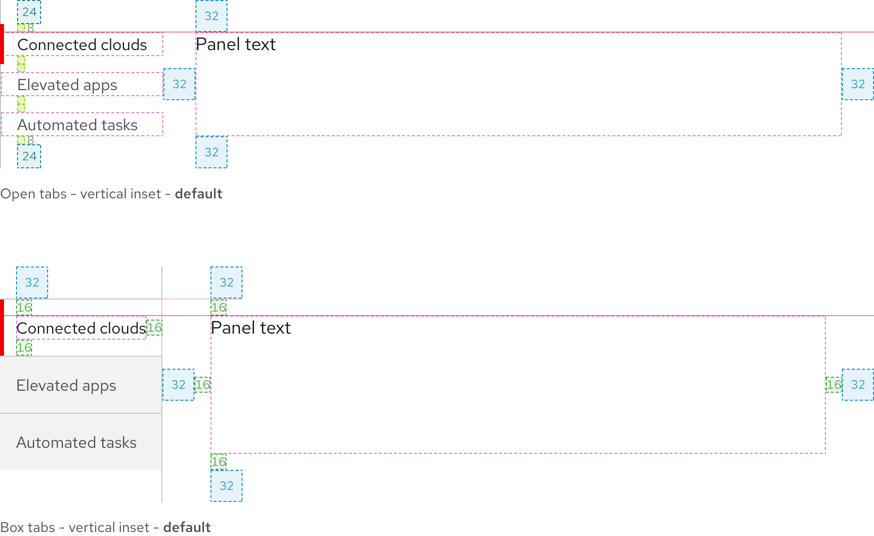
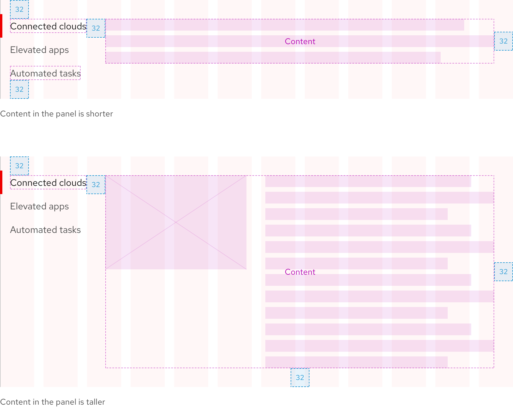
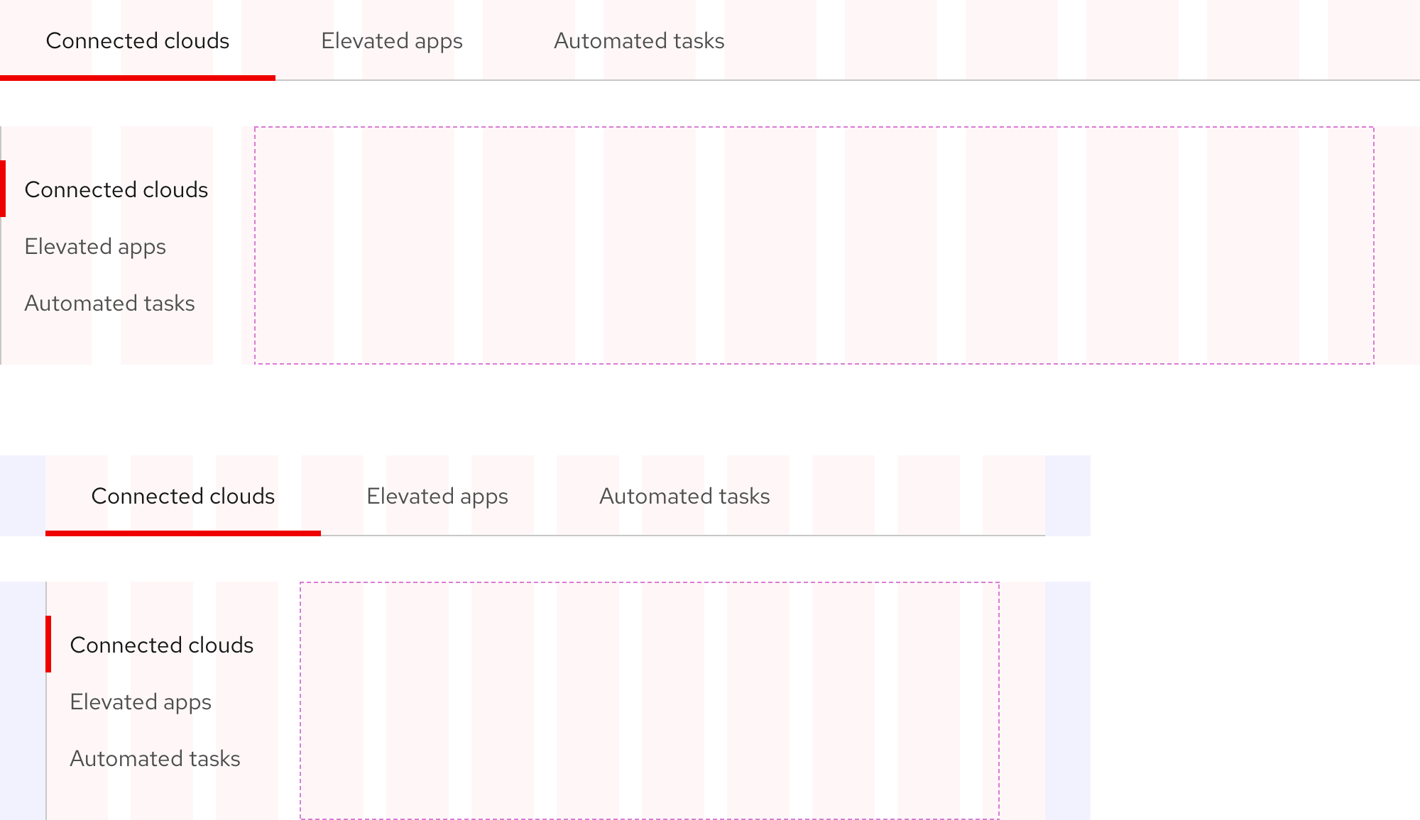
Inset and tab panel spacing
An inset is used to ensure consistent alignment and padding between text labels, overflow buttons, and content in the panel.
Helpful Tip
With horizontal tabs, there are two inset options. With vertical tabs, there is only one.
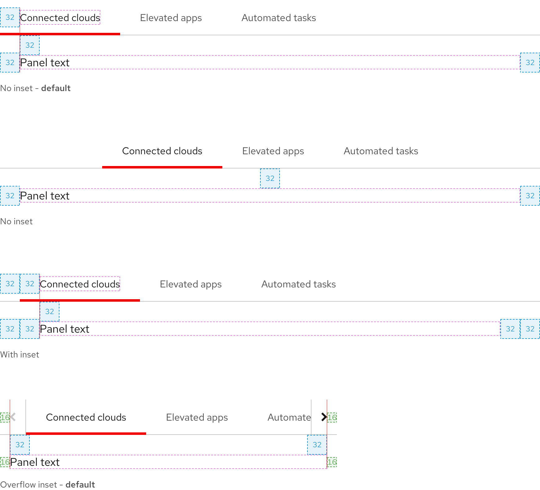
Certain content layouts may require removing the inset. While this is not a default style, it is possible with custom CSS.
Logos
In certain edge cases, logos can be used instead of text labels.
Tab panel
The panel is below or to the right of tabs. Use this area to place other elements or content like text, links, calls to action, and more. Text blocks should not exceed 750px to maintain optimal readability.
Warning
The Tabs element has no control over the panel in terms of content, layout, spacing, etc.
Writing content
Text labels
Text labels should be concise, scannable, and descriptive of content in the panel. They should not exceed more than two or three short words. If they do, work with a content strategist to shorten them.
Character count
In general, tabs should have three or four text labels maximum. Text labels should be short but descriptive.
Text labels should be short but descriptive.
| Column count | Character count |
|---|---|
| 3 to 4 | 20 to 30 |
Layout
Horizontal tabs width
The divider line can be set to any width or be the same width as the list of tabs.
Vertical tabs height
The divider line will become taller if the height of content in the panel exceeds the height of vertical tabs.
Card
Tabs can be used in a card if the layout is wide enough and there are fewer tabs.

Behavior
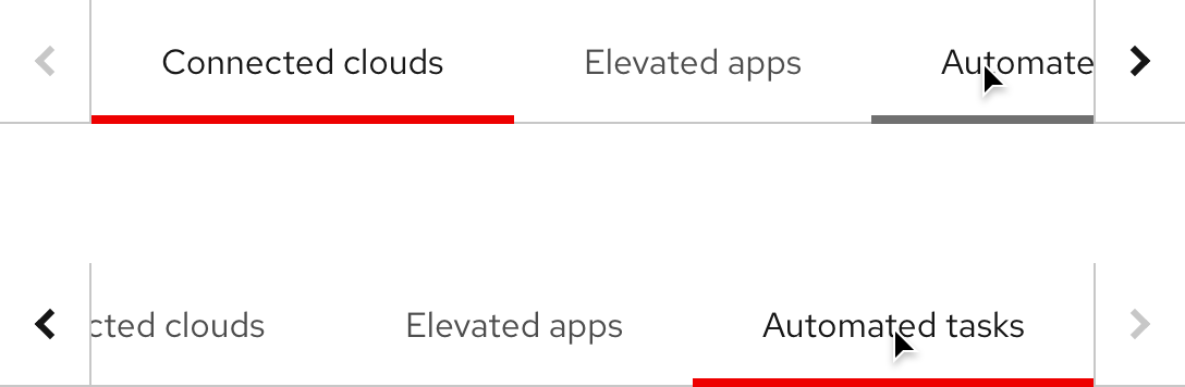
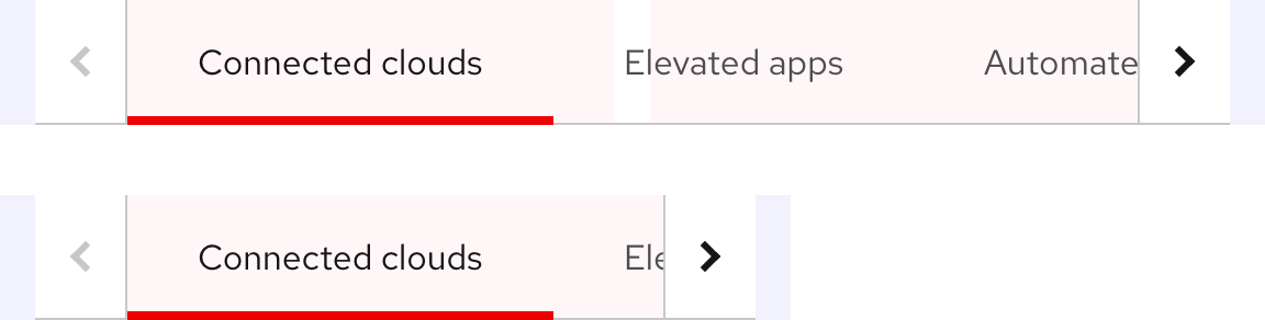
Overflow
If the number of tabs exceeds the container width or breakpoint, overflow buttons with chevron icons are added to each side so users can horizontally scroll to reveal hidden tabs.
Warning
Long text labels will make overflow buttons appear sooner, try and write text labels as short as possible.
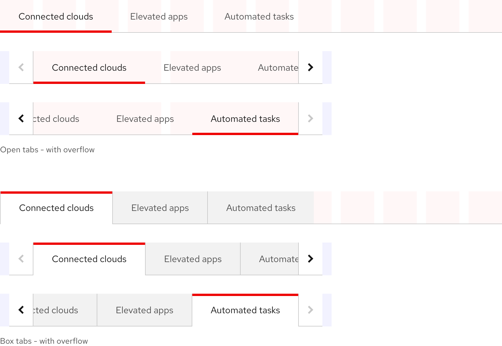
Navigating overflow tabs
When the first tab is active, the left overflow button is disabled. When the last tab is active, the right overflow button is disabled. When a tab that is cut off is selected, the list of tabs shifts so the selected tab is in full view.
Responsive design
Large breakpoints
Small breakpoints
Vertical tabs switch to horizontal tabs with overflow buttons on small breakpoints.
Best practices
Minimum number of tabs

There should always be at least two tabs.

Do not use only one tab.
Using many tabs

Use a reasonable number of tabs.

Do not use too many tabs. In the horizontal orientation, be aware that including a lot of tabs may mean that the overflow layout will be triggered.
Spacing and width

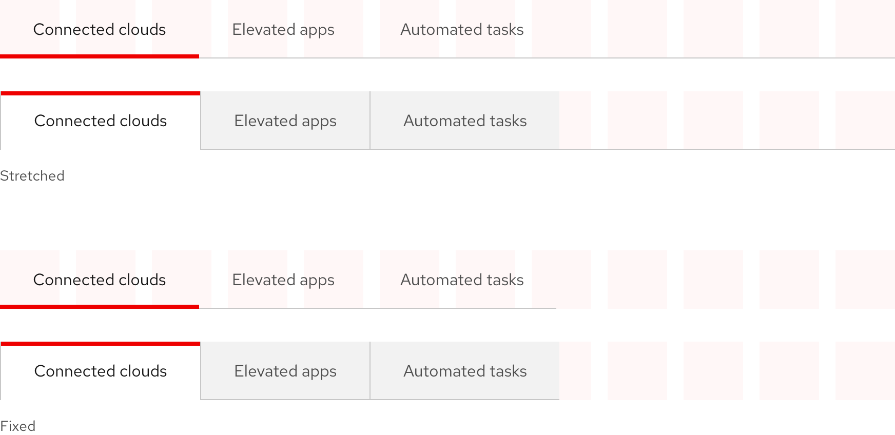
Retain the default spacing for tabs.

Do not add extra spacing or stretch the width of tabs.
Overflow buttons

Use overflow buttons if not all of the tabs can fit.

Do not make overflow buttons visible if all tabs can comfortably fit.
Other libraries
To learn more about our other libraries, visit this page.
Feedback
To give feedback about anything on this page, contact us.
