Tabs
On this page
Style
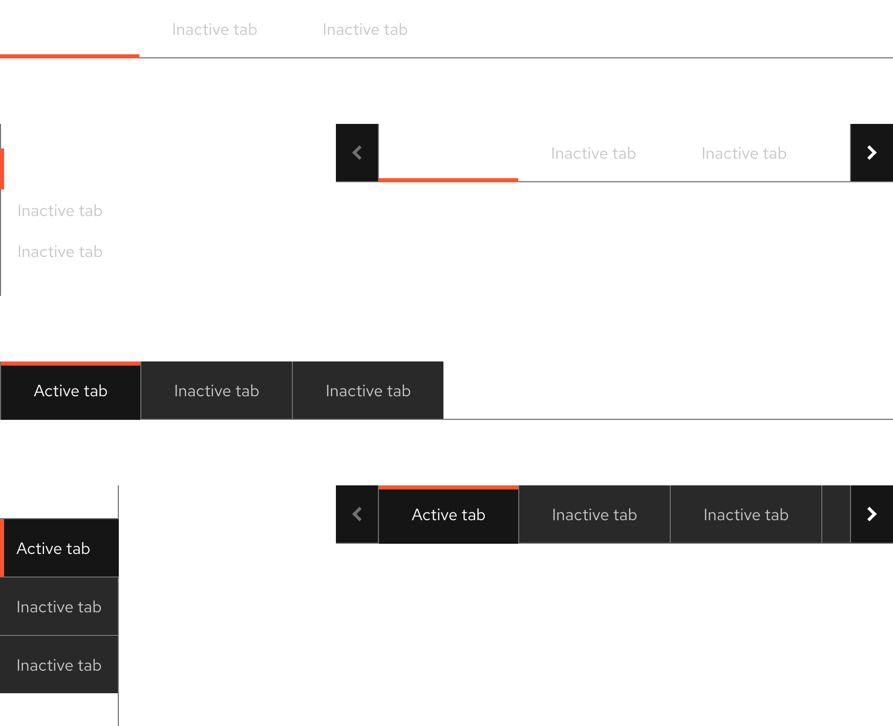
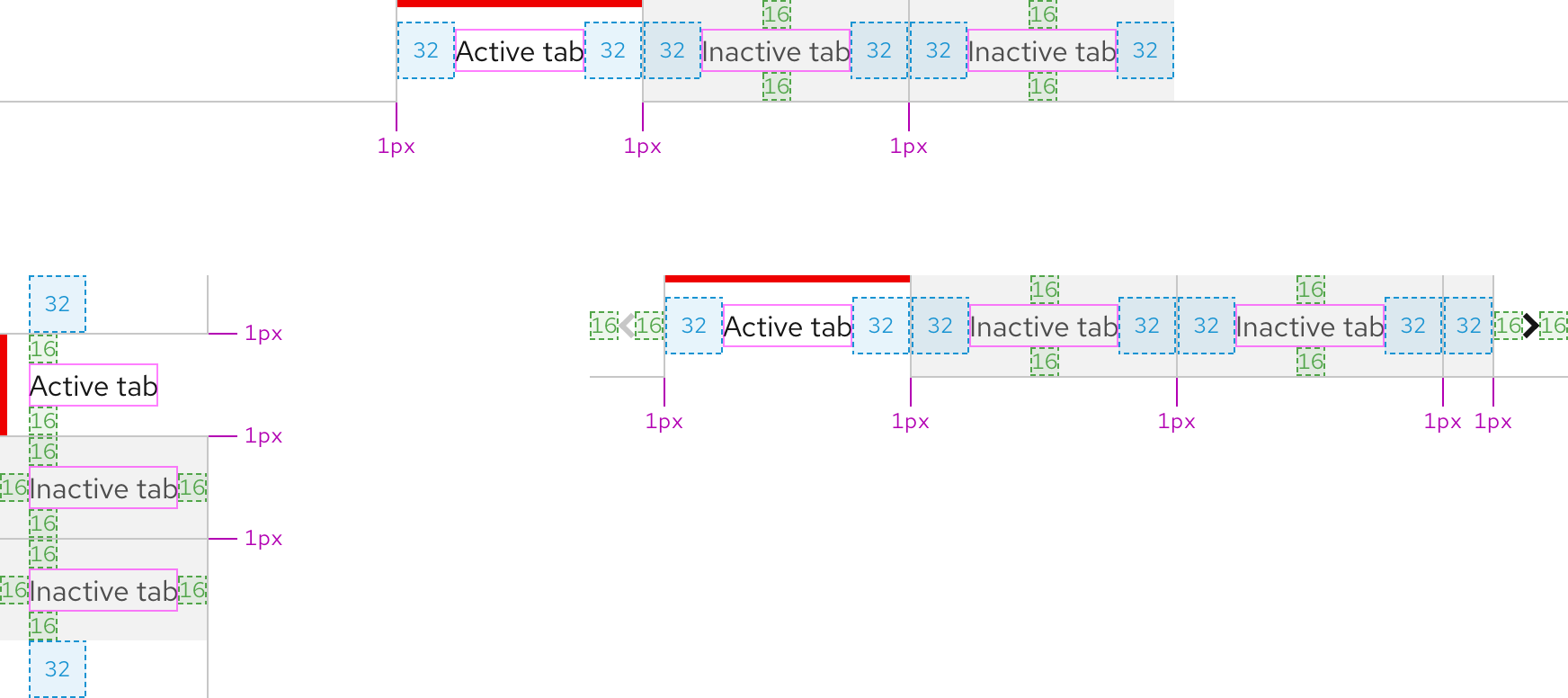
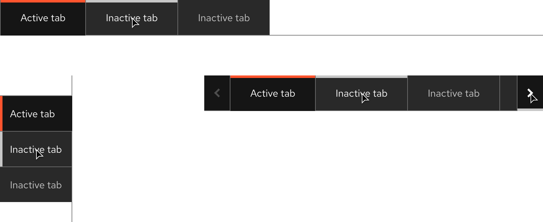
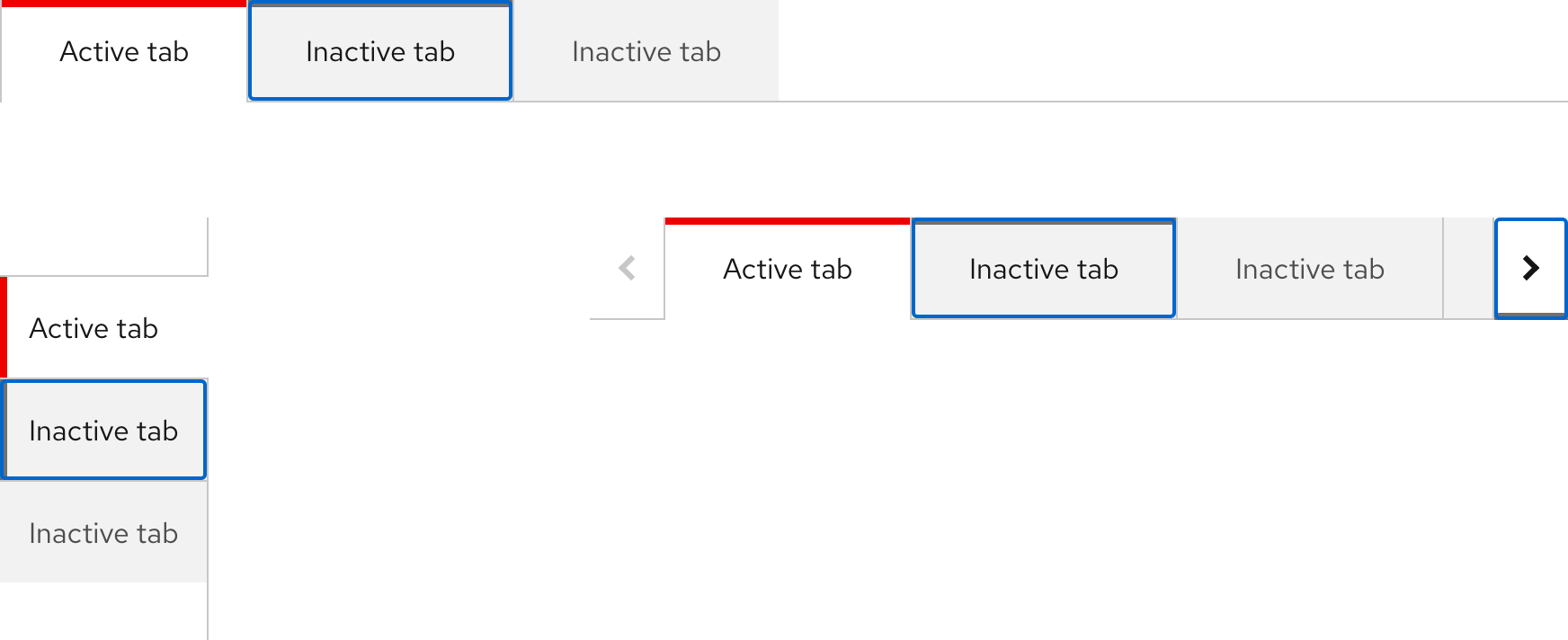
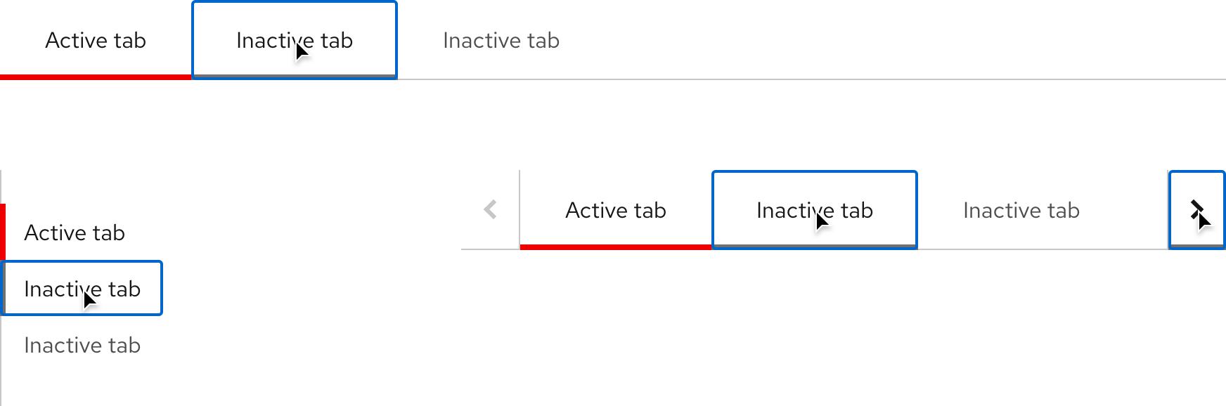
Tabs are used to group related content allowing users to navigate a view without leaving the page) Each tab is a text label placed in a visible or invisible container. There are two variants in two orientations and some of the styles and padding shift slightly depending on which variant is used.
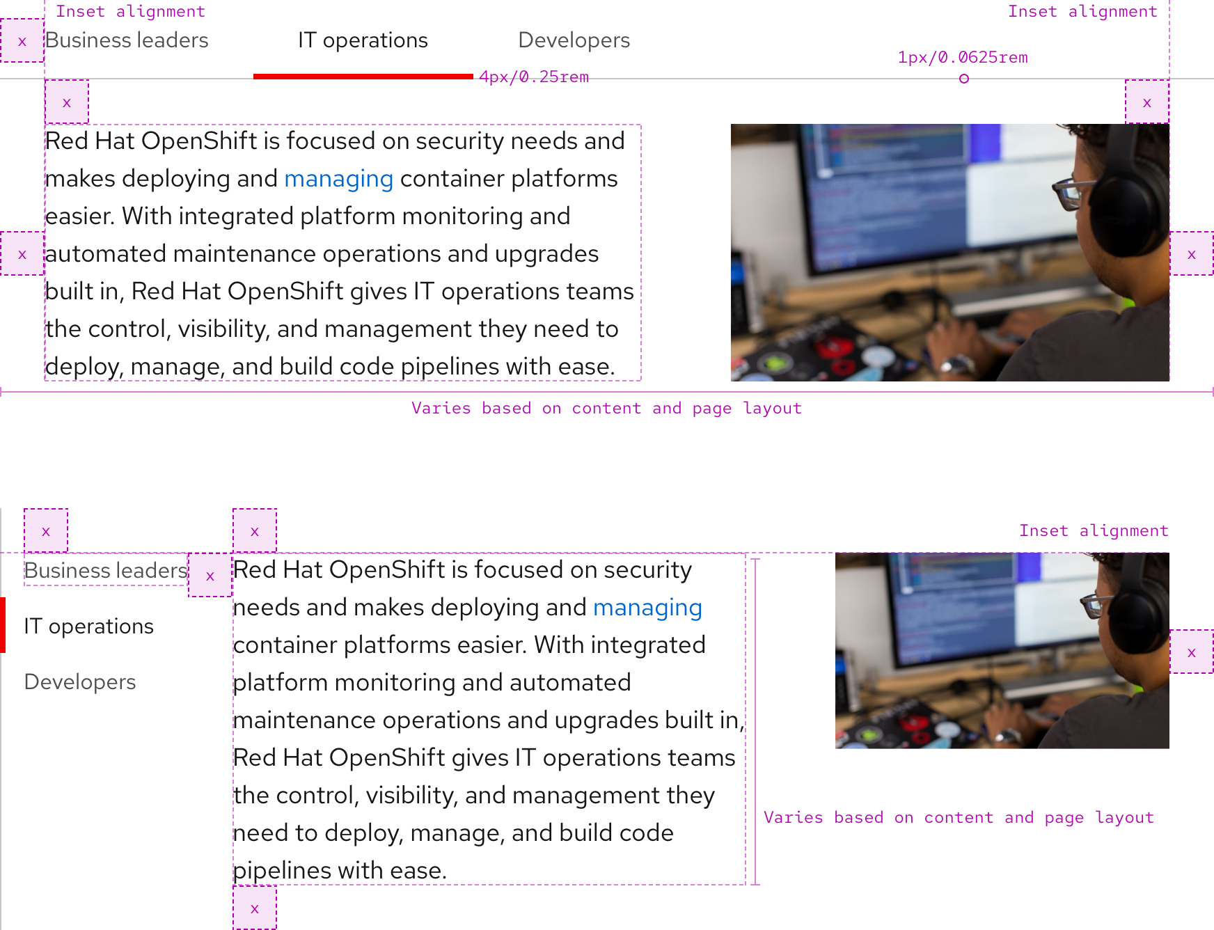
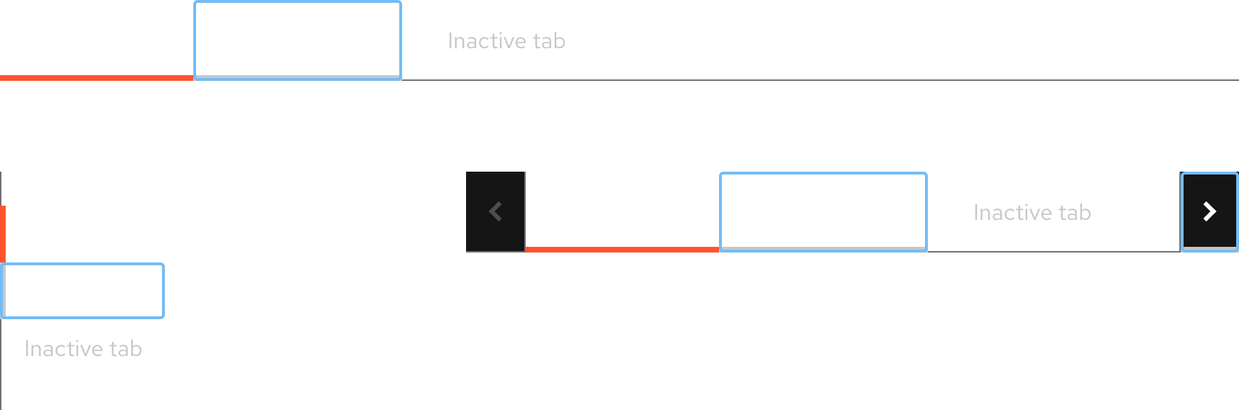
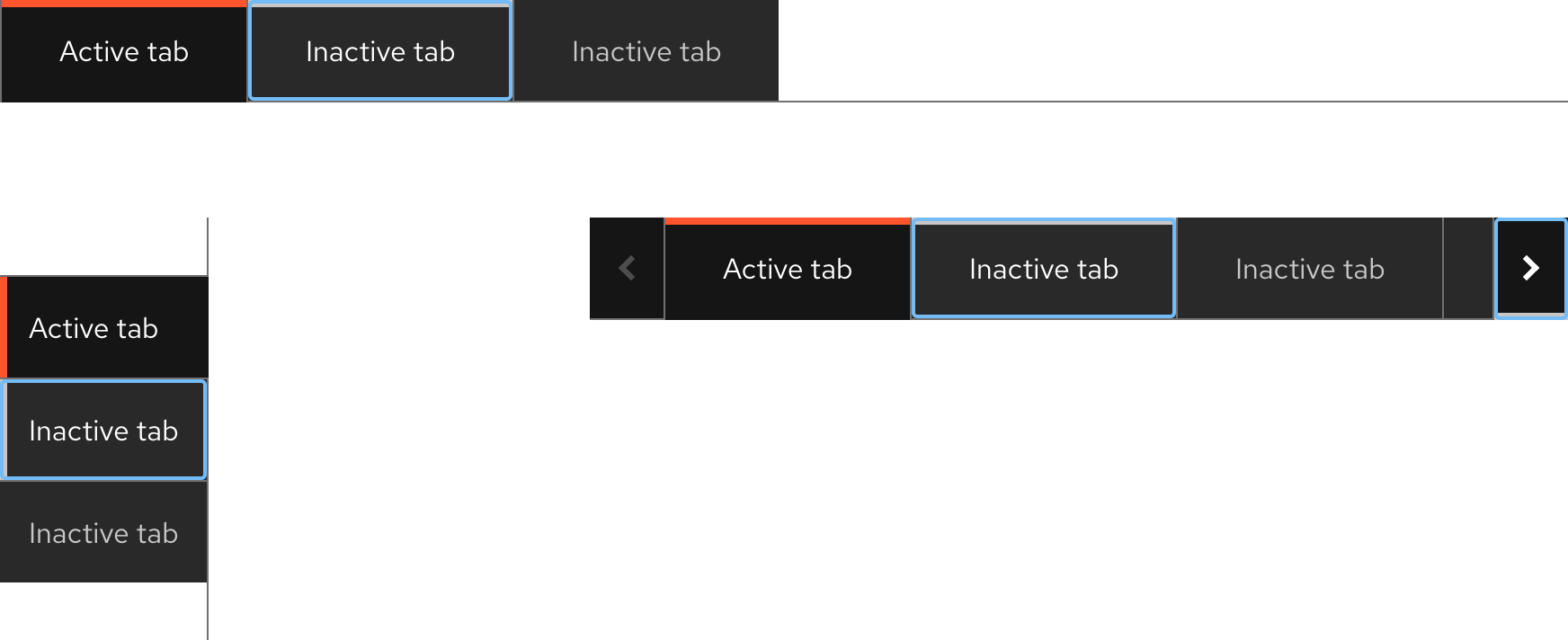
Anatomy
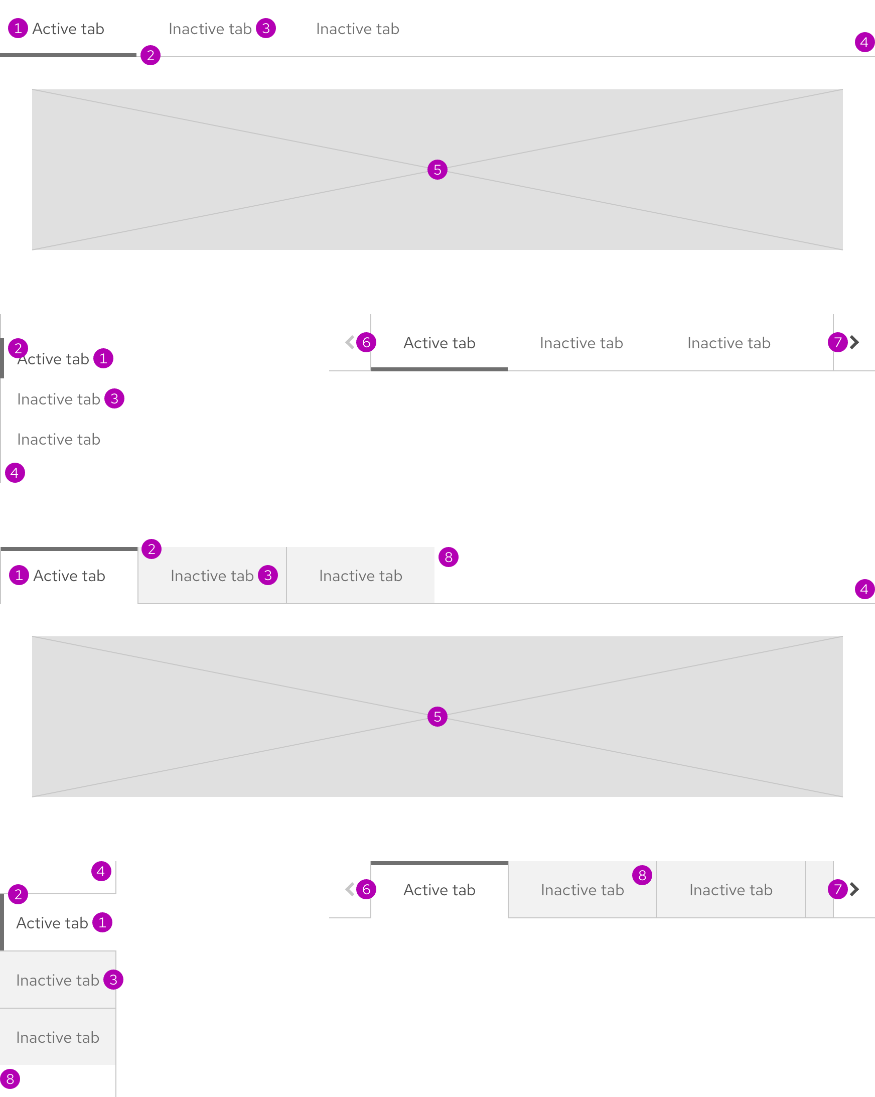
- Active tab
- Active tab accent
- Inactive tab
- Divider line
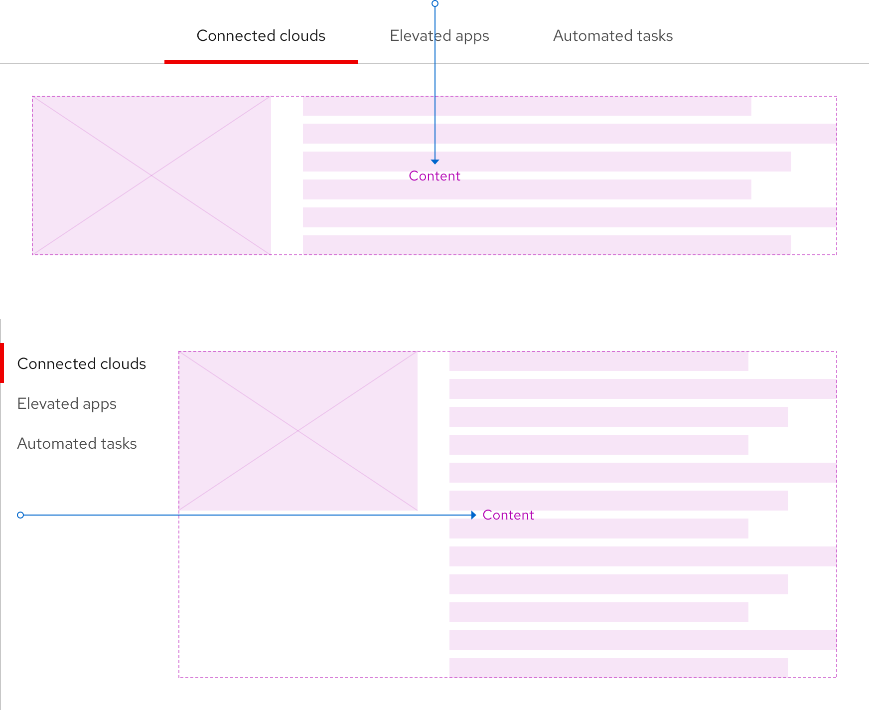
- Content area
- Overflow button - left
- Overflow button - right
- Inactive tab surface
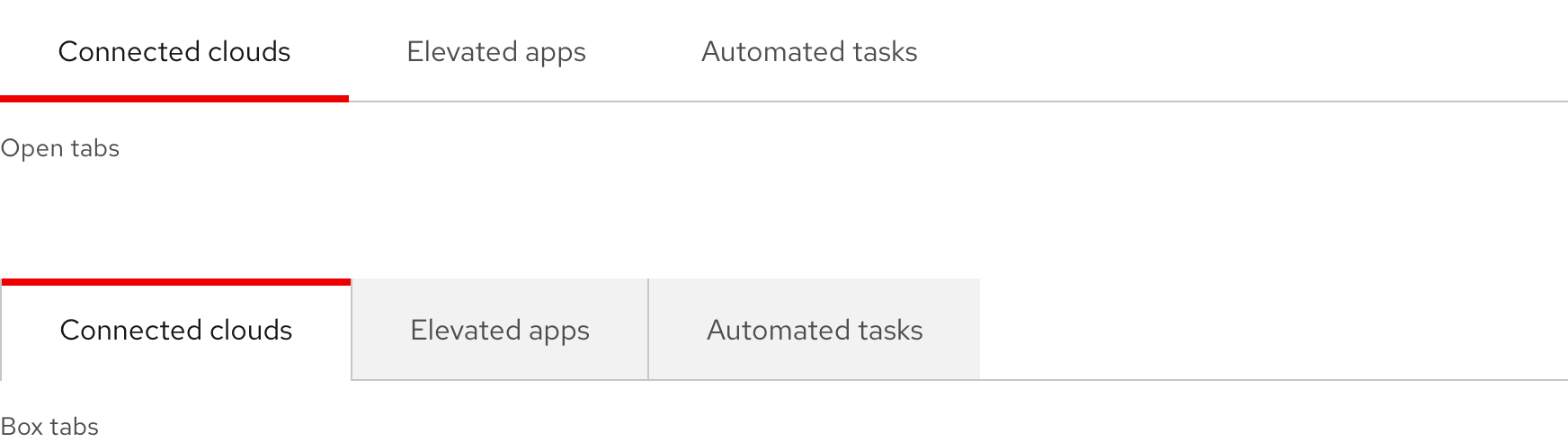
Variants
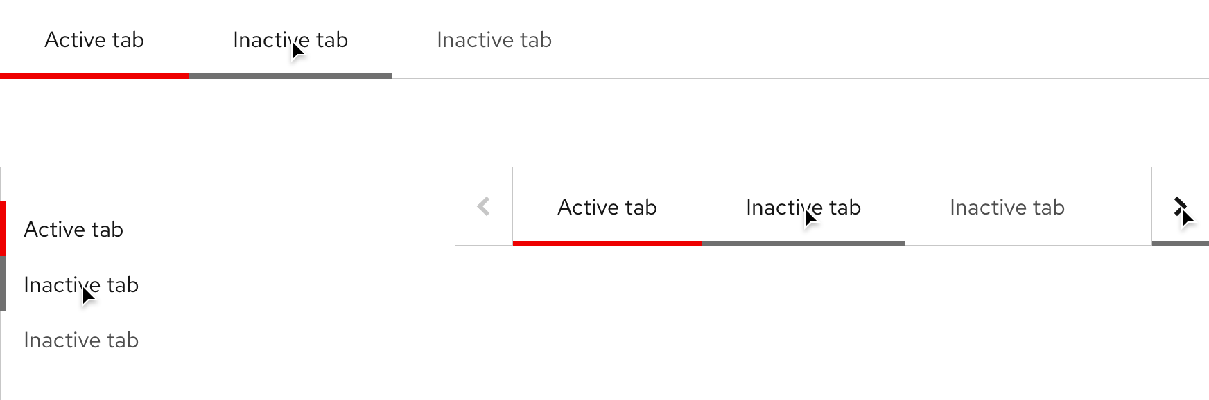
There are two available variants. Open tabs has a more understated style whereas Box tabs has a more traditional style.
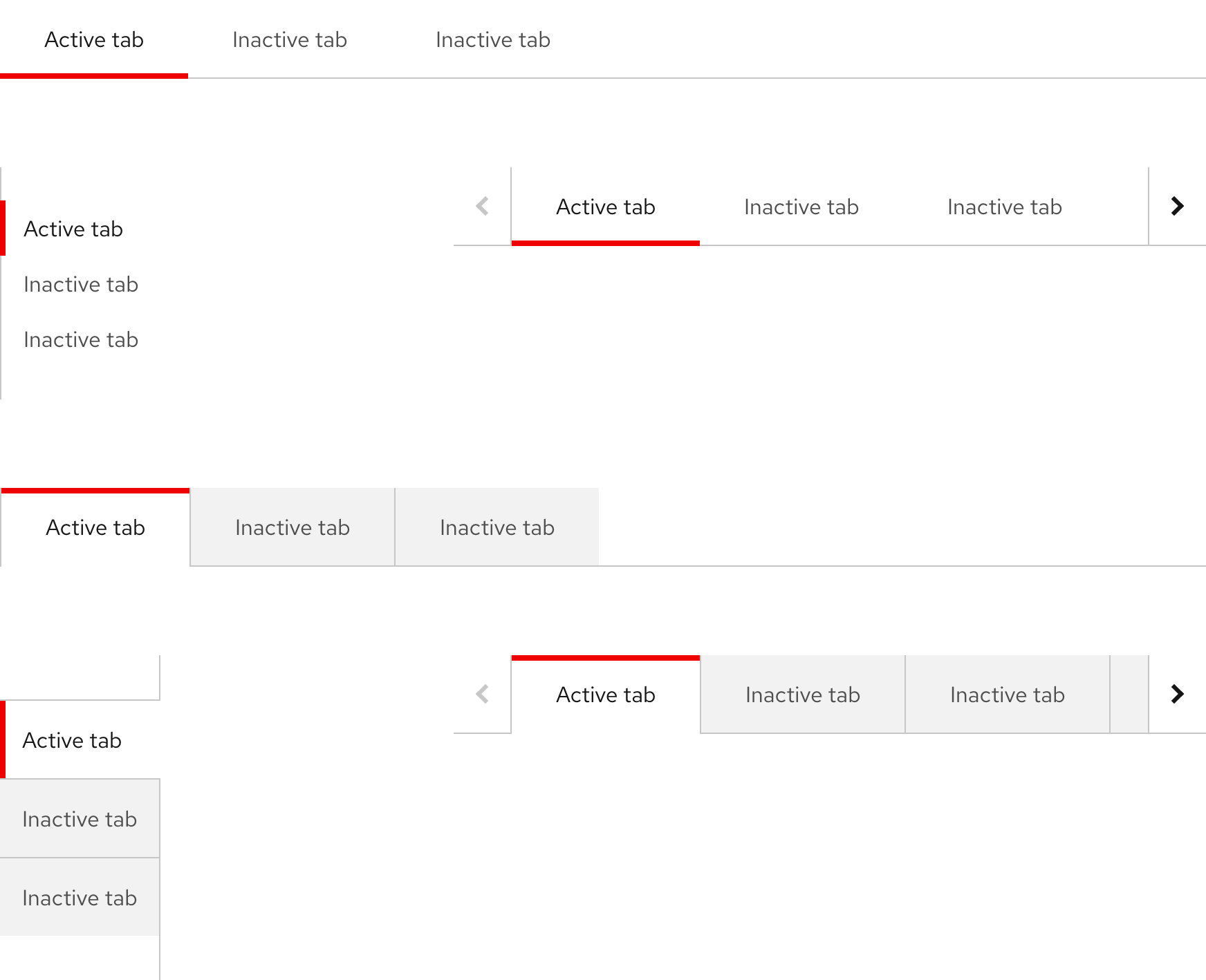
Orientations
There are two available orientations and the only difference is padding.
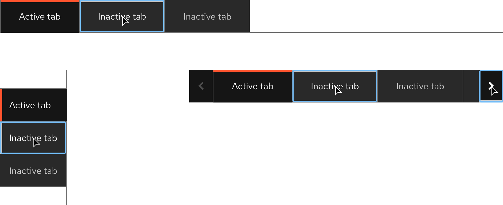
Color scheme
Both variants and orientations are available for both light and dark schemes.
Light theme
| Property | Light theme |
|---|---|
| Color - active tab text | #151515 |
| Color - active tab accent | #EE0000 |
| Color - active tab surface (Box tabs only) | #FFFFFF |
| Color - inactive tab text | #4D4D4D |
| Color - inactive tab surface (Box tabs only) | #F2F2F2 |
| Color - disabled chevron icon | #C7C7C7 |
| Color - active chevron icon | #151515 |
| Color - chevron button surface | #FFFFFF |
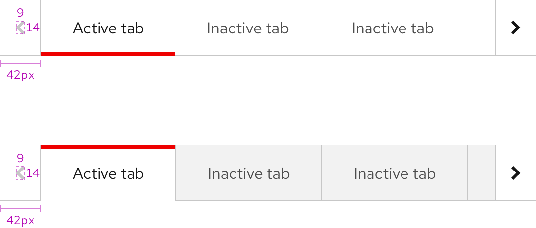
| Border width - active tab and chevron button accent | 4px |
| Border width - divider line and borders | 1px |
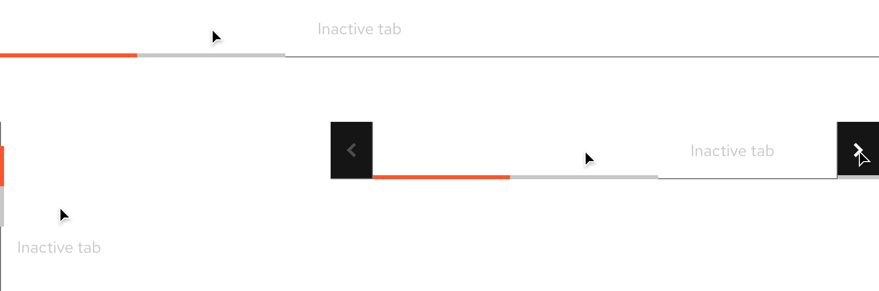
Dark theme
| Property | Dark theme |
|---|---|
| Color - active tab text | #FFFFFF |
| Color - active tab accent | #FF542E |
| Color - active tab surface (Box tabs only) | #151515 |
| Color - inactive tab text | #C7C7C7 |
| Color - inactive tab surface (Box tabs only) | #292929 |
| Color - disabled chevron icon | #707070 |
| Color - active chevron icon | #FFFFFF |
| Color - chevron button surface | #151515 |
| Border width - active tab and chevron button accent | 4px |
| Border width - divider line and borders | 1px |
Configuration
The panel for both orientations of tabs does not have a maximum height and should not scroll.
Overflow buttons
Overflow buttons are containers with chevron icons that are added to tabs on small breakpoints.
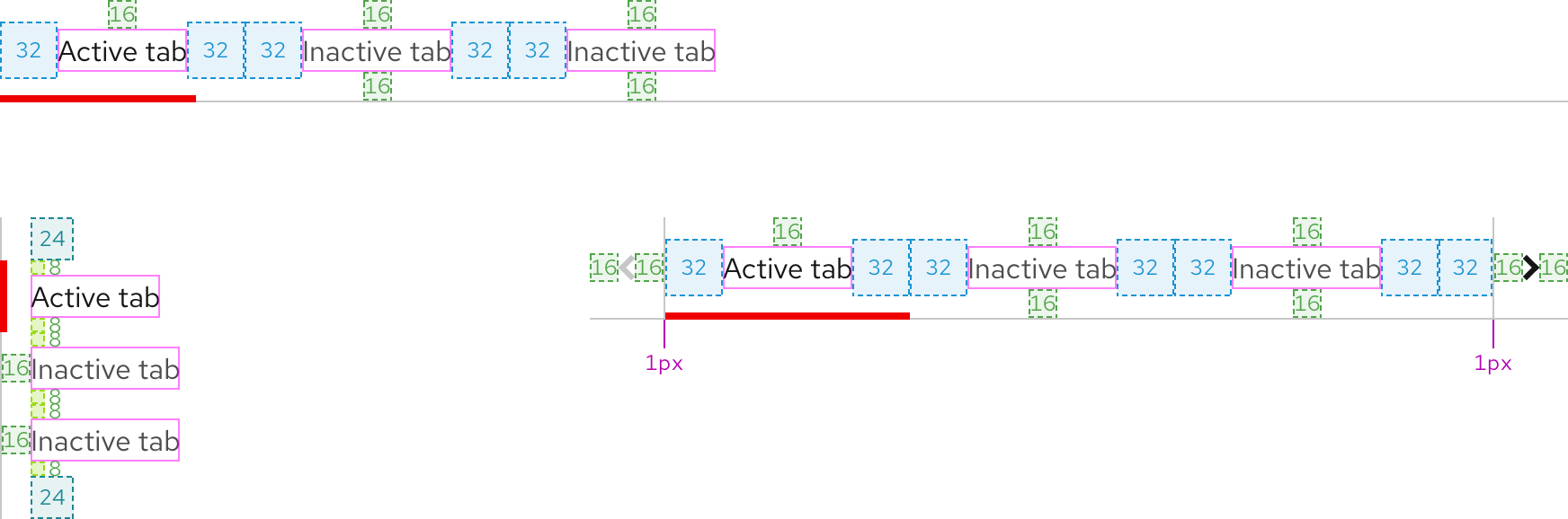
Space
Box tabs are separated by a 1px divider.
Example
Token
Description
md
8px spacer
lg
16px spacer
2xl
32px spacer
Interaction states
Interactive elements include inactive tabs and overflow buttons.
Hover - Open tabs
Inactive tabs and overflow buttons have the same hover state.
Hover - Box tabs
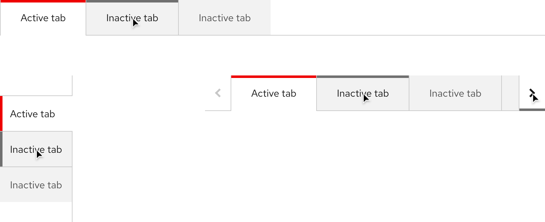
| Property | Light theme | Dark theme |
|---|---|---|
| Color - accent | #707070 | #C7C7C7 |
| Color - text and chevron icon | #FFFFFF | #151515 |
Focus - Open tabs
Helpful Tip
The Focus state has the same styles as the Hover state.

Focus - Box tabs
Helpful Tip
The Focus state has the same styles as the Hover state.
| Property | Light theme | Dark theme |
|---|---|---|
| Color - focus ring | #0066CC | #73BCF7 |
Active - Open tabs
Helpful Tip
The Active state has the same styles as the Hover state.
Active - Box tabs
Helpful Tip
The Active state has the same styles as the Hover state.

| Property | Light theme | Dark theme |
|---|---|---|
| Color - focus ring | #0066CC | #73BCF7 |
Other libraries
To learn more about our other libraries, visit this page.
Feedback
To give feedback about anything on this page, contact us.
