Statistic
On this page
Style
A statistic is a stacked combination of elements used to visualize a data point. By default, a statistic includes data text and body text at a minimum. Optional elements include an icon, title text, and a call to action for additional emphasis or context.
Anatomy
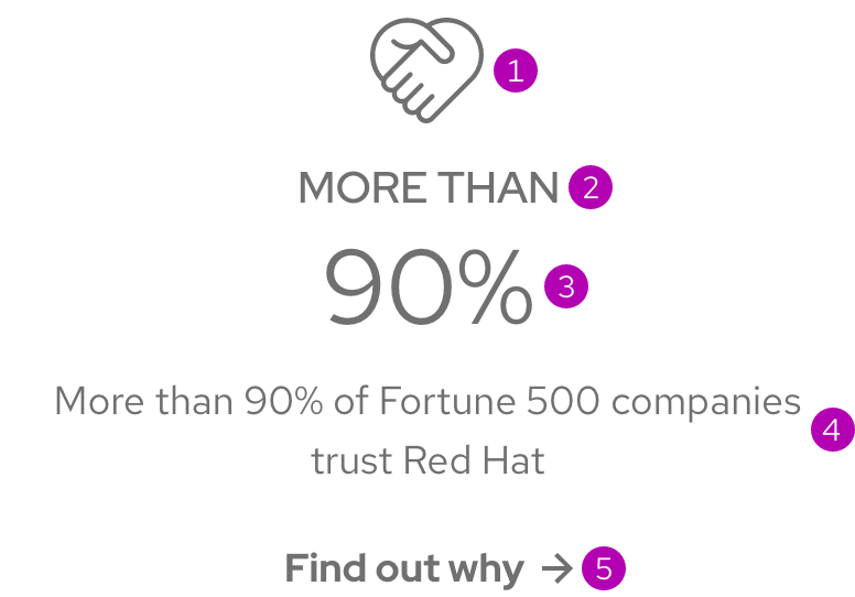
- Icon
- Title text
- Data text
- Body text
- Call to action
Sizes
There are two available sizes and the only difference is the size of some elements.
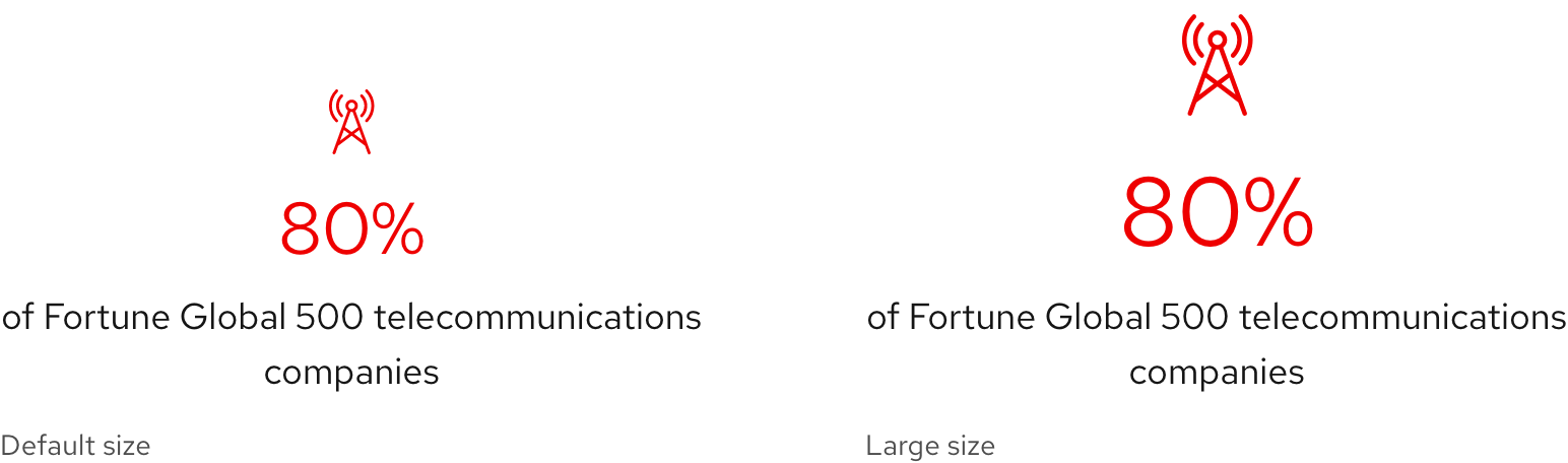
| Size | Element | Current value |
|---|---|---|
| Default | 40px | 36px 2.25rem |
| Large | 64px | 48px 3.0rem |
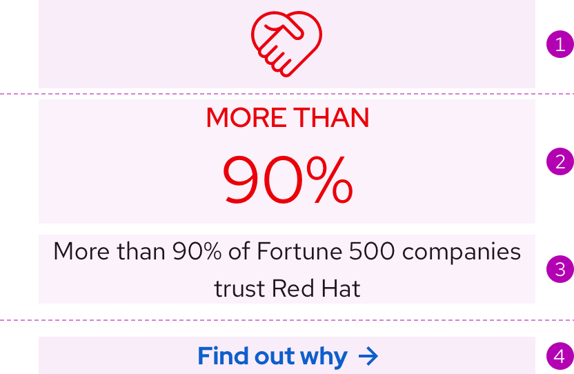
Color scheme
A statistic is available in both light and dark color schemes. The icon, title text, and data text for light scheme are red whereas elements and text for dark scheme (not including the call to action) are white to meet accessibility contrast requirements.
Light scheme

Dark scheme

Configuration
Container
By default, all elements in a statistic, no matter how many, are all stacked and vertically aligned. In some situations, it is acceptable to align elements to the left, for example if grouped statistics are used in several rows or if surrounding content is all left aligned.

Order
A statistic was designed to be read from top to bottom. If certain optional elements are included, the order will change.
- Icon (always ordered first if included)
- Title text and data text (ordered first if there is no icon)
- Body text (ordered last if there is no call to action)
- Call to action (always ordered last if included)
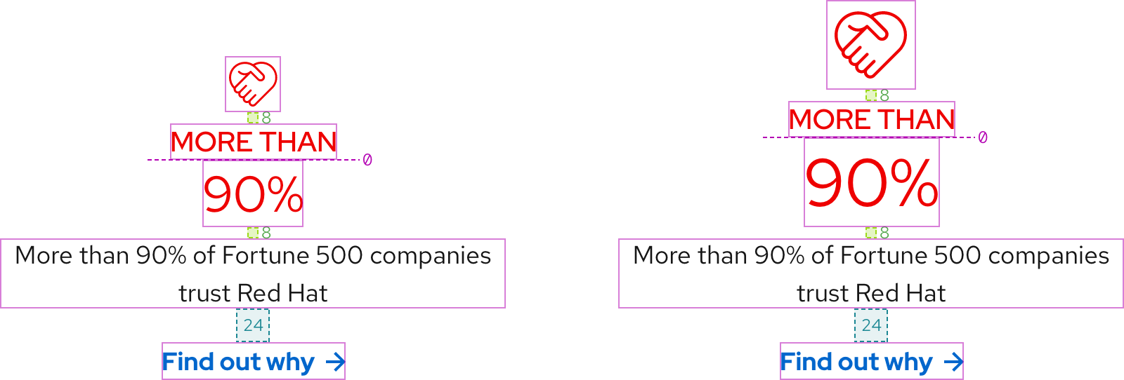
Space
Space values are the same for both Default and Large sizes and on all breakpoints. To see space values when statistics are used in a layout, go to the Guidelines page.
Example
Token
Description
md
8px spacer
xl
24px spacer
Interaction states
The optional call to action is the only interactive element. Go to the Call to action page to view the interaction states.
Other libraries
To learn more about our other libraries, visit this page.
Feedback
To give feedback about anything on this page, contact us.
