Statistic
On this page
Usage
Use a statistic to represent a data point that users can consume quickly. Statistics help users trust our page content, so use them strategically because there is a balance between using some and too many. If a layout has lots of content in different arrangements, using a statistic should offer users a visual break or respite.
Footnote
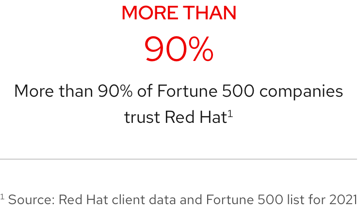
Include a footnote on every page especially if a statistic comes from an external source. Doing this increases the credibility of the statistic and better integrates the data with the rest of the page content.
Icons
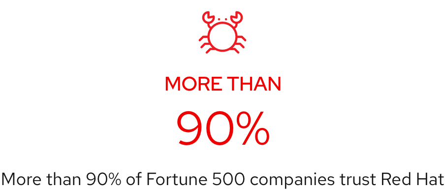
Use an icon to add visual context and emphasis while helping to explain a statistic further.
Large icon
There are situations where a large icon is used in place of data text and the data point is written into the body text. This is an edge case, so work with a content strategist to write short data text and body text or use another element instead.
Writing content
Statistic text is meant to be short so it can have impact especially when statistics are grouped together. It is recommended to write as few words as possible for text styles.
- Title text - do not allow title text to break to two lines in any environment
- Data text - if a percent or number includes a decimal, round up to decrease the character count
- Body text - be mindful of using too many words considering how statistics look when grouped
- Call to action text - use fewer words to avoid taking away impact and focus when reading
Character and line counts
| Element | Character count | Line count |
|---|---|---|
| Title text | 20 | 1 |
| Data text | 7 | 1 |
| Body text | 100 | 2 |
| Call to action text | 30 | 1 |
Title text
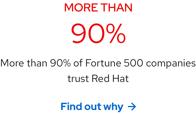
Title text is used to add quantitative emphasis or help explain data text. Include title text if using data text alone does not make sense. In the example below, if the data text 40 was by itself, then text title would be needed to describe what 40 pertains to or else the statistic would not make sense.
Helpful tip
Title text can be positioned above or below data text even if statistics are grouped.

Data text
Data text is the number or percent that represents data.

Body text
Body text explains data text. A percent or number means nothing without something that explains the rest of the statistic.

Call to action text
Use a call to action to entice users to learn more after they read a statistic. If statistics are grouped, it is not mandatory for each statistic to include a call to action.
Internationalization
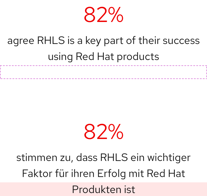
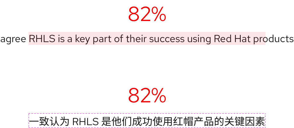
Translated text can increase or decrease character counts, line length, and the number of lines. Be mindful when writing body text that might get translated. This is important for statistics used in groups as more words will cause them to be arranged closer to each other therefore reducing any comfortable spacing around them.
Layout
Grouping
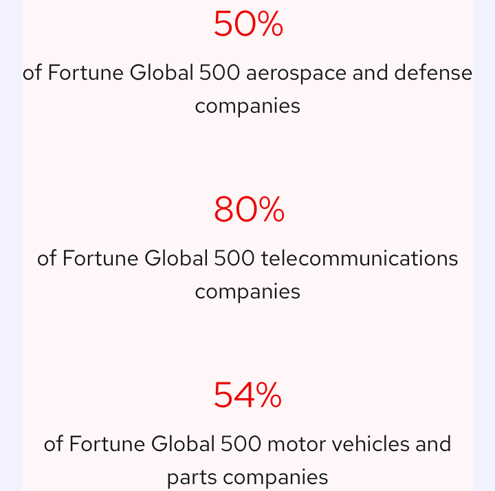
The minimum number of statistics per row is one and the maximum is four regardless if they are in a container or not.

Card
A statistic can be placed in a card if the body text or other text styles are short enough. Otherwise, keep them on the page to avoid readability issues.

Alignment
By default, a statistic is always center aligned. However, a statistic may be left aligned if grouped and if the surrounding content is also left aligned.

Padding
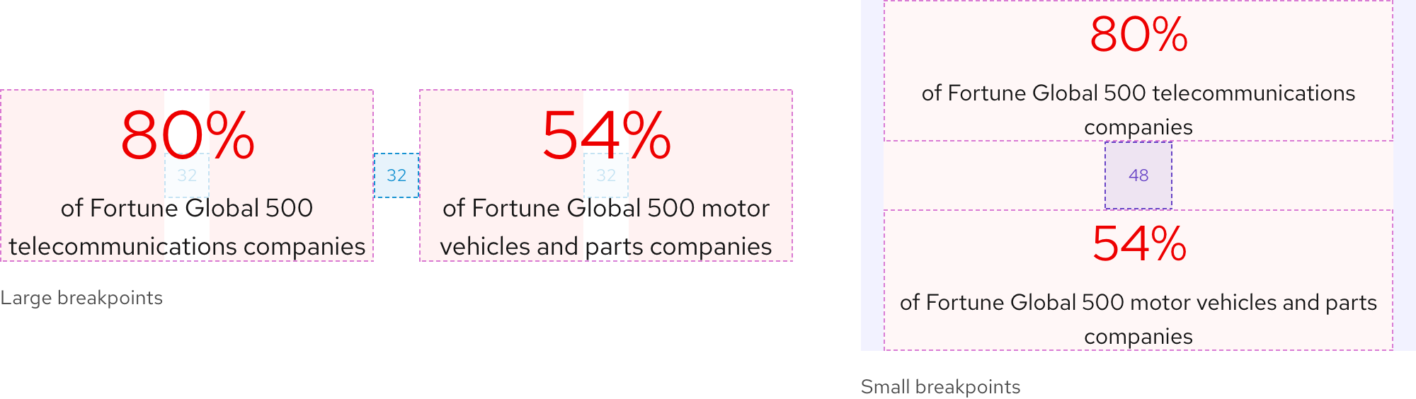
The page grid usually determines the space between blocks or containers of content, but in most situations, it is 32px on large breakpoints. On small breakpoints, the padding is 48px for better vertical rhythm.
Responsive design
Large breakpoints
If only one statistic is used, it can span a maximum of six columns.

Small breakpoints
Statistics arranged in a row on large breakpoints will stack on small breakpoints. Text sizes will also be reduced based on the mobile typography scale.
Best practices
Custom statistic
Do not duplicate or rearrange any element to create a custom statistic.

Unrelated icon
Do not use an icon that is unrelated to the rest of the statistic content.
Inconsistent elements
Keep statistics consistent when grouping. Either use the same number of elements for all statistics or do not use them at all. For example, if a statistic has an icon and the others do not, either remove the icon or ensure they all have an icon.

Too much text
Do not include too much body text, a statistic should clarify a single data point quickly and with impact, not tell a long story.

Other libraries
To learn more about our other libraries, visit this page.
Feedback
To give feedback about anything on this page, contact us.
