Spinner
On this page
Style
A spinner is an animated line segment that follows a track and may include an optional text label.
Anatomy
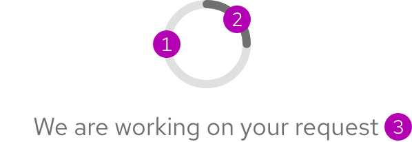
- Track
- Indicator
- Optional text label
Sizes
A spinner comes in large, medium, and small sizes. Each size includes an optional text label on the bottom.
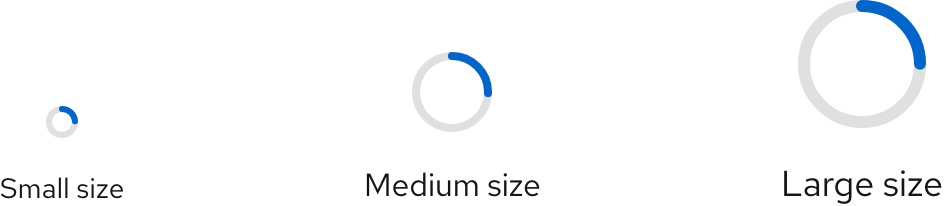
| Size | Element | Current value |
|---|---|---|
| Small | Text label size | 14px0.875rem |
| Medium | Text label size | 16px1.0rem |
| Large | Text label size | 18px1.125rem |
Color scheme
A spinner is available in both light and dark color schemes.
Light scheme

Dark scheme

Configuration
Container
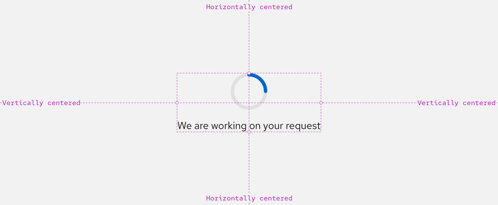
A spinner is centered horizontally and vertically within a container and the viewport by default. This demonstrates that the whole container is loading rather than one specific area.
Button
If a small size spinner is used within a button, it can be positioned to the left of the text as if it were an icon.
Space
Example
Token
Description
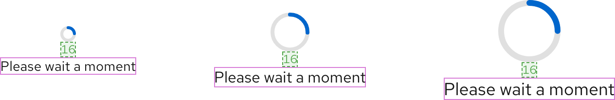
lg
16px spacer
Interaction states
A spinner is intentionally not operable or navigable and has no interaction states.
Other libraries
To learn more about our other libraries, visit this page.
Feedback
To give feedback about anything on this page, contact us.
