Spinner
On this page
Usage
Use a spinner to show that something is loading after a user takes action.
When to use a spinner
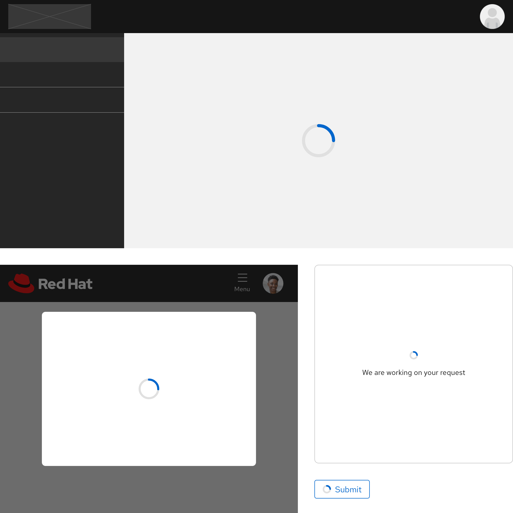
When users advance to a new page and the structure is unknown both in quantity and shape, use a spinner. If users expect to see components on a new screen after they perform an action, a Skeleton should be used instead in order to reflect the structure. If the wait time after performing an action is less than a few seconds, a spinner should be used. For experiences that need longer than a few seconds to load, use a Progress bar instead. Lastly, when the result of an experience has no data or the screen is empty, use an Empty state instead.
Character count
The text label should be as brief and general as possible in order to give users enough time to read it.
| Element | Character count |
|---|---|
| Text label | 30 |
Sizes
Depending on what data is being retrieved and loaded and how much space it occupies, use a spinner size that matches.
- The large size is the default, it can be used for whole pages or large containers
- The medium size is recommended for smaller pages or containers
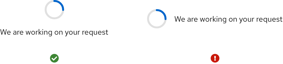
- If you use the small size with a text label, it can be used in very small containers like a card
- If you use the small size without a text label, it should only be used in buttons or other containers of equal size
Orientation
A spinner is always oriented above the optional text label, if visible.
Animation
The spinner animation will loop until the data is retrieved and disappears when it loads.
Best practices
Placement

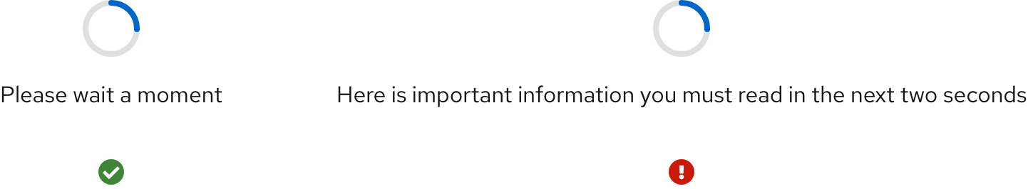
Keep the spinner centered to help users understand that the whole area is loading.

Do not align a spinner away from the horizontal and vertical center.
Text orientation

Keep the spinner always positioned above the text label.

Do not change the orientation of the text label relative to the spinner.
Spinner size

Use a spinner size that’s proportional to the size of its container.

Avoid using a small spinner for large containers or large spinners for small containers.
Other libraries
To learn more about our other libraries, visit this page.
Feedback
To give feedback about anything on this page, contact us.
