Skip link
On this page
Style
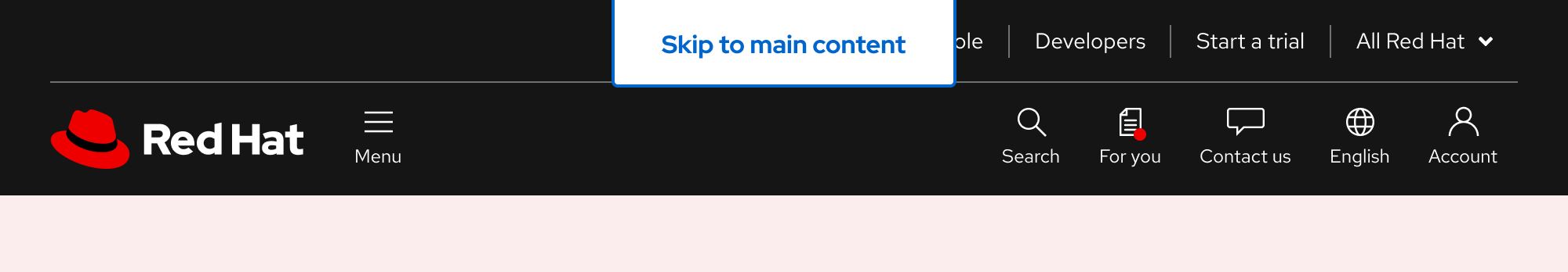
A skip link is designed to be easily seen once a user navigates to it.
Anatomy

- Text label
- Container
- Border
Color scheme
A skip link appears the same in both light and dark color schemes.

Configuration
A skip link’s bottom corners have a border radius of 4px, which matches the border radius of the call to action element. The top corners have a border radius of 0px to keep the top edge flush with the top of the page.
Placement
A skip link should be centered and aligned with the top edge at all viewport sizes. It also overlaps items at the top of the page.
Space

Example
Token
Description
lg
16px spacer
2xl
32px spacer
Interaction states
Interaction states are visual representations used to communicate the status of an element or pattern.
Focus
Because a skip link is in focus once it appears on the screen, the default and focus states are the same. The blue, 2px-wide border mimics the focus ring for other elements.

Hover

Active
Helpful tip
The Active state has the same styles as the Hover state.

Other libraries
To learn more about our other libraries, visit this page.
Feedback
To give feedback about anything on this page, contact us.
