Tabs
Overview
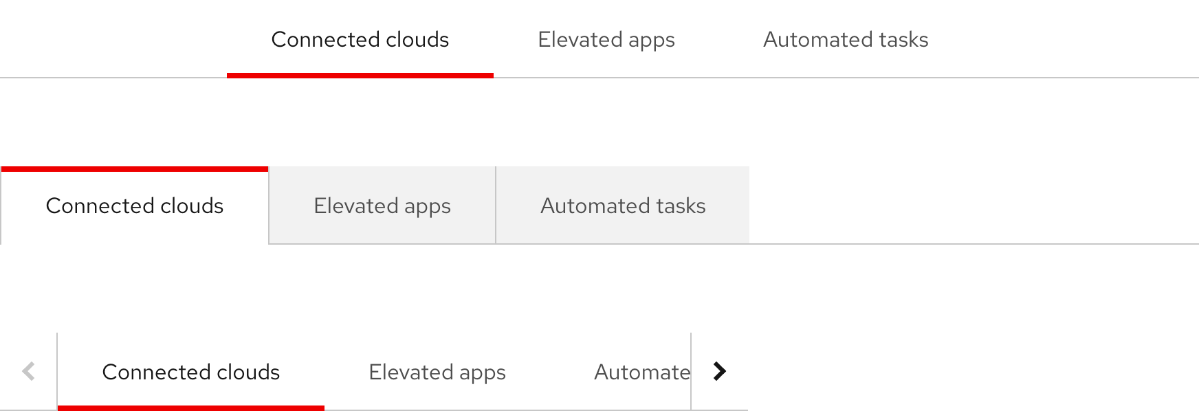
Tabs are used to organize and navigate between sections of content. They feature a horizontal or a vertical list of section text labels with a content panel below or to the right of the component.
Sample component
Open tabs
Tab heading 1
Mi ut adipiscing nec porttitor a dis tempor mauris maecenas ullamcorper nisi vulputate mus massa augue et parturient felis luctus adipiscing.Vivamus suspendisse fringilla a dictum justo diam vestibulum et mollis magna mus natoque a potenti nam.
Tab heading 2
Fugiat ullamco qui occaecat Lorem qui pariatur quis cillum. Duis commodo dolor ad anim cillum. Incididunt elit ullamco in laborum in. Dolor ipsum laborum nisi exercitation do aute velit. Elit veniam velit qui ex ullamco.
Tab heading 3
Erat malesuada a nisl ornare nam per urna in nam conubia vulputate ullamcorper felis vestibulum leo massa massa tincidunt adipiscing porttitor cubilia mattis semper ultrices felis habitasse a semper a.Condimentum ridiculus nisl ullamcorper adipiscing natoque adipiscing quam litora a suspendisse a torquent tincidunt diam ornare at.
Box tabs
Tab heading 1
Mi ut adipiscing nec porttitor a dis tempor mauris maecenas ullamcorper nisi vulputate mus massa augue et parturient felis luctus adipiscing.Vivamus suspendisse fringilla a dictum justo diam vestibulum et mollis magna mus natoque a potenti nam.
Tab heading 2
Fugiat ullamco qui occaecat Lorem qui pariatur quis cillum. Duis commodo dolor ad anim cillum. Incididunt elit ullamco in laborum in. Dolor ipsum laborum nisi exercitation do aute velit. Elit veniam velit qui ex ullamco.
Tab heading 3
Erat malesuada a nisl ornare nam per urna in nam conubia vulputate ullamcorper felis vestibulum leo massa massa tincidunt adipiscing porttitor cubilia mattis semper ultrices felis habitasse a semper a.Condimentum ridiculus nisl ullamcorper adipiscing natoque adipiscing quam litora a suspendisse a torquent tincidunt diam ornare at.
Component status
Demo
View a live version of this component and see how it can be customized.
Style
Tabs can be used in light and dark themes and there are two variants to choose from. Open tabs feature a more understated or cleaner visual style whereas Box tabs feature a familiar box or container visual style.
Theme
Orientation
Both Tab variants have horizontal and vertical orientations. The styles are the same between orientations, only the arrangement of elements is different.
Open tabs feature section text labels that float above the anchor line in the horizontal orientation or to the right of the anchor line in the vertical orientation.
Box tabs feature section text labels that are contained in a background and are aligned to the bottom of the anchor line in the horizontal orientation or to the left of the anchor line in the vertical orientation.
Usage
Tabs are used for navigating between sections of content in a contained view while staying on the same page. Tabs aren't an optimal component for comparing content simultaneously, use an Accordion instead.
Navigation
Navigating through each section should display different blocks of content, but not direct users to another page, unless they select a link in the content area.
Label formatting
Section text labels should be written concisely and be representative of the content within. Be mindful of lengthy character counts and how they can impact the appearance of both variants, especially on smaller screens or if they're translated.
Content area
A content panel is located below or to the right of the component, depending on horizontal or vertical orientation. It may contain the same elements that can also be used in other sections of the page, like text, cards, images, etc. Text shouldn’t exceed eight grid columns to maintain optimal readability.
Best practices
Tabs require at least two sections be available for users to navigate through.
Don’t use more than five section text labels in the horizontal orientation.
Don’t add extra spacing in between section text labels.
Don’t change the alignment of section text label groups.
Behavior
Section text labels
When a different section is clicked on or tapped, the active indicator bar highlights the chosen section and the content below or to the right of the component changes at the same time.
Overflow scroll buttons
Overflow scroll buttons can only be used in the horizontal orientation. They help users view any section text labels that are cut off. Don’t use lengthy or too many section text labels and be mindful of how they can impact the appearance of tabs, especially on smaller screens or if they’re translated.
Overflow scroll buttons will appear if the number of section text labels exceeds the width of either horizontal variant
Responsive design
Default avatars with text can be used on desktop and mobile. If text that's positioned on the right becomes too compressed, it will flow under and its alignment will change to centered. On mobile, Default avatars with text always stack vertically.
Mobile
Tabs can’t be used on screens that are less than 576px wide because the limited space will cause too many section text labels to get cut off. In this environment, tabs will convert to an accordion.
Breakpoints
Tabs can be used on a variety of screen sizes, but be mindful of how the group of section text labels will scale down on smaller screens.
Desktop
Large screens have lots of space where all of the section text labels can be seen
Tablet
Sometimes one or two section text labels will get cut off or break to two lines, which is acceptable
Mobile
Don’t use tabs on mobile because too many section text labels will get cut off or severely compressed
Interaction states
The interaction states in the horizontal orientation are the same as the vertical orientation of the same variant. View the live components below to experience their various interaction states.
Open tabs
Tab heading 1
Mi ut adipiscing nec porttitor a dis tempor mauris maecenas ullamcorper nisi vulputate mus massa augue et parturient felis luctus adipiscing.Vivamus suspendisse fringilla a dictum justo diam vestibulum et mollis magna mus natoque a potenti nam.
Tab heading 2
Fugiat ullamco qui occaecat Lorem qui pariatur quis cillum. Duis commodo dolor ad anim cillum. Incididunt elit ullamco in laborum in. Dolor ipsum laborum nisi exercitation do aute velit. Elit veniam velit qui ex ullamco.
Tab heading 3
Erat malesuada a nisl ornare nam per urna in nam conubia vulputate ullamcorper felis vestibulum leo massa massa tincidunt adipiscing porttitor cubilia mattis semper ultrices felis habitasse a semper a.Condimentum ridiculus nisl ullamcorper adipiscing natoque adipiscing quam litora a suspendisse a torquent tincidunt diam ornare at.
Box tabs
Tab heading 1
Mi ut adipiscing nec porttitor a dis tempor mauris maecenas ullamcorper nisi vulputate mus massa augue et parturient felis luctus adipiscing.Vivamus suspendisse fringilla a dictum justo diam vestibulum et mollis magna mus natoque a potenti nam.
Tab heading 2
Fugiat ullamco qui occaecat Lorem qui pariatur quis cillum. Duis commodo dolor ad anim cillum. Incididunt elit ullamco in laborum in. Dolor ipsum laborum nisi exercitation do aute velit. Elit veniam velit qui ex ullamco.
Tab heading 3
Erat malesuada a nisl ornare nam per urna in nam conubia vulputate ullamcorper felis vestibulum leo massa massa tincidunt adipiscing porttitor cubilia mattis semper ultrices felis habitasse a semper a.Condimentum ridiculus nisl ullamcorper adipiscing natoque adipiscing quam litora a suspendisse a torquent tincidunt diam ornare at.
Tab order
When the Tab key is pressed repeatedly, the focus indicator highlights each section text label from left to right in the horizontal component or from top to bottom in the vertical component.
Spacing
Tabs use PatternFly 4 spacers to define spacing values between elements.
Open tabs
Box tabs
Feedback
To give feedback about anything on this page, contact us.
Foundations
To learn how to use our other components in your designs, visit the Components section.