Footer
On this page
On this page
Overview
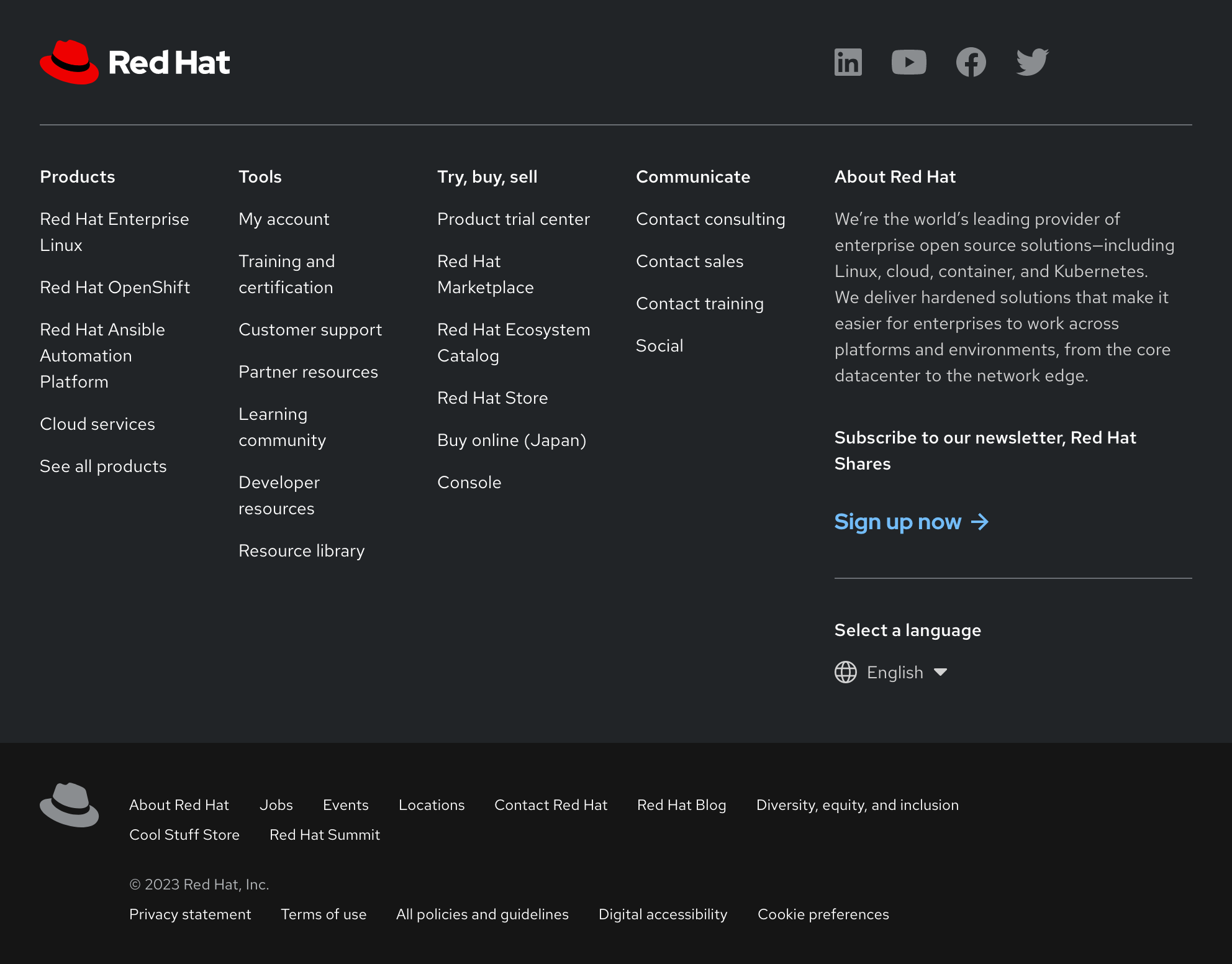
A footer displays secondary content and legal information to users who reach the bottom of a page.
Status
What do these mean?
- Figma library:
-
Ready - RH Elements:
-
Ready - RH Shared Libs:
-
Ready
Sample element
Products
- Red Hat Enterprise Linux
- Red Hat OpenShift
- Red Hat Ansible Automation Platform
- Cloud services
- See all products
Tools
- My account
- Training and certification
- Customer support
- Developer resources
- Learning community
- Partner resources
- Resource library
Try, buy & sell
- Product trial center
- Red Hat Marketplace
- Red Hat Ecosystem Catalog
- Find a partner
- Red Hat Store
- Console
Communicate
About Red Hat
We’re the world’s leading provider of enterprise open source solutions—including Linux, cloud, container, and Kubernetes. We deliver hardened solutions that make it easier for enterprises to work across platforms and environments, from the core datacenter to the network edge.
Subscribe to our newsletter, Red Hat Shares
Red Hat legal and privacy links
- About Red Hat
- Jobs
- Events
- Locations
- Contact Red Hat
- Red Hat Blog
- Diversity, equity, and inclusion
- Cool Stuff Store
- Red Hat Summit
Red Hat legal and privacy links
When to use
- When you need a place to put secondary content that does not fit anywhere else
- When you want to give users persistent access to secondary content outside of the navigation
- When you need a place to put copyright or legal information
Example of a footer element
Status checklist
| Property | Status | Meaning |
|---|---|---|
| Figma library |
|
Component is available in the Figma library |
| RH Elements |
|
Component is available in the RH Elements repo |
| RH Shared Libs |
|
Component is available in the RH Shared Libs repo |
Other libraries
To learn more about our other libraries, visit this page.
Feedback
To give feedback about anything on this page, contact us.
