Navigation (secondary)
On this page
Style
A secondary navigation is a group of links and menus placed in a bar container that spans the width of the browser window.
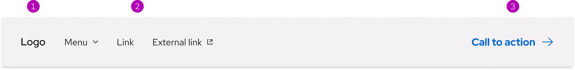
Anatomy
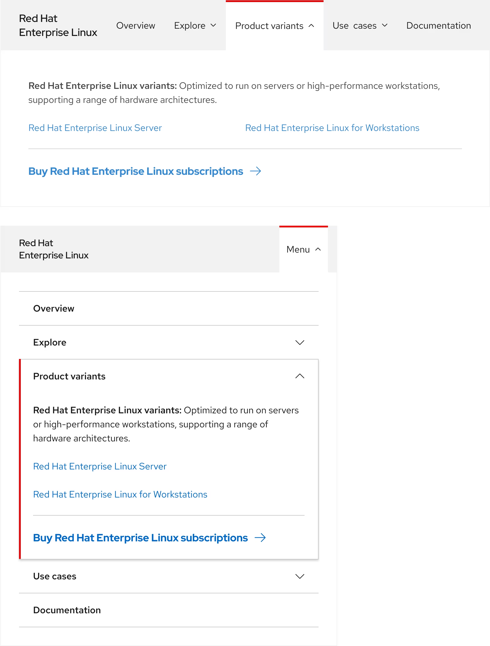
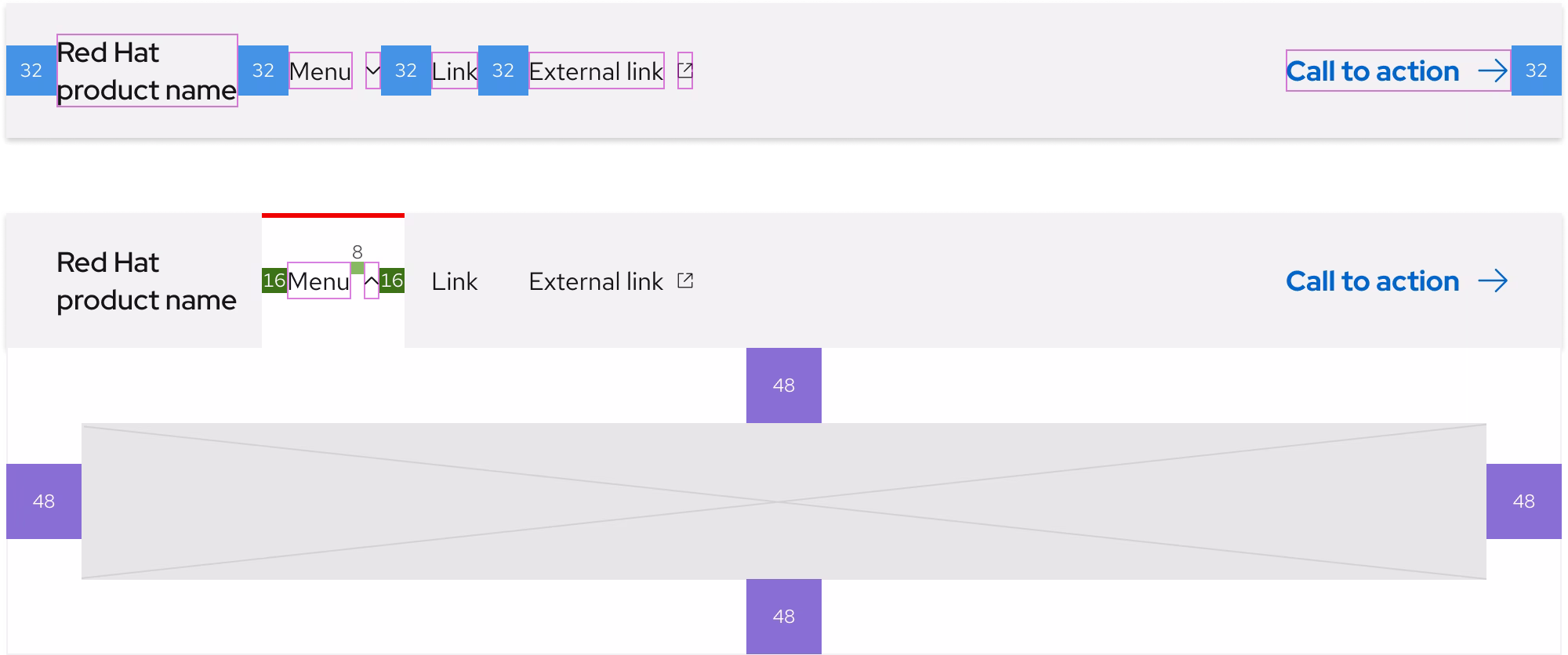
A secondary navigation is divided into three slots. It is not required to use all three slots.
- Logo (
logo) - includes primary elements, like a linked logo or a product name - Navigation (
nav) - includes navigation elements, such as inline links, menus, and external links - Call to action (
cta) - includes a call to action, typically the default variant (optional)
Slots and breakpoints
On small breakpoints, elements in the nav slot will collapse into an accordion within a menu (also called the mobile-menu slot). Optional elements in the cta slot will be placed below the accordion or hidden completely.
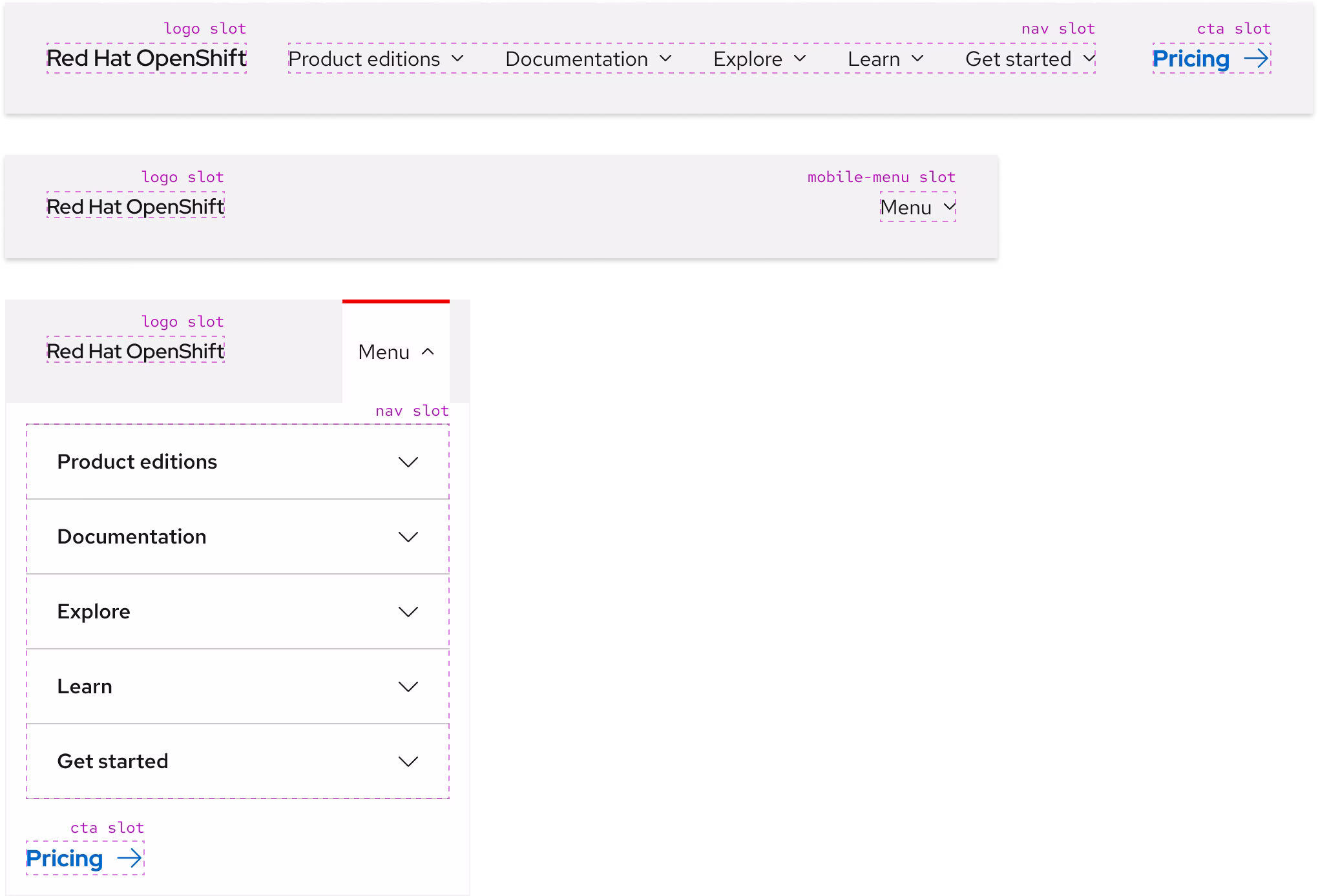
Using the expandable menu
The expandable menu is an area where content can be placed like text, links, calls to action, and more. The menu requires a backdrop so it can separate itself from the page underneath, this helps users focus on the menu content.
| Property | Current value |
|---|---|
| Color - backdrop | --rh-color-gray-90 |
| Opacity - background | --rh-opacity-80 |
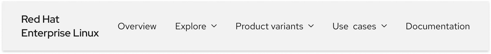
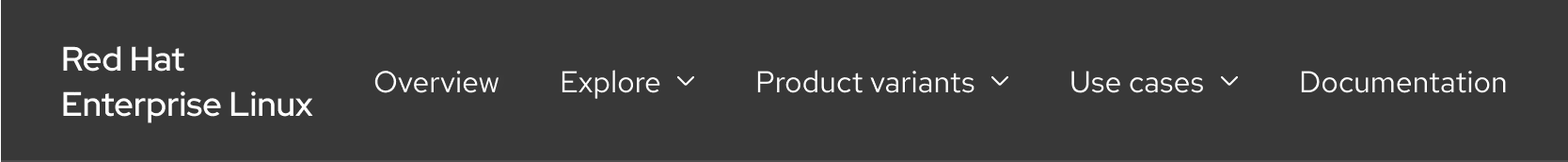
Color scheme
A secondary navigation is available in both light and dark schemes. The light scheme background includes a box shadow whereas the dark scheme background includes a gray bottom border.
Light scheme
The light scheme secondary navigation should be used in environments with a lighter look and feel. The box shadow is always visible unless covered by an expanded menu.
Dark scheme
The dark scheme secondary navigation should be used in environments with a darker look and feel. The gray bottom border is always visible unless covered by an expanded menu.
Configuration
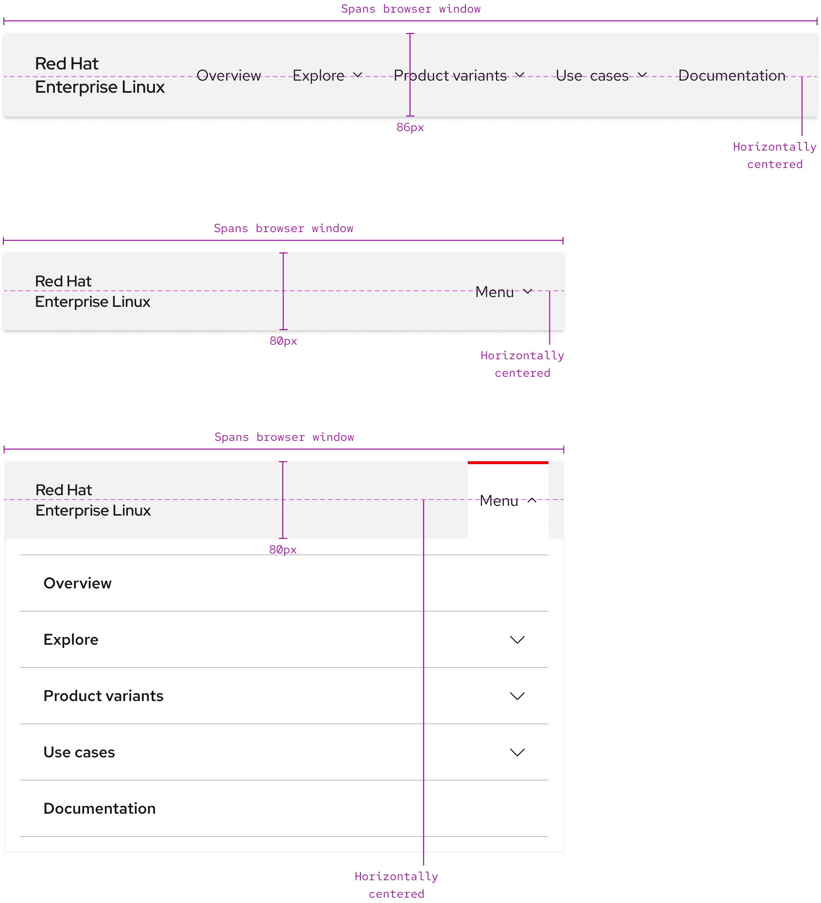
A secondary navigation spans the entire width of a browser window on all breakpoints. It has a fixed height of 86px on large breakpoints and a fixed height of 80px on small breakpoints even if the logo slot’s text is only one line. Content in all slots is horizontally centered with the background.
Expandable menu styles
An expandable menu includes content like text, links, calls to action, and more. The menu tab, panel, and backdrop have the same styles on all breakpoints.
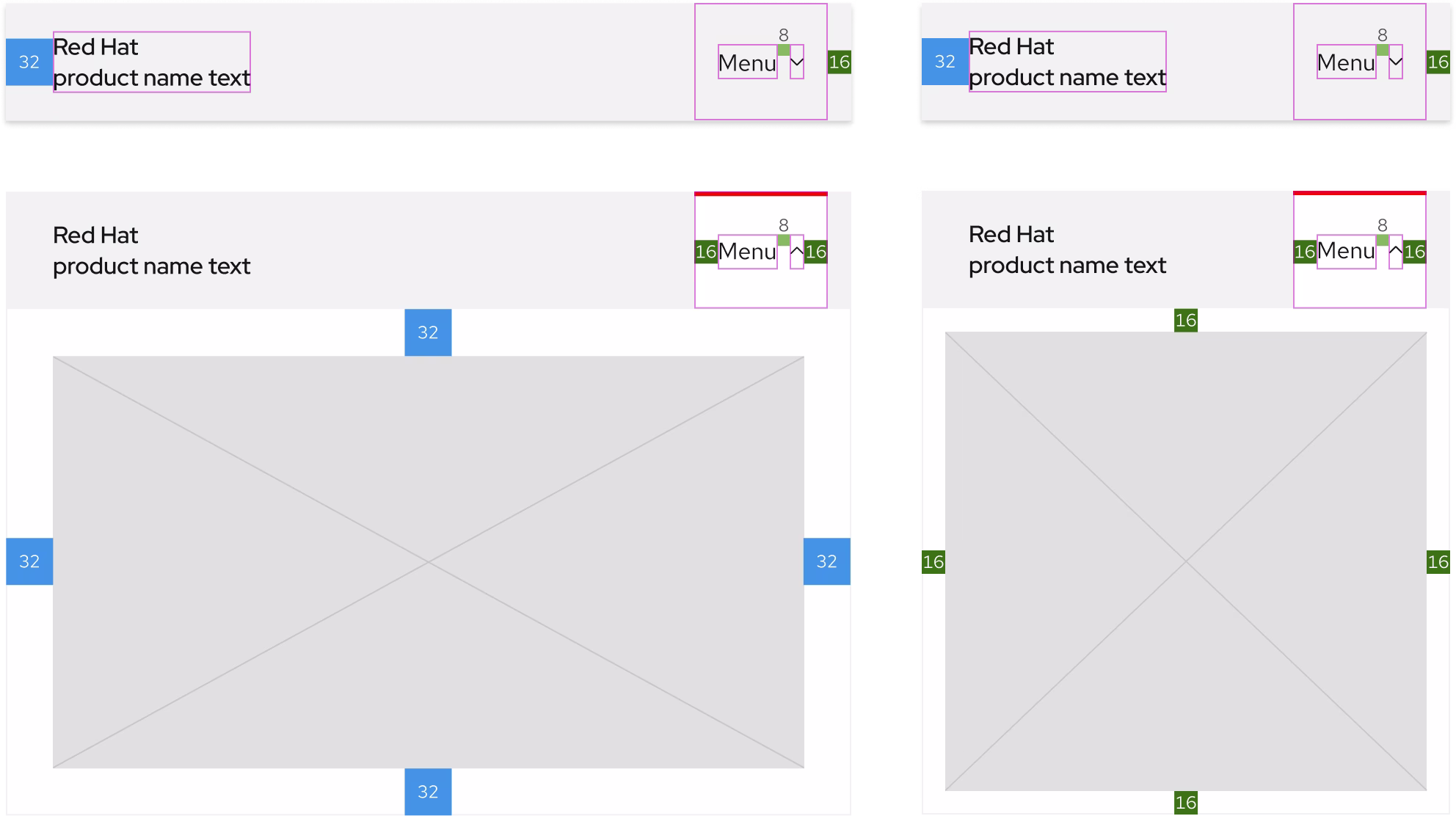
Space
The amount of space in a secondary navigation remains about the same on all breakpoints.
Large breakpoints
Small breakpoints
Example
Token
Description
md
8px spacer
lg
16px spacer
2xl
32px spacer
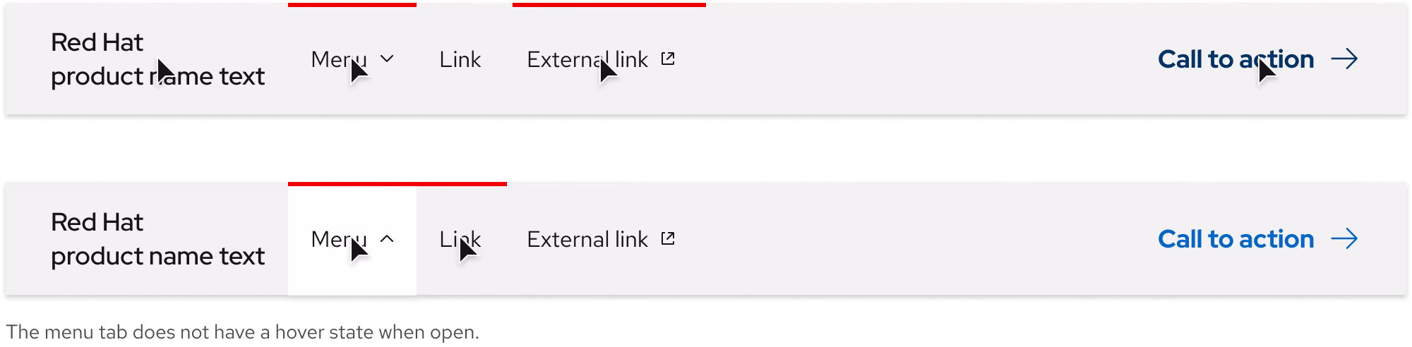
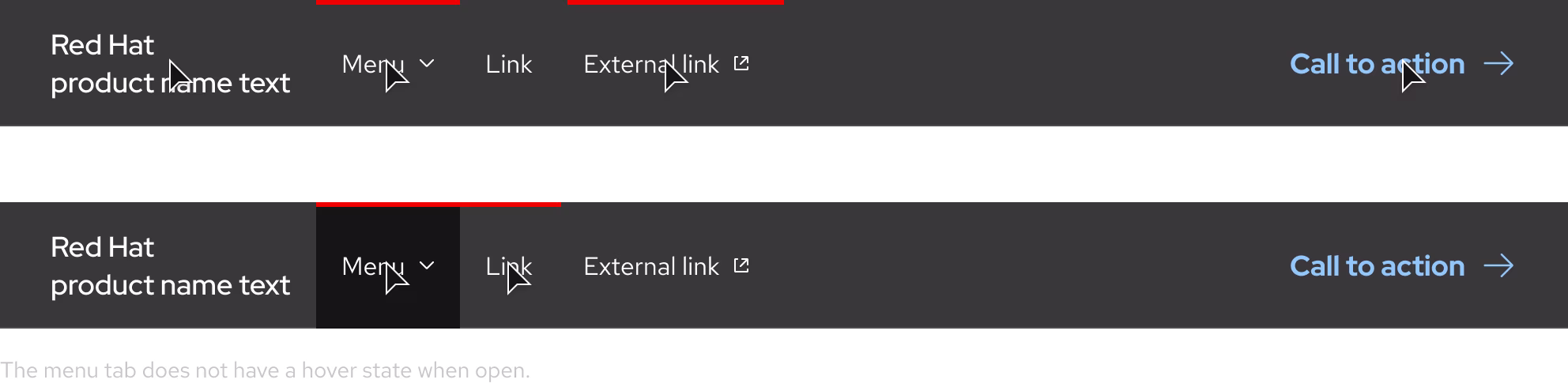
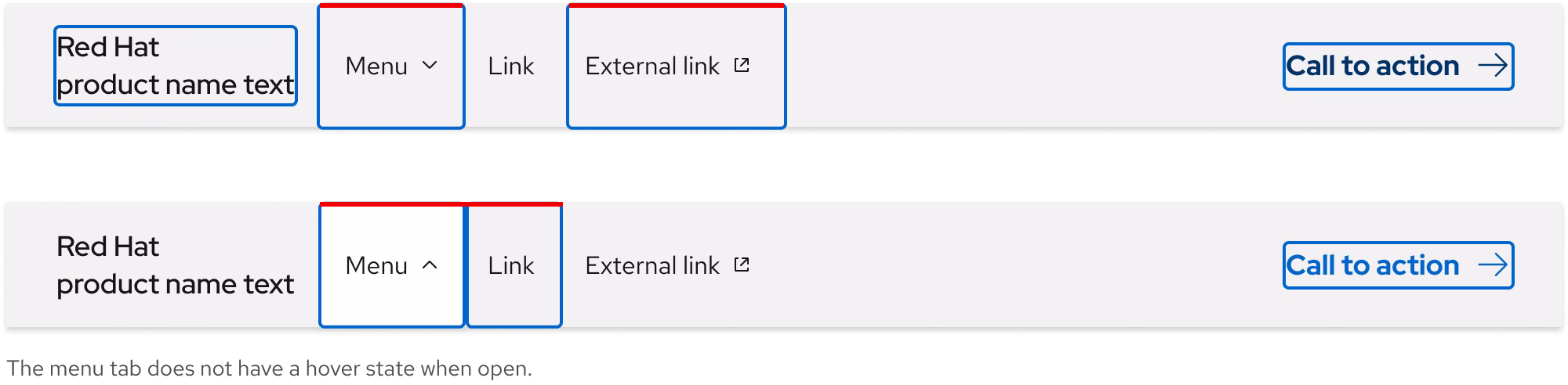
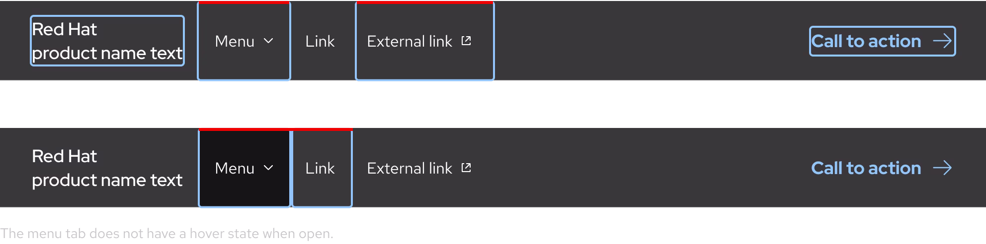
Interaction states
Interaction states are visual representations used to communicate the status of an element or pattern.
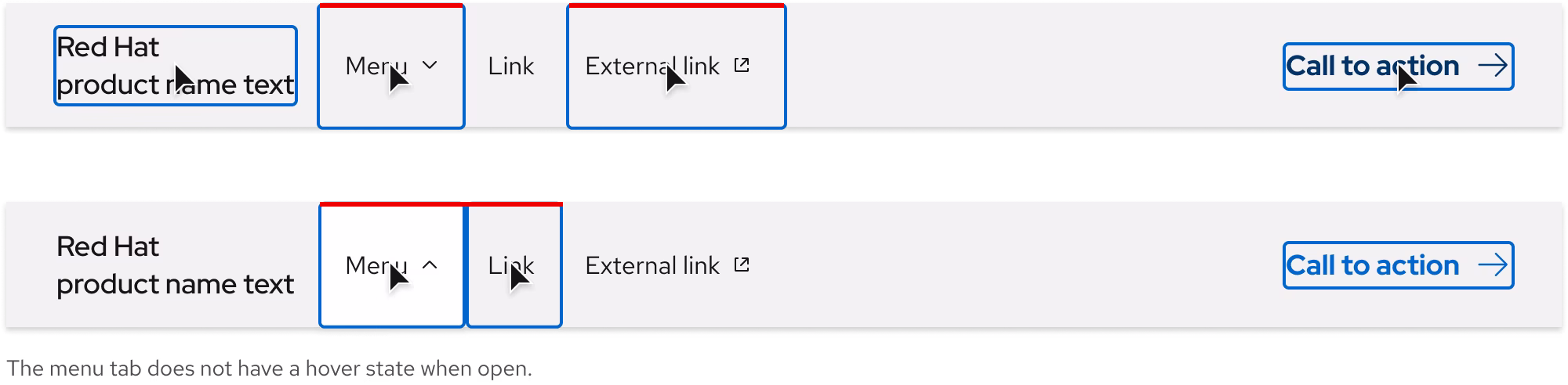
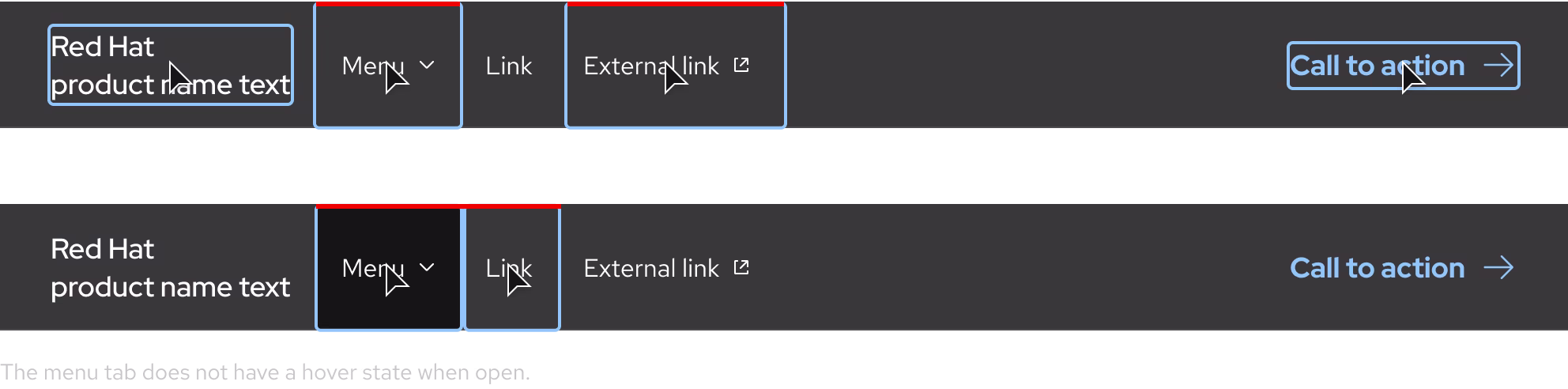
Hover
Focus
Active
Other libraries
To learn more about our other libraries, visit this page.
Feedback
To give feedback about anything on this page, contact us.
