Subnavigation
On this page
Style
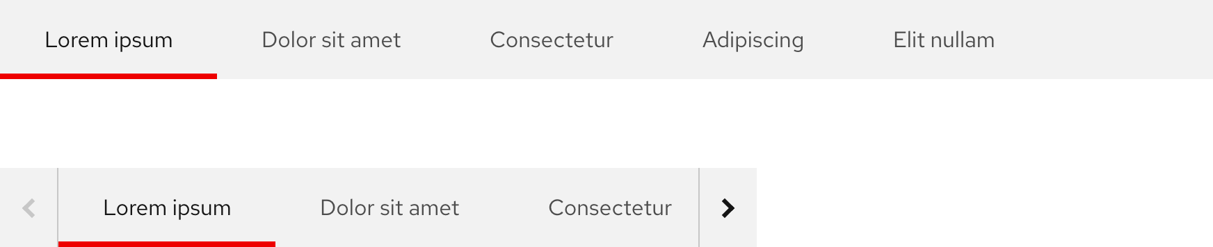
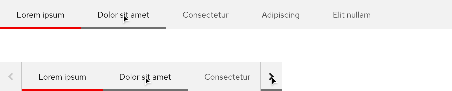
A subnavigation is visually similar to tabs, but the text labels are links instead. They are arranged horizontally on a thin bar with no other styling except for the active page accent.
Anatomy
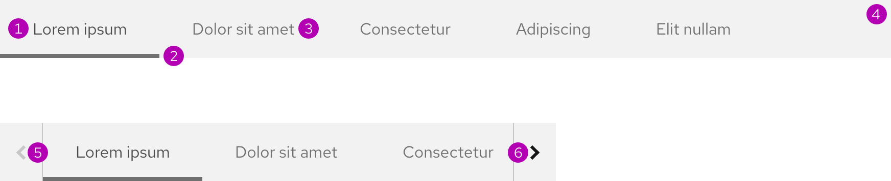
- Active page
- Active page accent
- Inactive page
- Surface
- Overflow button - left
- Overflow button - right
Color scheme
A subnavigation is available for both light and dark color schemes.
Configuration
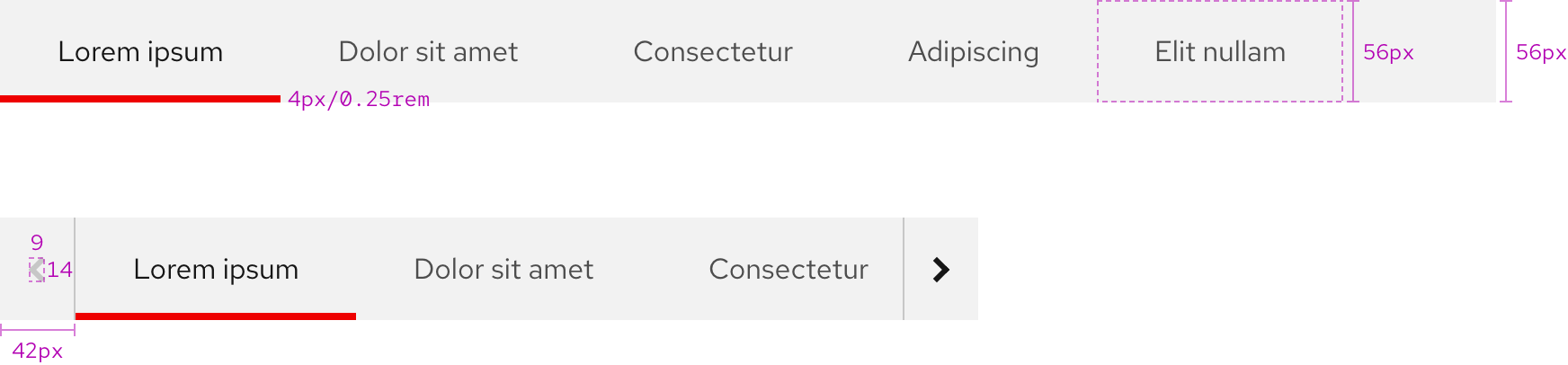
Each link container is the same height as the bar.
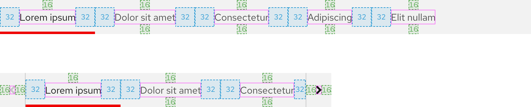
Space
Helpful tip
To view inset spacing when a subnavigation is used below the primary navigation or a heading, go to the Guidelines page.
Example
Token
Description
lg
16px spacer
2xl
32px spacer
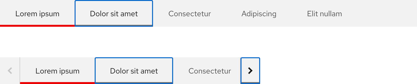
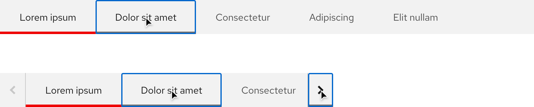
Interaction states
Interactive elements include inactive links and overflow buttons.
Hover
Inactive links and overflow buttons have the same hover state.
Focus
Helpful tip
The Focus state has the same styles as the Hover state.
Active
Helpful tip
The Active state has the same styles as the Hover state.
Other libraries
To learn more about our other libraries, visit this page.
Feedback
To give feedback about anything on this page, contact us.
