Subnavigation
On this page
Usage
Use a subnavigation when you want to provide users with granular navigation using only links.
When to use a subnavigation
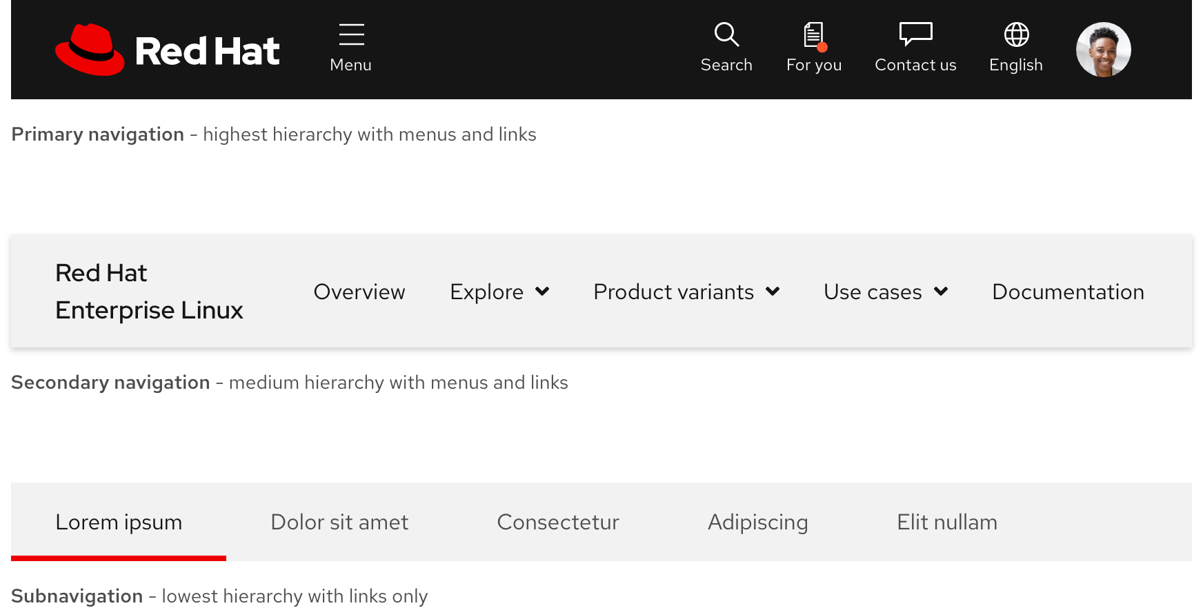
A subnavigation allows users to navigate between four or five related pages maximum. It is different than tabs because tabs allow users to switch between views on the same page whereas subnavigation links send users to other pages. A user might use the primary navigation or secondary navigation to access a high-level page and then use a subnavigation to browse through lower-level pages.
Subnavigation vs. other navigations
A subnavigation is a flat hierarchy whereas other navigations have deeper hierarchies with levels. Therefore, a subnavigation cannot include menus, only links. If your content requires a structure with more levels, use another navigation.
Number of links
To reduce cognitive load and a cluttered user interface, avoid using more than four or five links.

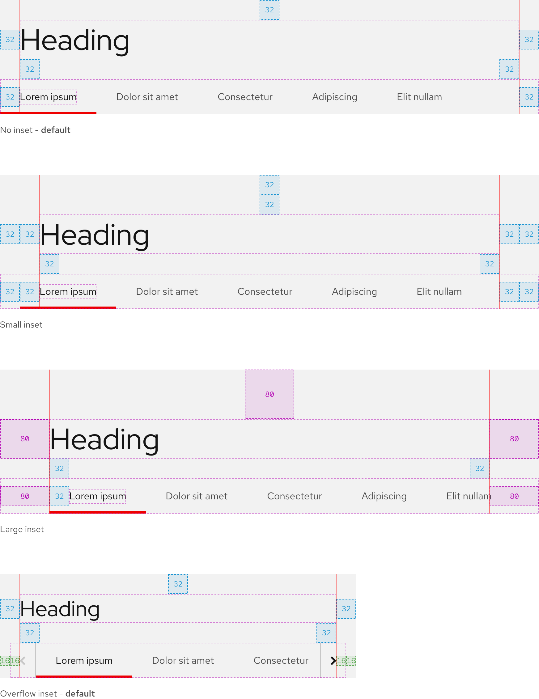
Inset
An inset is used to ensure consistent alignment and padding between headings, text labels, and overflow buttons.
Writing content
Link text labels
Link text labels should be concise, scannable, and descriptive. They should not exceed more than two or three short words. If they do, work with a content strategist to shorten them.
Character count
A subnavigation should have four or five links maximum. Text labels should be short but descriptive. The recommended maximum character count for the elements of a subnavigation are listed below and include spaces.
| Element | Character count | Word count |
|---|---|---|
| Link | 20 | 2 to 3 |
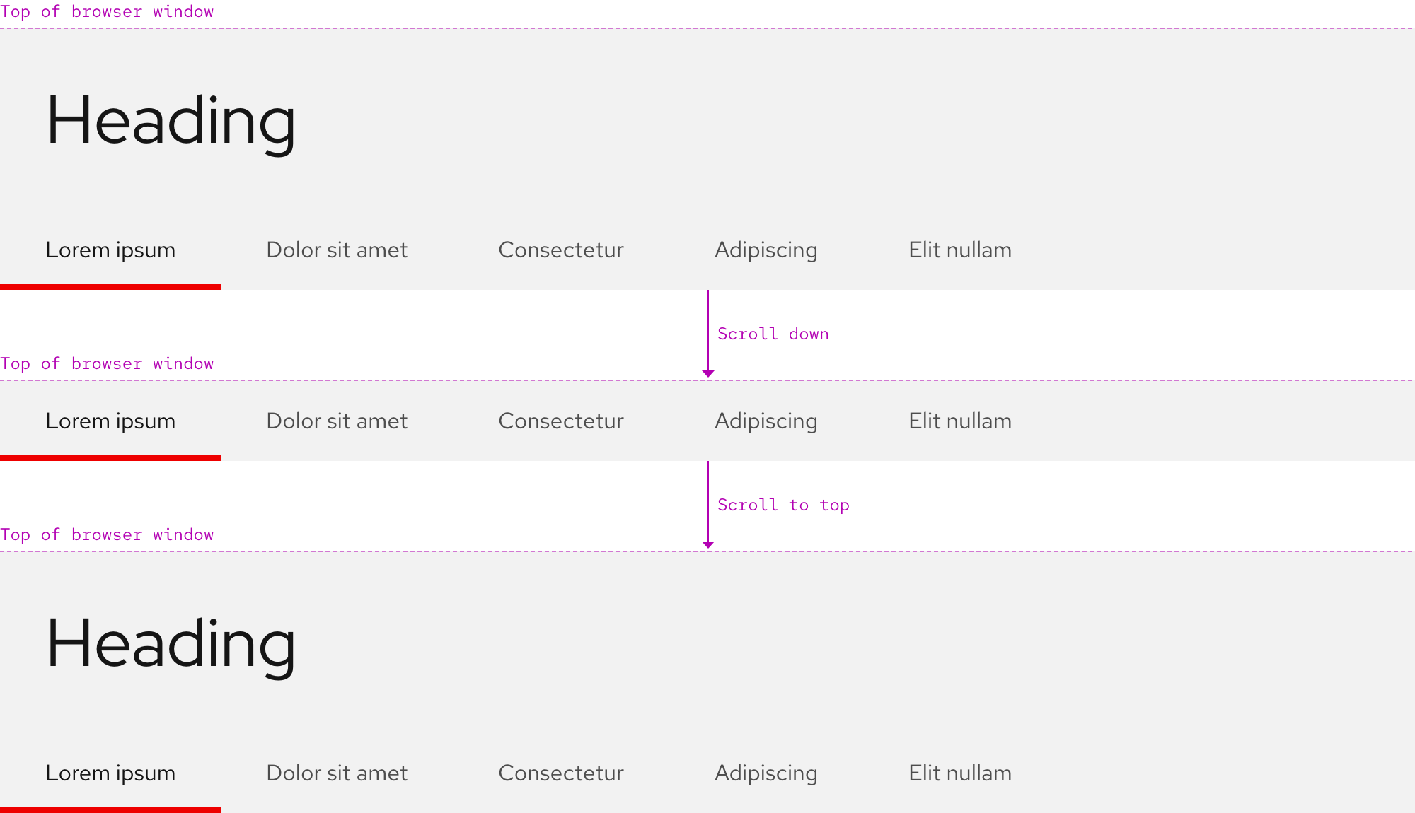
Layout
A subnavigation can be placed below the primary navigation or a heading.
Behavior
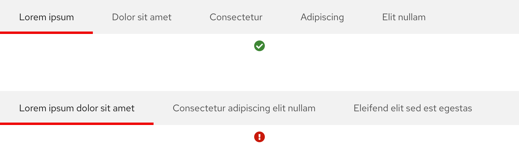
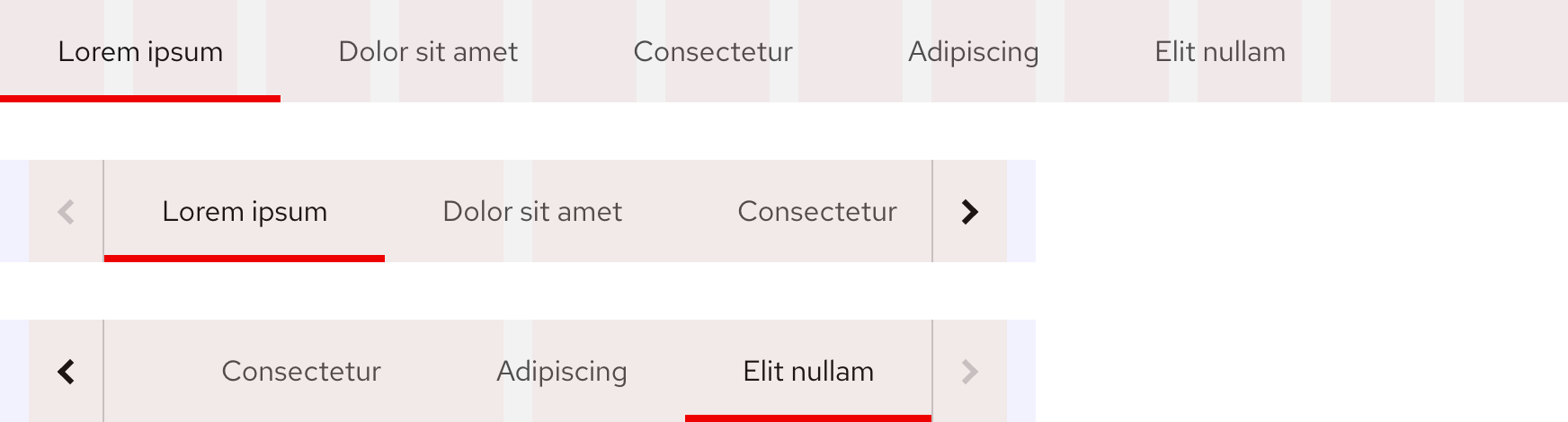
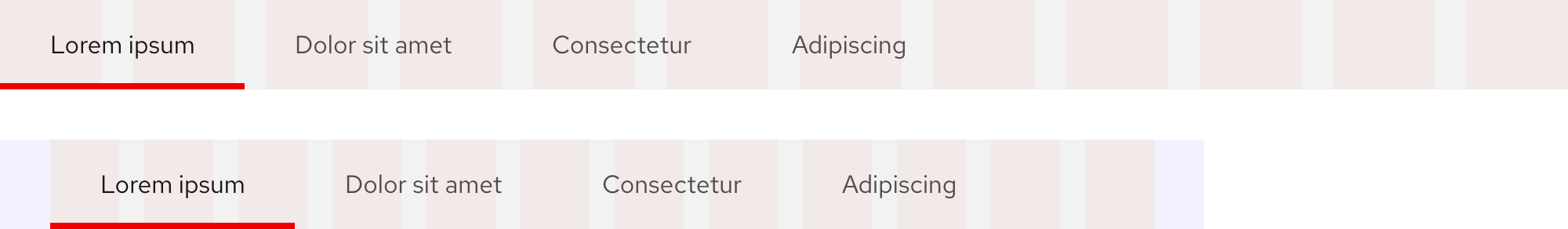
Current page indicator
When a user is viewing a page, a red bottom border is visible. It will move as a user moves from page to page.
Scrolling
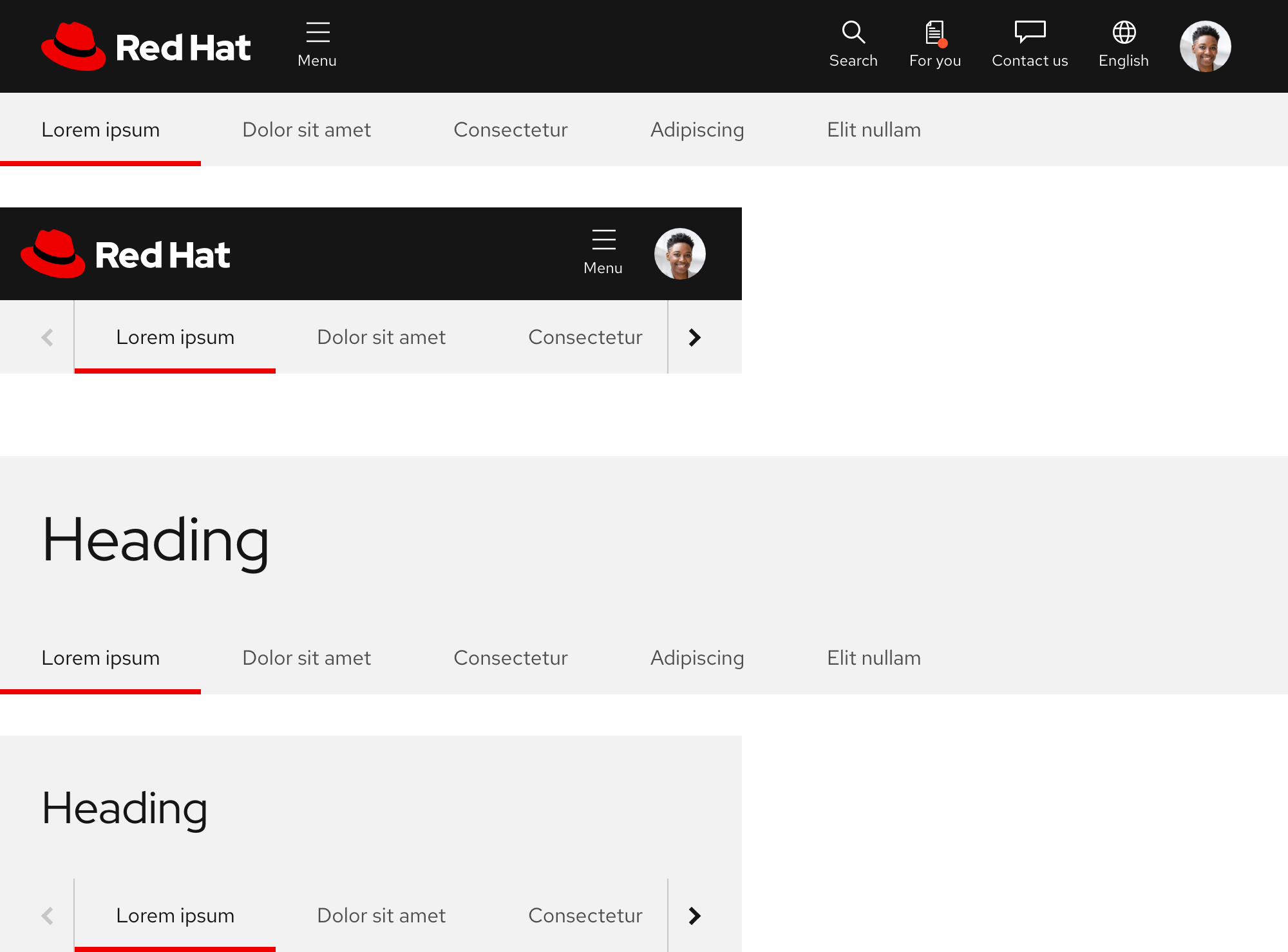
A subnavigation is positioned below the primary navigation or a heading when the page loads. Similar to other navigations, when a user scrolls down, the primary navigation or heading disappears and the subnavigation becomes fixed to the top of the browser window. When a user scrolls back up, the subnavigation is positioned under the primary navigation or heading again.
With primary navigation
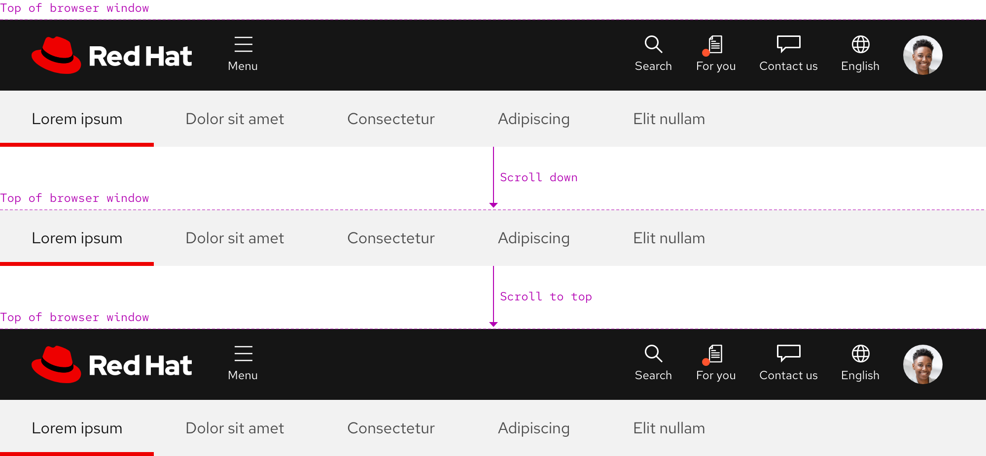
With heading
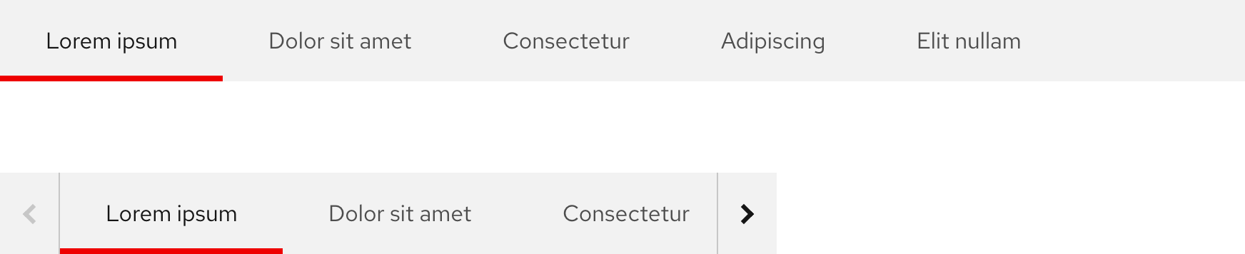
Overflow
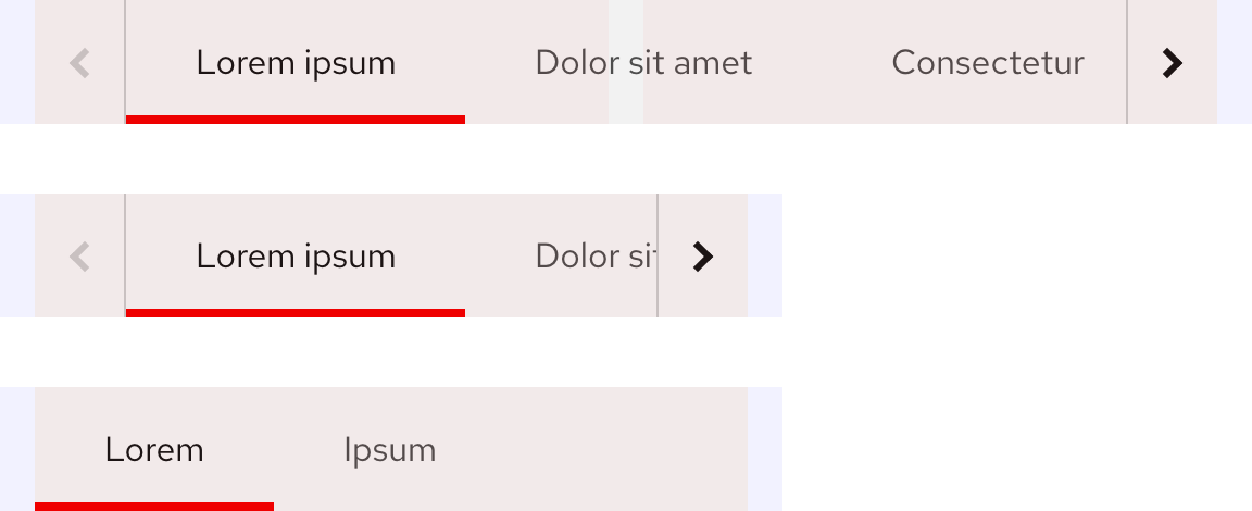
If the number of links exceeds the container width or breakpoint, overflow buttons with chevron icons are added to each side so users can horizontally scroll to reveal hidden links.
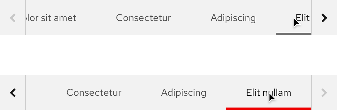
Navigating overflow links
When the first link is active, the left overflow button is disabled. When the last link is active, the right overflow button is disabled. When a link that is cut off is selected, the list of links shifts so the selected link is in full view.
Responsive design
Overflow buttons will appear within a subnavigation as soon as the width of links exceeds the width of the breakpoint. It is possible for overflow buttons to be hidden on small breakpoints if there are two links with very short text labels.
Large breakpoints
Small breakpoints
Best practices
Navigation order

Subnavigation should always appear below the primary navigation.

Do not position the subnavigation above the primary navigation.
Minimum number of links

There should be at least two links in subnavigation.

Do not add only one subnavigation link.
Maximum number of links

There is no specific maximum number of links, but use a reasonable number of links.

Avoid displaying too many links. Some will become hidden, even at large breakpoints.
Spacing and width

Retain the default spacing and width of each subnavigation link.

Do not add extra spacing or stretch the width of links.
Overflow buttons

Use overflow buttons if not all of the links can fit.

Do not make overflow buttons visible if all links can comfortably fit and are visible.
Other libraries
To learn more about our other libraries, visit this page.
Feedback
To give feedback about anything on this page, contact us.
