Accordion
On this page
Style
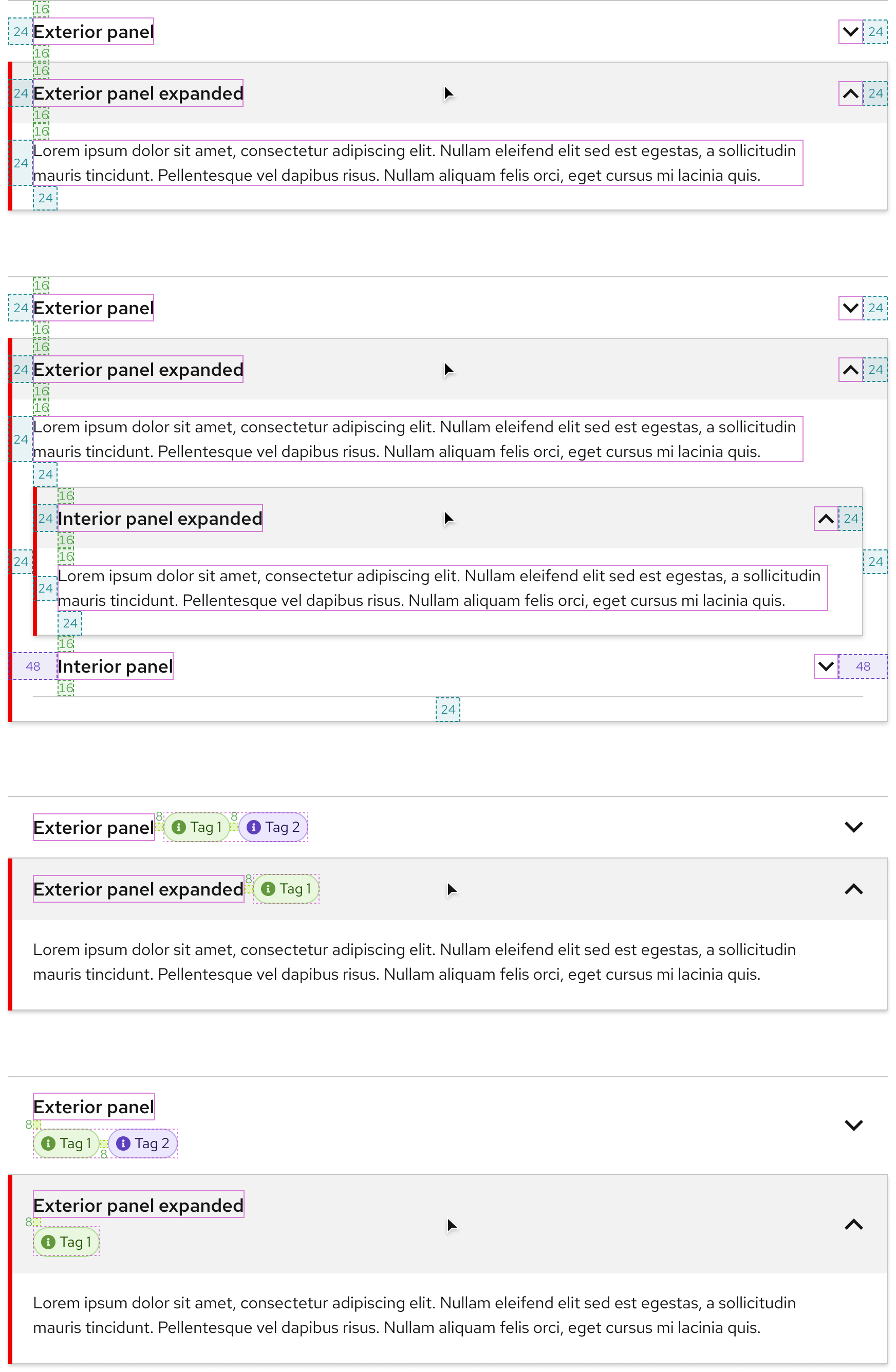
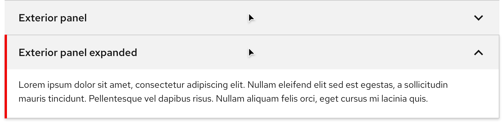
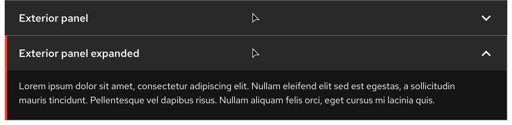
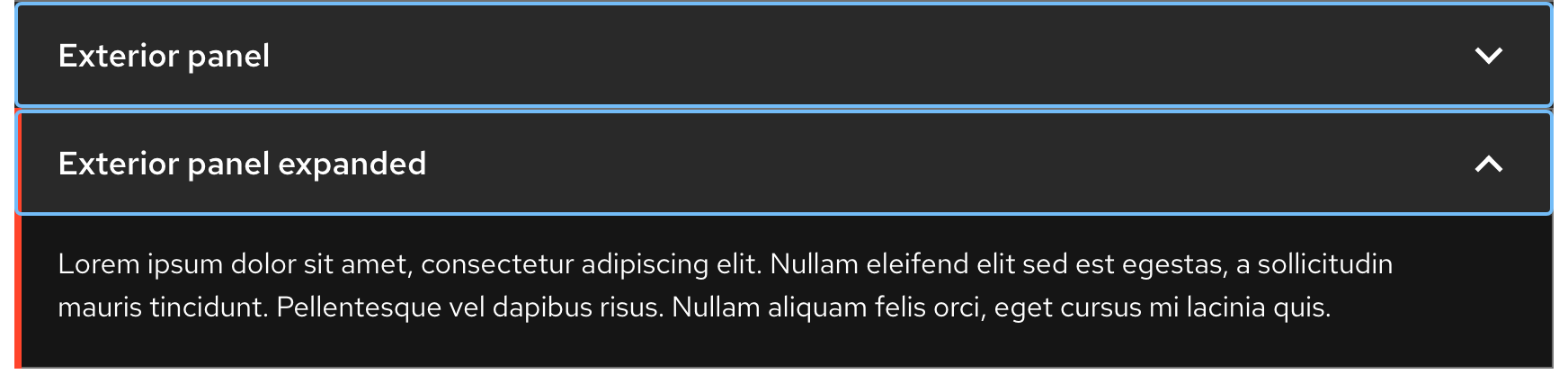
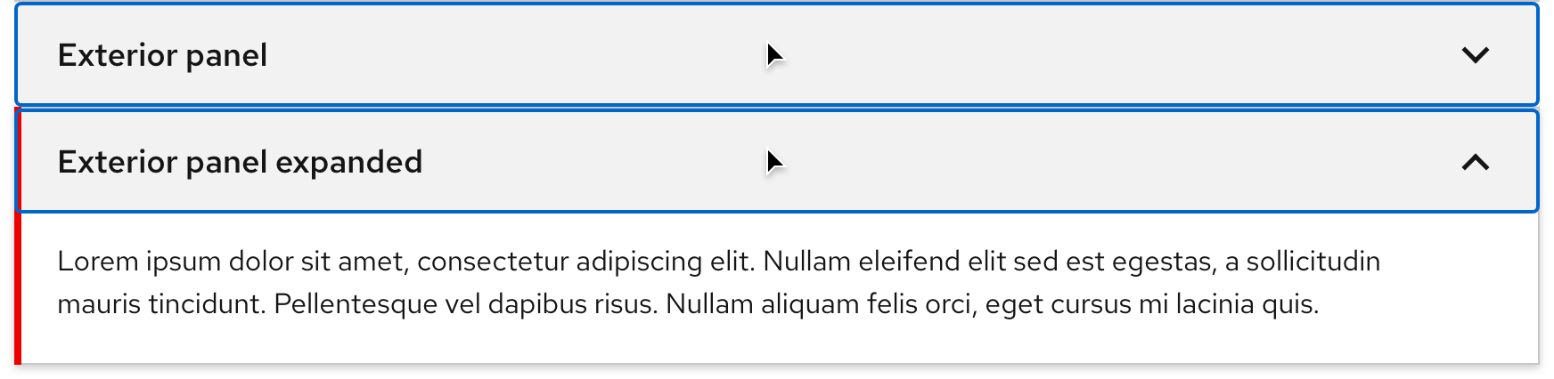
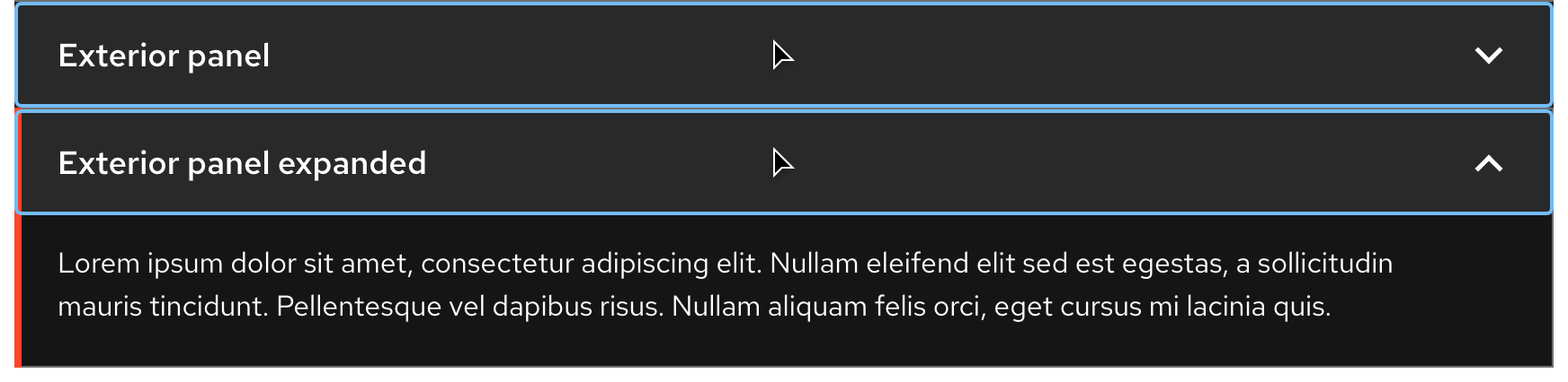
Accordion panels include title text, a chevron icon, body text, and other content. When a panel is collapsed, only the top and bottom borders are visible. When a panel is expanded, all borders are visible including a thicker left border for emphasis.
Anatomy
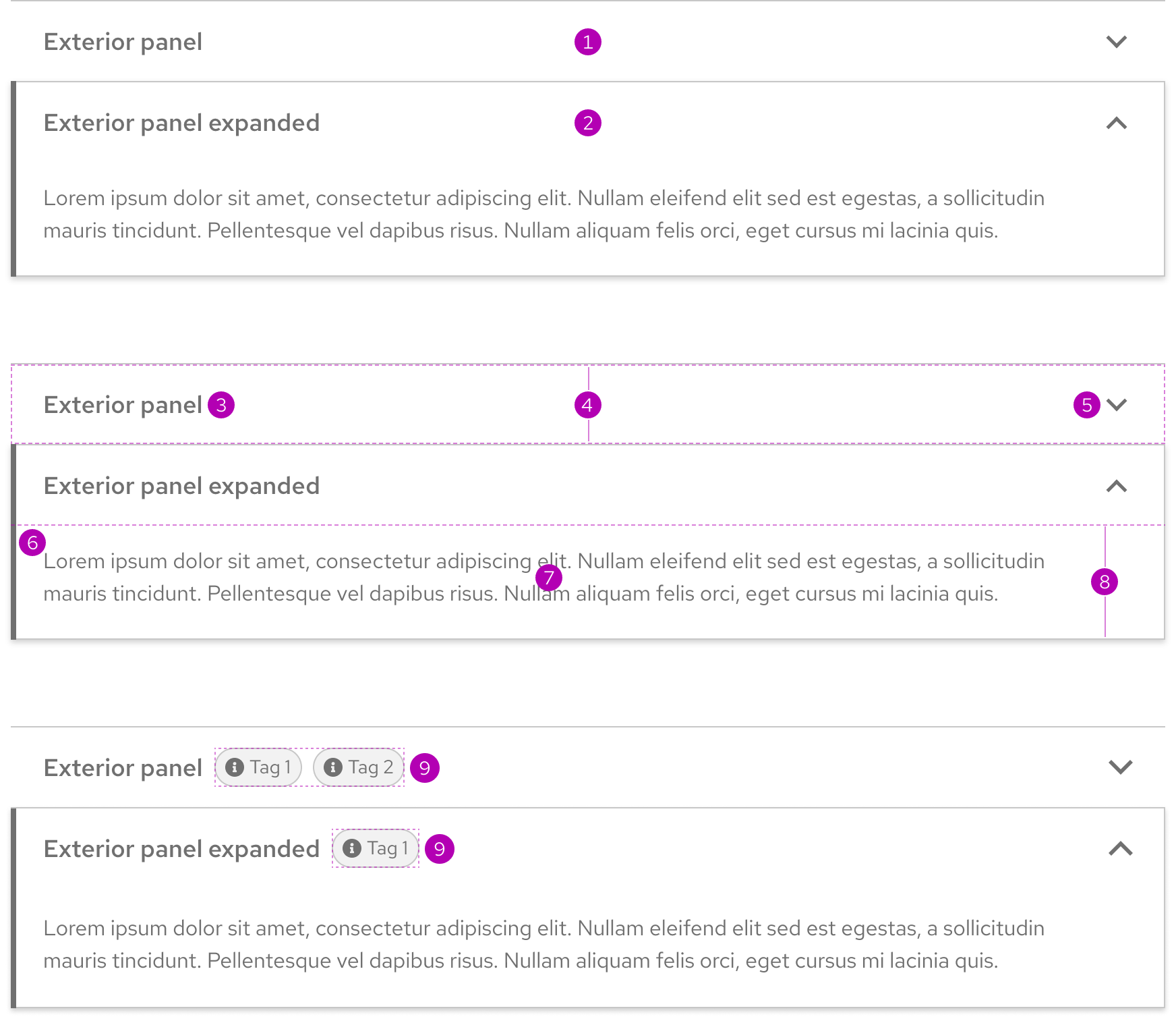
- Collapsed panel
- Expanded panel
- Title
- Panel header region
- Caret
- Emphasis
- Content
- Panel body region
- Accent slot
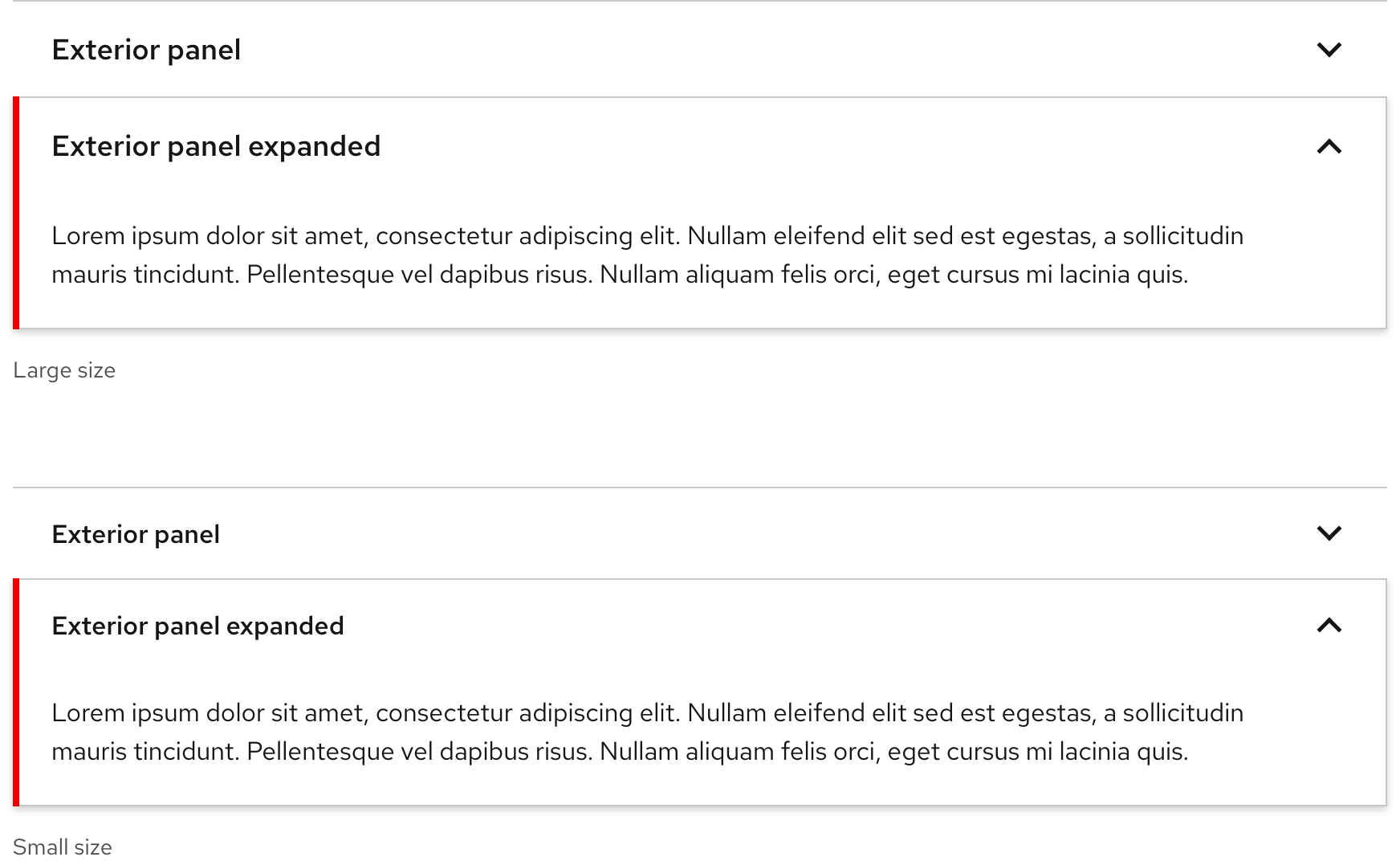
Sizes
There are two available sizes and the only difference is the title text size. You can use the Small size on large breakpoints, but not the Large size on small breakpoints due to the potential of long title text wrapping to more than two lines.
Color scheme
An accordion is available for both light and dark schemes. The light scheme expanded panel includes a box shadow, but the dark scheme does not.
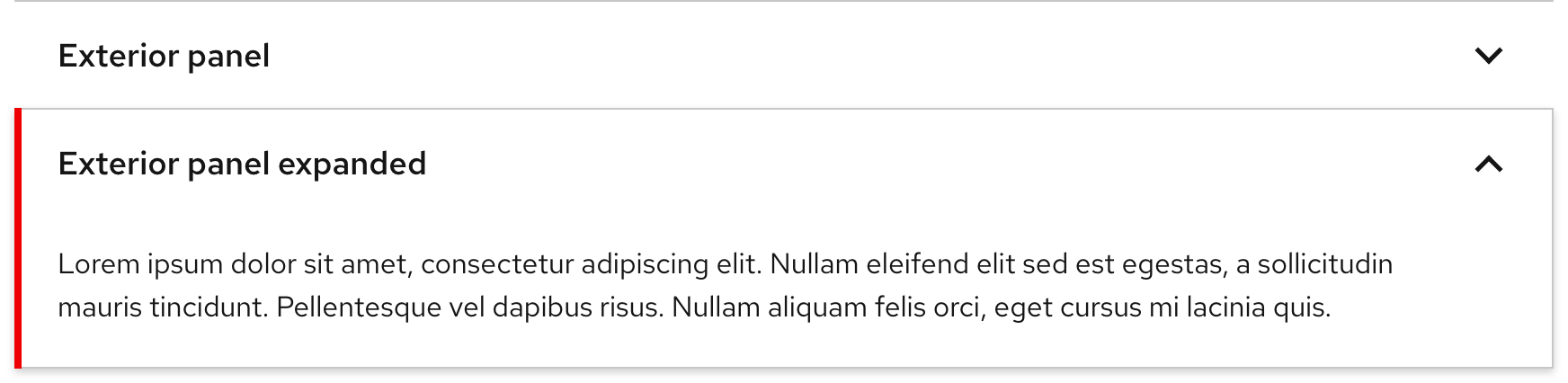
Light theme
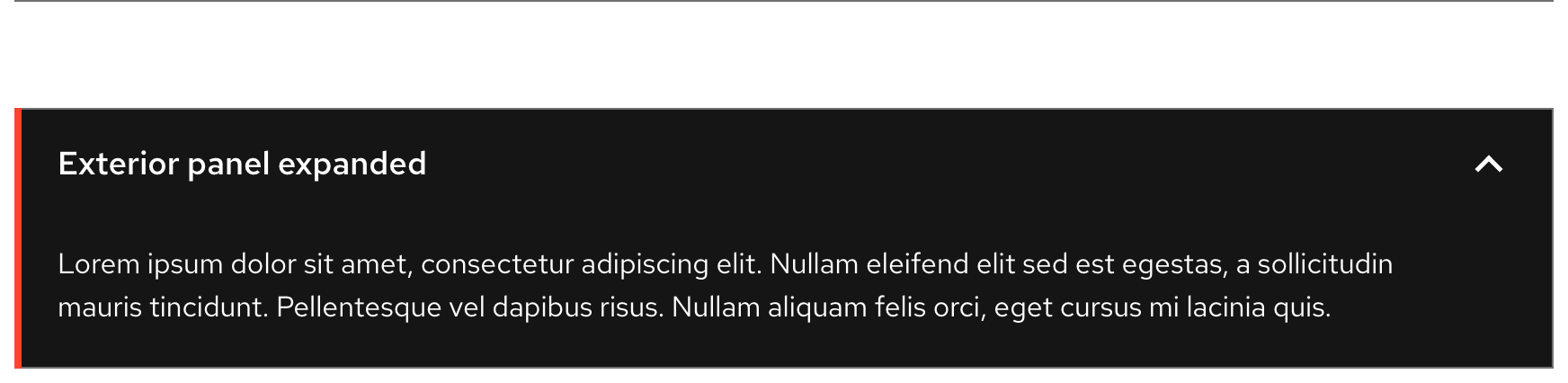
Dark theme
Configuration
An expanded panel does not have a maximum height, but it may scroll if constrained by vertical space. The width of an accordion varies based on content and page layout. Title text and icons are horizontally aligned.
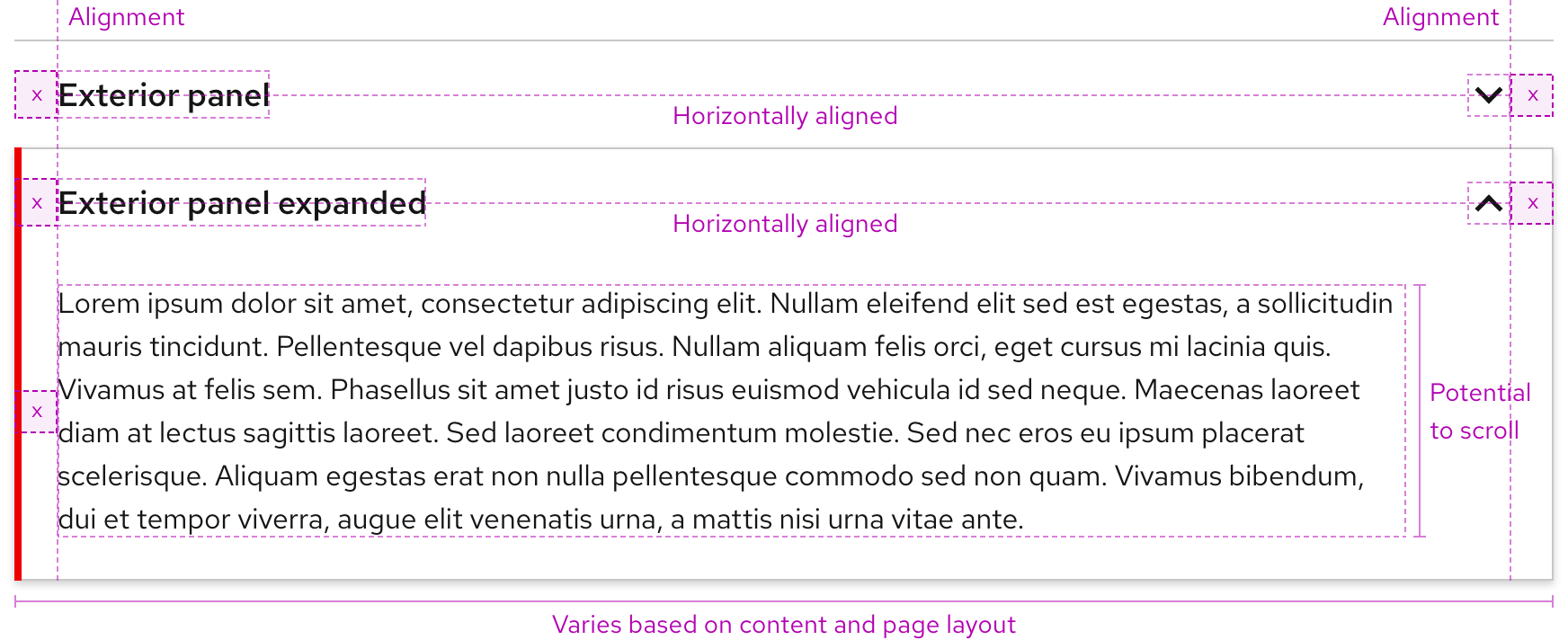
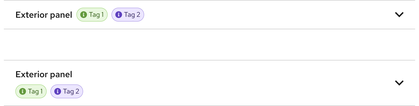
Accent slot
The accent slot can be positioned inline or below the panel's title. This can contain tags, badges, or other small elements with secondary information.
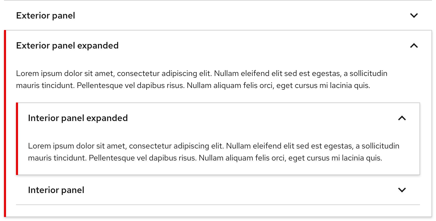
Nested panels
Panels can be nested to help organize complex or granular sections of content.
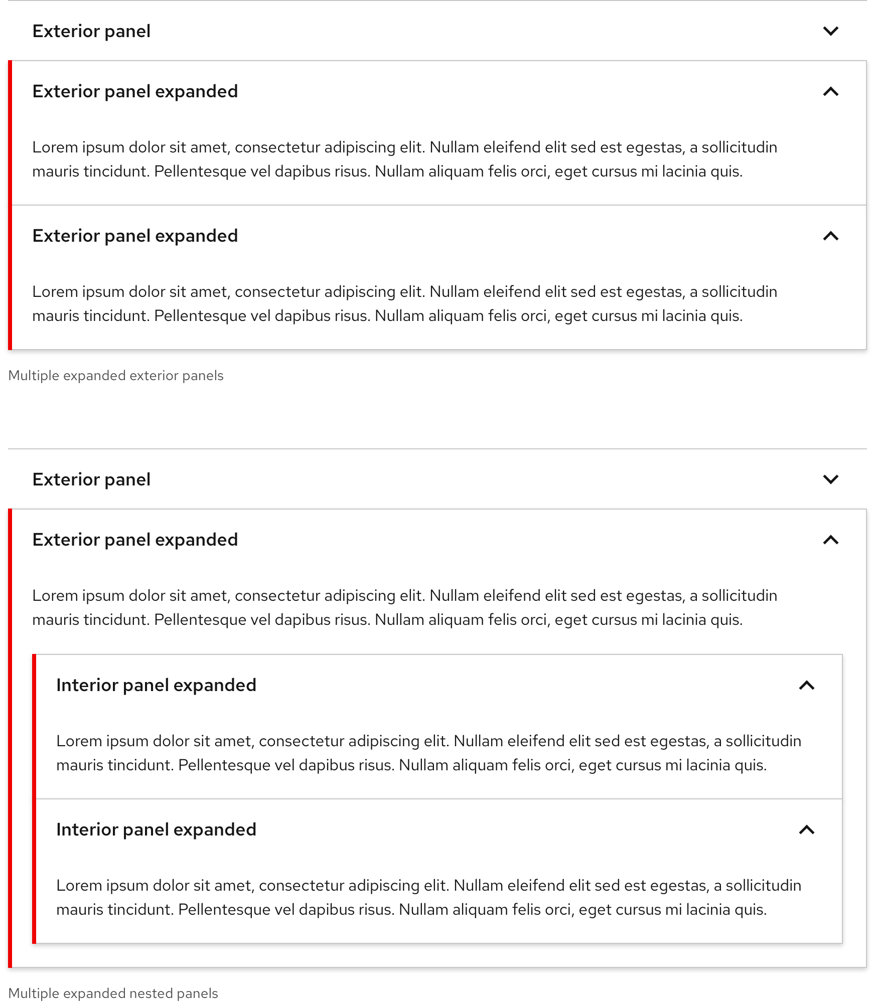
Stacked panels
Multiple panels can be expanded simultaneously even when nested.
Space
Example
Token
Description
lg
16px spacer
xl
24px spacer
3xl
48px spacer
Interaction states
Interaction states are visual representations used to communicate the status of an element or pattern.
Hover
| Property | Light theme | Dark theme |
|---|---|---|
| Color - panel header | --rh-color-surface-dark-lighter |
darkened --rh-color-surface-dark |
Focus
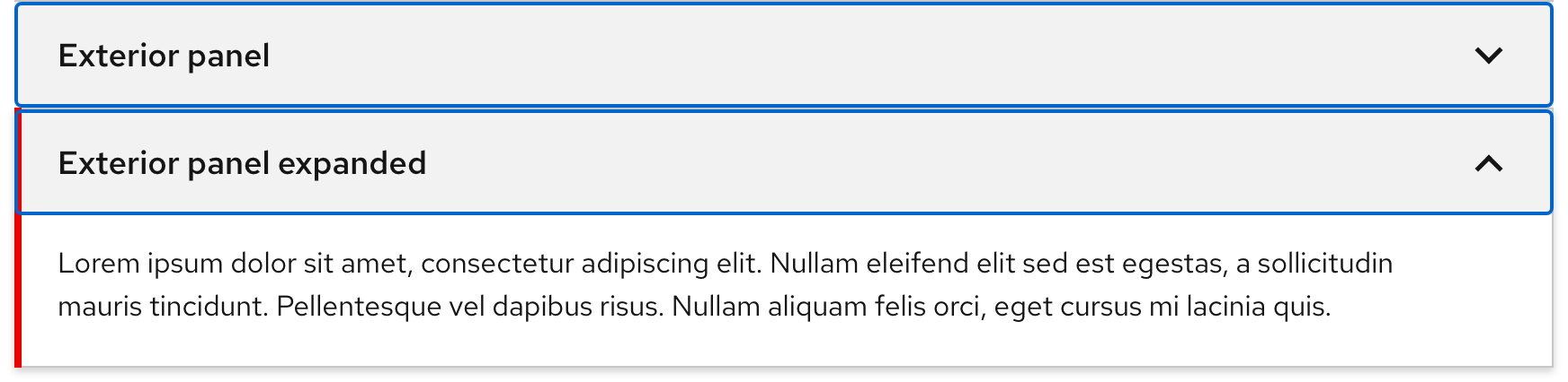
| Property | Light theme | Dark theme |
|---|---|---|
| Color - panel header | --rh-color-surface-dark-lighter |
darkened --rh-color-surface-dark |
| Color - focus ring | --rh-color-interative-primary-focus |
--rh-color-interative-primary-focus |
Active
| Property | Light theme | Dark theme |
|---|---|---|
| Color - panel header | --rh-color-surface-dark-lighter |
darkened --rh-color-surface-dark |
Other libraries
To learn more about our other libraries, visit this page.
Feedback
To give feedback about anything on this page, contact us.
