Accordion
On this page
Usage
Use an accordion to organize a large amount of content into sections. This allows users to scan through critical information first and then access additional information when needed. Users can also compare information by expanding multiple panels simultaneously.
When to use an accordion
Using an accordion provides an easy way to organize content while reducing page scrolling, but at the expense of hiding information or burdening users with more clicks. There is a chance that important information will be missed or not immediately noticed by users. Therefore, if reading important information is critical to the user experience or if important information requires more focus and less clicking, it is advised to not use an accordion.
Accordion vs. disclosure
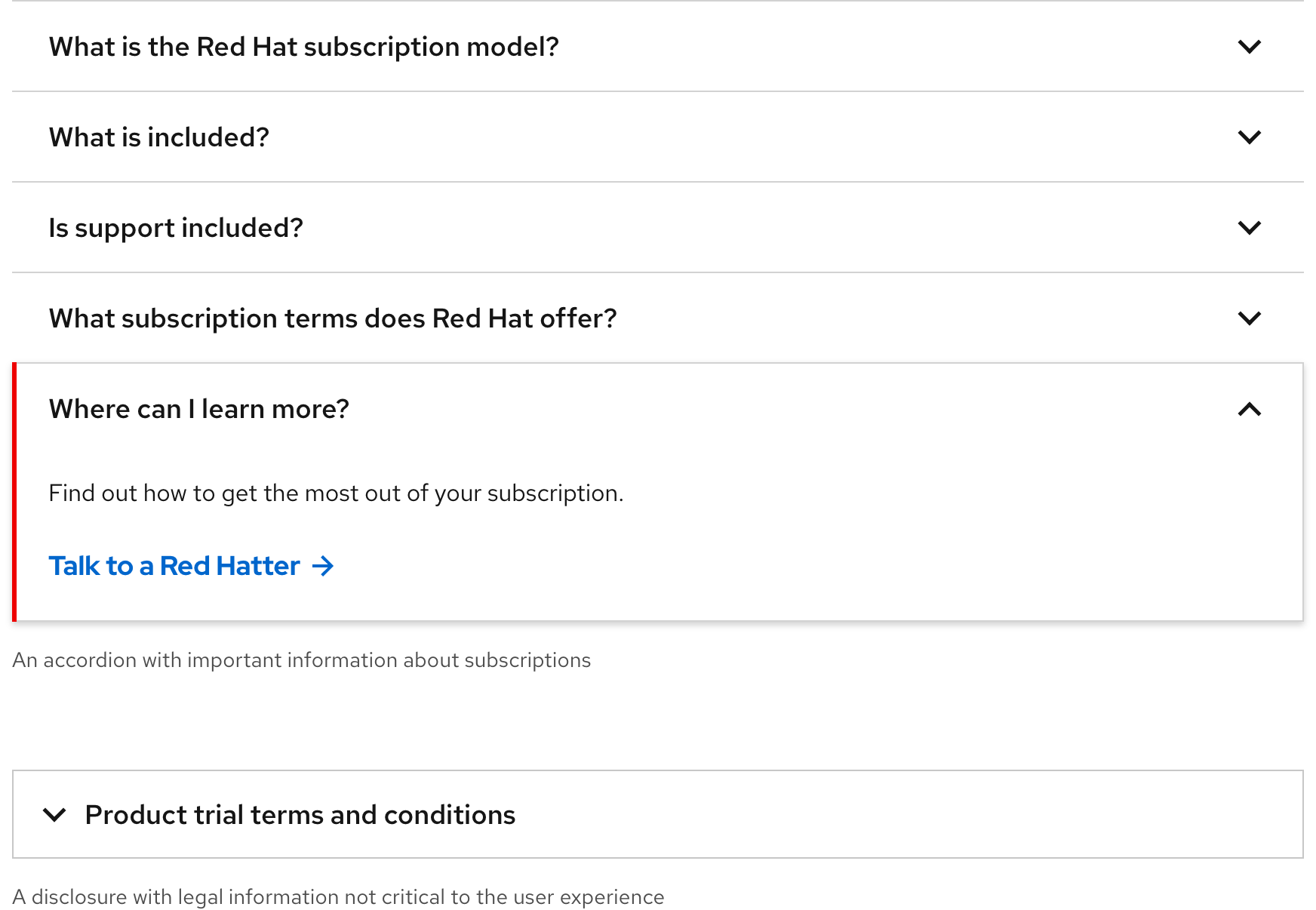
An accordion is used to organize important information whereas a Disclosure can be used to organize secondary information that might not be critical to read or impact the experience. An accordion can also accommodate multiple sections of content, whereas a disclosure can only accommodate one.
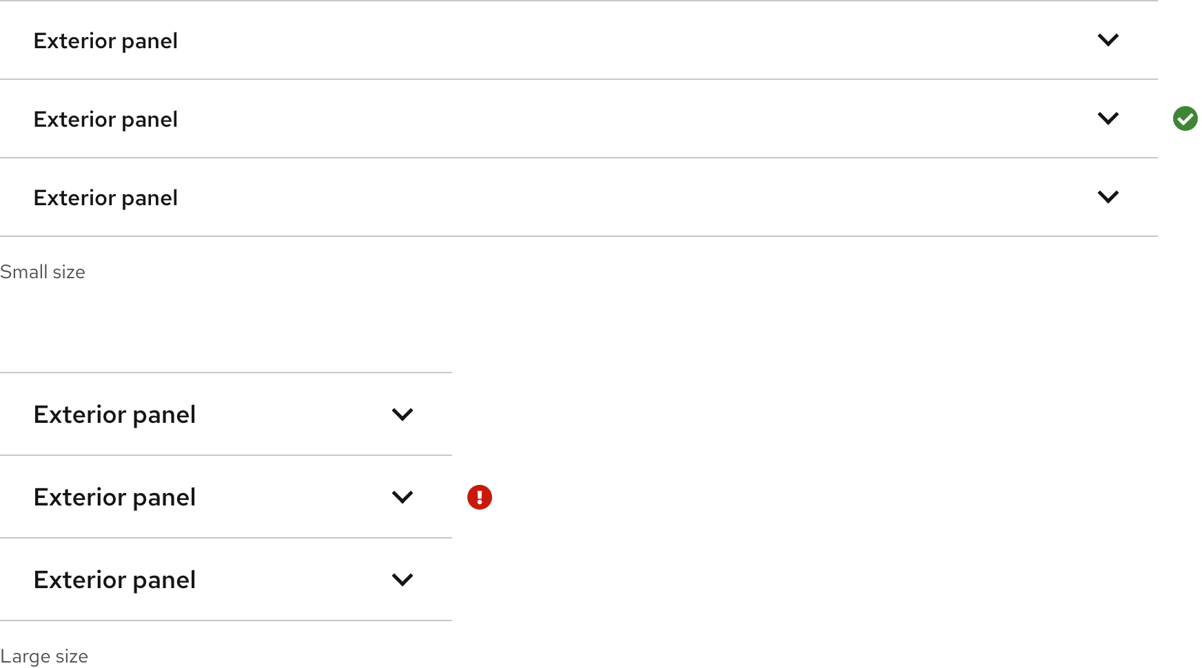
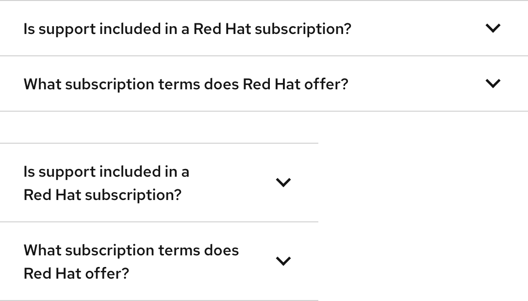
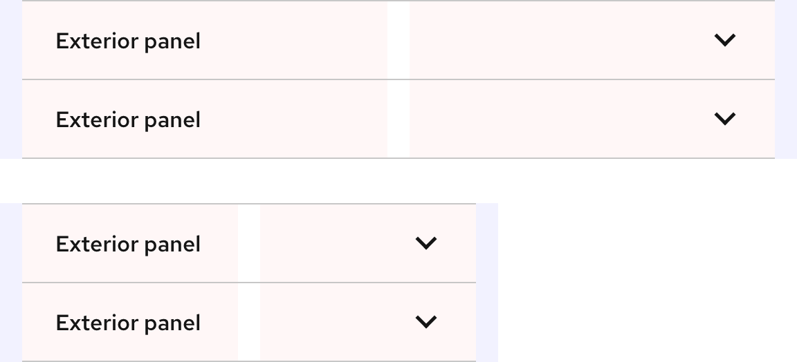
Sizes
It is acceptable to use the Small size on large breakpoints, but do not use the Large size on small breakpoints.
Writing content
Title text
Title text should be written concisely so users know what to expect when they expand a panel. Beware of long character counts especially on small breakpoints or when translated. If title text is too long, create another section. Do not write title text to sound like a call to action, make it as easy as possible for users to understand the content within.
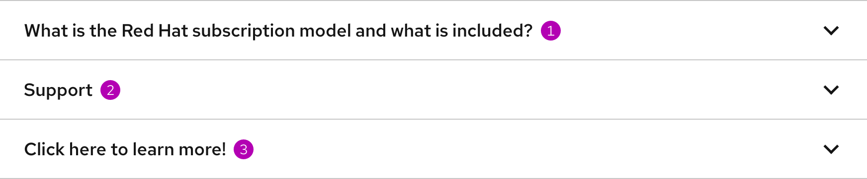
- Title text is too long and should be broken into two sections
- Title text is short and might not help users understand the content within
- Title text should not be written like a call to action
Character count
Title text should have fewer characters to help users make sense of what the content will be when they expand a panel.
| Title text | Character count |
|---|---|
| Title text | 65 |
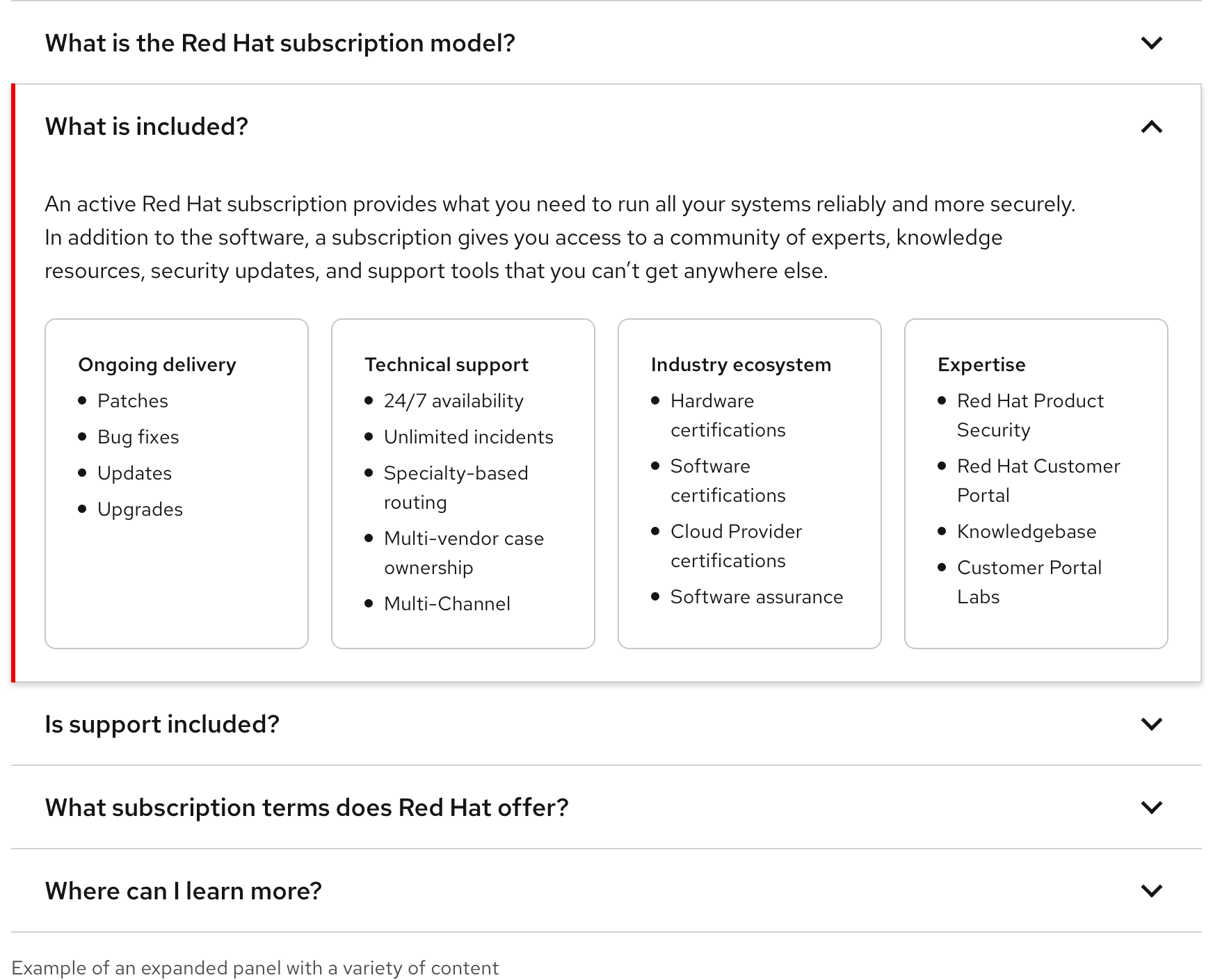
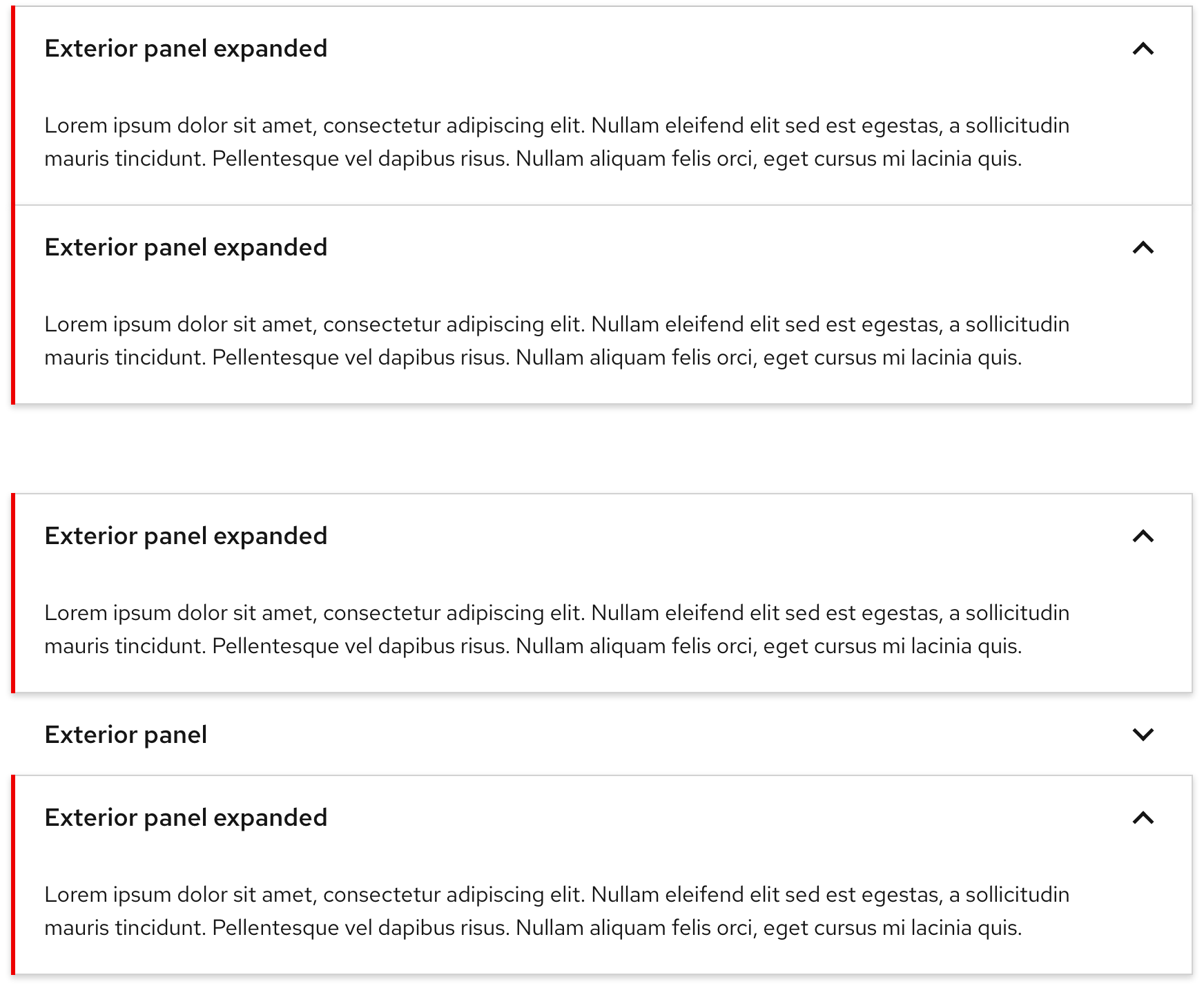
Panel content
When a panel is expanded, some content must appear below the title text and
chevron icon. Content can include text, cards, images, etc. Text blocks should
not exceed 750px to maintain optimal readability.
Long title text
Title text can be two lines on small breakpoints, but no more.
Layout
The width of an accordion can be adjusted on large breakpoints to fit fewer columns if necessary.
Behavior
Expanding and collapsing panels
Users can expand and collapse panels one at a time by default. More than one or all panels cannot be expanded at once unless that functionality is added along with an Expand all button. When a panel is collapsed, the caret points down. When a panel is expanded, the caret animates to point up.
Expanding multiple panels
Users can expand multiple panels simultaneously either stacked on top of each other or not. Expanding one panel does not collapse another.
Responsive design
An accordion changes from the Large size to the Small size as breakpoints get smaller.
Breakpoints
| Breakpoint | Range | Size |
|---|---|---|
| Desktop, large | > 1680px | Small and Large |
| Desktop, medium | 1440px - 1679px | Small and Large |
| Desktop, small | 1200px - 1439px | Small and Large |
| Tablet, large | 992px - 1199px | Small and Large |
| Tablet, small | 768px - 991px | Small and Large |
| Mobile, large | 576px - 767px | Small only |
| Mobile, small | < 575px | Small only |
Best practices
One panel

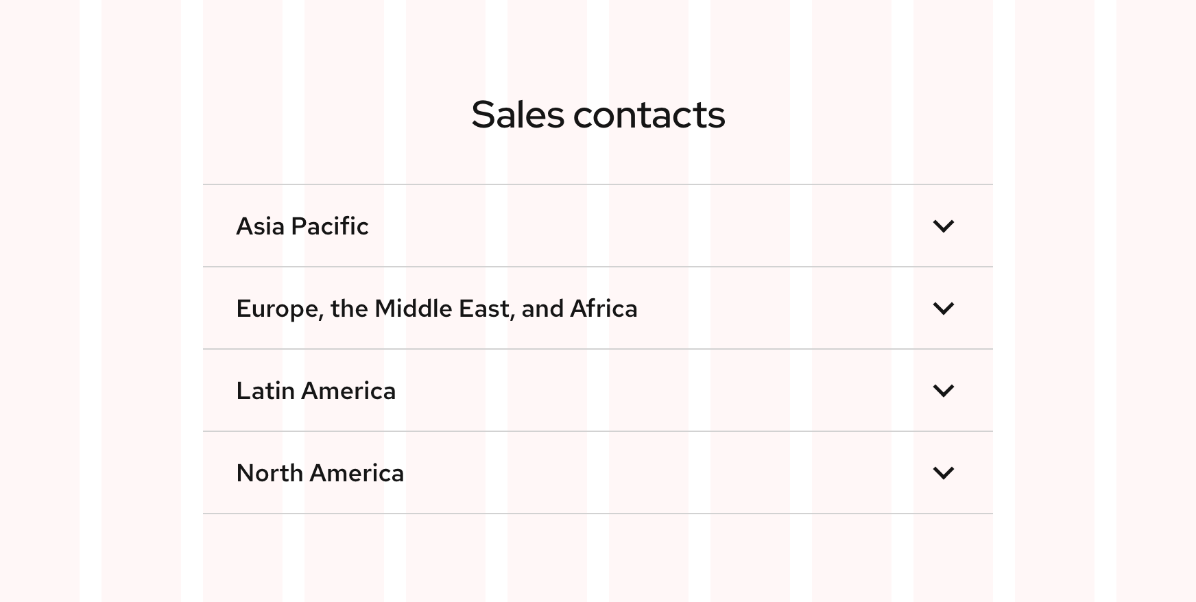
Use accordion in groups of two or more.

Do not display one panel only.
Text readability

The text in a panel should be limited to a maximum width of 750px, which maintains optimal readability.

Do not allow text within panels to fill the entire width of a panel, if the text would exceed a width of 750px.
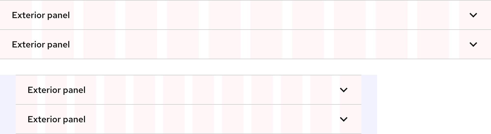
Mixing color palettes

An accordion group should match the color palette of the container it’s in. This ensures that all of the text is visible and has adequate color contrast.

Do not use a light accordion in a dark environment and vice versa because it may cause accessibility and usability issues.
Other libraries
To learn more about our other libraries, visit this page.
Feedback
To give feedback about anything on this page, contact us.
