Tooltip
On this page
Style
A tooltip is a container with text that includes an arrow and sometimes a drop shadow. It can be anchored to various elements like buttons, icons, etc.
Anatomy
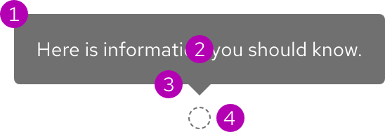
- Container
- Text
- Arrow
- Trigger
Color scheme
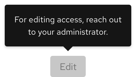
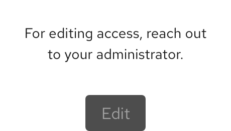
A tooltip is available for both light and dark schemes. The dark scheme tooltip container does not include a drop shadow.
Configuration
All badges have the same height and border radius.
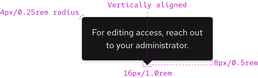
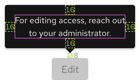
Space
Example
Token
Description
md
8px spacer
lg
16px spacer
Animation
A tooltip has a 300ms entry delay on hover by default, but this can be customized. For example, if you would like it to appear immediately, set the delay to 0ms.
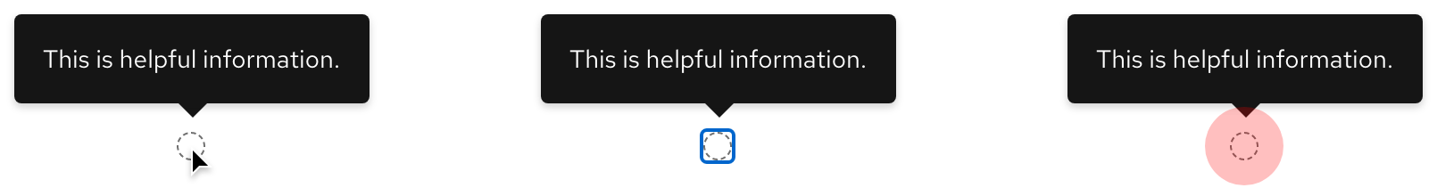
Interaction states
A tooltip appears near an icon or element on hover, focus, or when tapped. A tooltip contains only text and is not interactive.
Other libraries
To learn more about our other libraries, visit this page.
Feedback
To give feedback about anything on this page, contact us.
