Tooltip
On this page
Usage
Use a tooltip as a way for users to see more information before they select an element, go to a new page, or trigger an action on the page.
Tooltip vs. popover
Both tooltips and popovers provide contextual information for users. However, they differ in a few ways.
Tooltip
- Used for brief messages (one or two lines of text)
- Contains only plain text.
- Appears when triggering element receives mouse hover, keyboard focus, or is tapped.
- Has no internal means of dismissal (e.g., a close button).
- Dismissed when triggering element loses hover/focus, or when a touchscreen user taps elsewhere.
Popover
- Can be more descriptive than a tooltip.
- Can contain headings, images, and interactive content.
- Appears when triggering button is clicked.
- Has a close button.
- Dismissed when user clicks close button, presses esc, or clicks/taps outside the popover.
Content
Content in a tooltip is limited to text only. Consider the following when writing tooltip content.
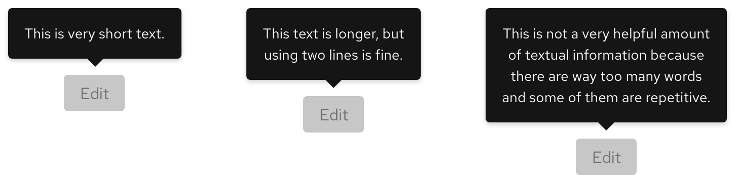
Character count
A tooltip's body text should be short and descriptive.
| Element | Character count |
|---|---|
| Body | 60 |
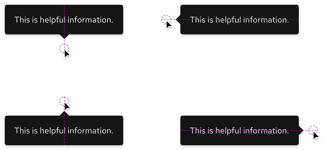
Orientation
The correct orientation of a tooltip depends on the amount of content and browser window. If a tooltip covers up important information or gets cut off, choose a different orientation.
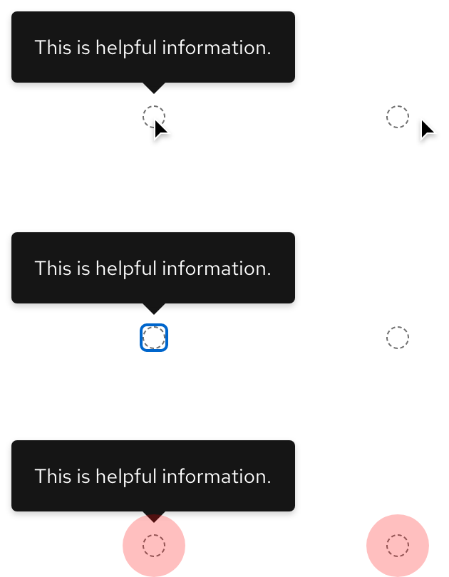
Behavior
When a cursor or focus is moved, the tooltip disappears. On mobile devices, users must tap to trigger a tooltip and then tap again to make it disappear.
Responsive design
A tooltip can generally be used on both large and small breakpoints if the content is not too long.
Best practices
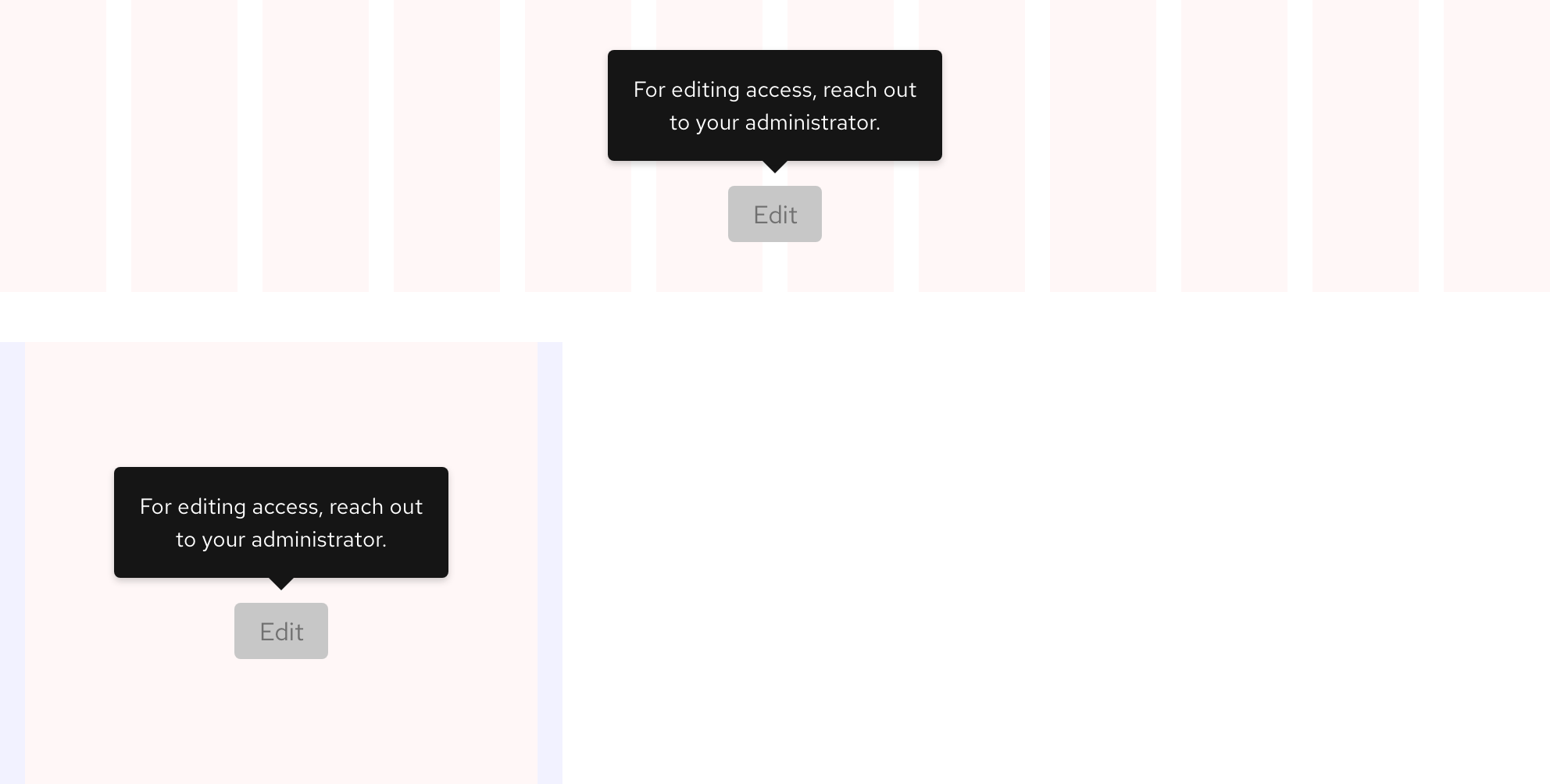
White on white

Use the tooltip that corresponds with the theme of the container it’s in.

Do not use a dark theme tooltip in light theme environments and vice versa.
Cut off by browser window

Place the tooltip so that the whole element is visible.

A tooltip should not be cut off by the browser window. Change the orientation if it does.
Unnecessary pairing

Tooltips should be used if a user might need to know more information to understand the page or to complete an action.

Do not add a tooltip to interface elements or actions that do not require further explanation.
Other libraries
To learn more about our other libraries, visit this page.
Feedback
To give feedback about anything on this page, contact us.
