Dialog
On this page
Usage
Use a dialog to communicate critical information that requires input or action. A dialog can be used to validate user decisions, confirm non-destructive or destructive actions, report errors, share task results and statuses, and prompt required user input.
A dialog is also interruptive by design. When active, users are blocked from viewing page content and cannot return to their workflow until the dialog task is complete or the dialog is dismissed. A dialog can be effective when used correctly, but it should be used sparingly to limit disruption.
When to use a dialog
A dialog is commonly used for short tasks. If users need to perform a task several times on the same page, consider moving it to the main page instead. Do not use a dialog unless the information or task within is vital to user success and worth disrupting their workflow.
Patterns
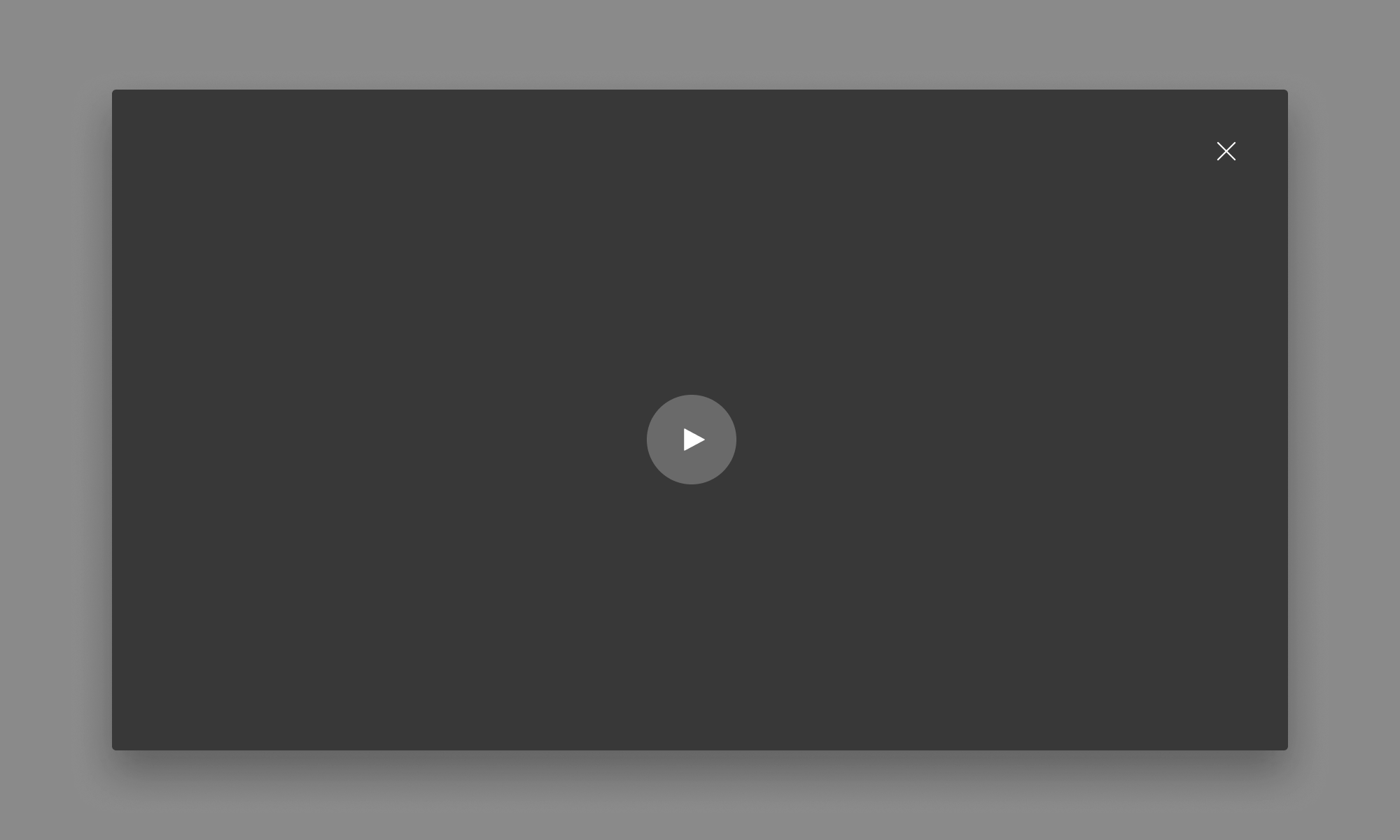
Video player dialog
A video dialog should have the same aspect ratio as the video and include a close button.
Writing content
Dialog content should be descriptive and specific so users can scan, understand the context of an action, and make a quick decision. A dialog includes three main content sections.
Headline
A headline introduces the purpose of a dialog, sometimes as a question. Use important key words, like ”permanently,” to describe an action and its consequences.
Body text
Body text provides additional information about the consequence of an action in three lines or less, typically concerning changes to a workflow or access to information. Be mindful of adding interactive elements that would navigate users away from a dialog, unless they are crucial yet helpful resources like documentation.
Buttons
Buttons allow users to answer the headline prompt. Write button text labels as verbs to communicate their function and consequence. Button verbs can be pulled from the headline for better scannability.
Character and line counts
The recommended maximum character and line counts for the elements of a dialog are listed below and include spaces.
| Element | Character count | Line count |
|---|---|---|
| Title text | 40 | 1 |
| Body text | 175 | 2 |
| Button text | 30 | 1 |
Overflow content
When dialog content is taller than the dialog container height, the default behavior keeps the header fixed while the body and footer sections scroll vertically. To make both the header and footer fixed, refer to the “Code” subpage.
The content will visibly fade at the end of the scrolling section to indicate there is additional content out of view. Dialog content should never scroll horizontally.

Layout
Placement
By default, a dialog container is horizontally and vertically centered on top of the backdrop and viewport. There is also an option to position the dialog container at the top of the viewport.
Fixed-width
The fixed-width dialog container works well for environments with a fixed grid, like marketing pages. There are three dialog container sizes: small, medium, and large. While large is the default, users should choose a size that works best for the amount of available content.
| Size | Dialog width |
|---|---|
| Small | 35 rem |
| Medium | 52.5 rem |
| Large | 70 rem |

Full-width
The full-width dialog container works well for environments with a fluid grid. It may also be helpful if a dialog contains a chart, a complex image, or other any content that should appear at a larger size.
This option is currently available only if the dialog is positioned at the top.

Responsive design
Large breakpoints
Both the fixed-width and full-width dialog containers can be used on large breakpoints.

Small breakpoints
As breakpoints get smaller, the fixed-width dialog container will change to full-width and become taller.

Best practices
Reading time

Keep content in the dialog brief. If supplementary information is needed, move it to the main page and include a link in the dialog instead.

Do not add elements that will make users spend too much time reading a dialog.
Unclear context

Write clearly about what will happen when users confirm an action.

Avoid writing confusing or ambiguous content when a dialog confirms a user’s action.
Number of buttons

Use up to two buttons in a dialog.

Do not use more than two buttons in a dialog.
Other libraries
To learn more about our other libraries, visit this page.
Feedback
To give feedback about anything on this page, contact us.
