Badge
On this page
Usage
Use a badge to reflect counts like number of objects, events, or unread items.
Variants
A badge includes various status colors that communicate different semantic meanings.
Warning
Relying on color alone to communicate information causes barriers to access for many readers. Go to the Accessibility page to learn more.
| Badge | Name | Use case |
|---|---|---|
| Neutral | Indicates neutrality or no impact | |
| Info | Indicates informative or low impact | |
| Success | Indicates stability or completion | |
| Warning | Indicates a warning | |
| Caution | Indicates an increased need for caution or attention | |
| Danger | Indicates an error |
Badge vs. tag
If you need to add specific text captions to elements, consider using a Tag instead.
Writing content
Counter number
The width of a badge varies based on the counter number. Using a number larger
than the threshold will display a + at the end. For example, if 999 is the
threshold, using 1,000 or larger will display 999+.
Behavior
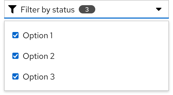
Filtering
A badge is often found in filter toggles to indicate the number of selections that are made in a toolbar filter or select list.
Best practices
Large number
A value threshold for the number displayed in a badge should be established, and any number that’s larger should be shown as the threshold value with a plus sign.
Do not allow a badge to display a value over 999.
Two badges
Use at least one visual cue other than color when using two badges side by side.
Do not use only color to associate two consecutive badges with two different meanings.
Other libraries
To learn more about our other libraries, visit this page.
Feedback
To give feedback about anything on this page, contact us.
